

DESIGN BLOG
Thoughts
&
Musings
Shades of Blue
The color blue in its most positive symbolism and psychological influence conveys intelligence, communication, trust, serenity, reflection and calm. Some of its negative connotations can be coldness, aloofness, and lack of emotion.
The skill of using color in design and art to its best advantage is knowing how much, where and why.

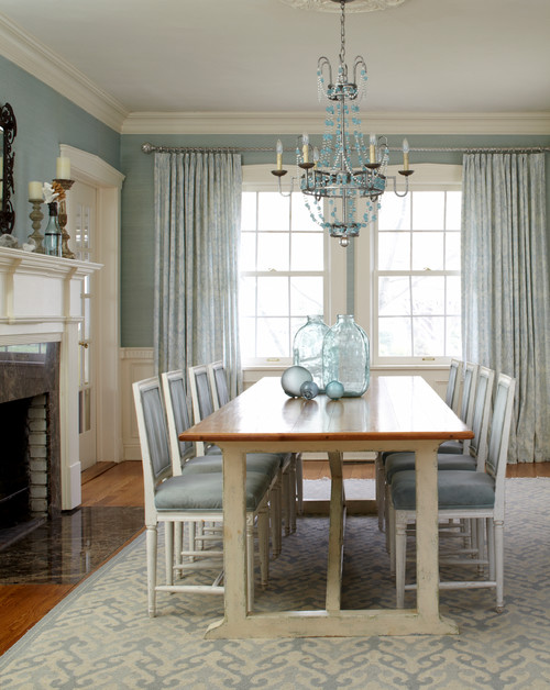
A good example and simple illustration is the difference between the two interiors above and below; the first uses a deep ultramarine blue as the dominant theme, below a lighter sea foam blue.
Even though the common denominator is blue; the difference in effect couldn't be more radical. The first conveys a strong, quiet, earthy, contemplative mood. The second although peaceful is far more delicate and ephemeral.
Below is Picasso's self portrait done during his blue period. His gaze is a faraway, pensive look. The surrounding blue creates a mysterious atmosphere; his coat in a deeper navy anchors the pale jaundiced visage of the painter.
Pablo Picasso, Self Portrait
Just as blue can be used as a device to create an entire mood, it can also be used as a way of balancing out the presence of a color such as this orange / red and stopping it from completely dominating a room. In this instance, the exciting warmth of the couch's color is countered by the cool blues in the water and sky of this landscape I created for a client's home, clearly illustrating using color in art as a design solution.
"The Queen's Necklace" by Nathalie Tierce
Understanding Which Color is Right and Why

A space can serve a singular purpose or have several functions. Color reinforces that harmony between that environment and the reason someone is in it.
Some spaces are for social gathering and interaction, others for quiet contemplation. Understanding the psychological effects of hue on our minds and emotions makes for better choices in designing living areas with color.
A study which illustrates the power of color effecting state of mind was done in the 1960's. Violent prisoners at a Naval Detention Center were placed in cells painted particular shade of pink (now known as Baxter - Miller Pink), there were no incidents of violent or erratic behavior. Exposure of 15 minutes was enough to have the effect.
Another aspect to understanding color sometimes ignored is the type of light the area in question receives. This gives rise to one of a very common problem of seeing a paint swatch or fabric sample in a showroom and then getting it home and it looking completely different to the way it did in the store.
Natural sunlight provides the widest spectrum of light allowing us to perceive the widest spectrum of chroma.
Even so, depending on the direction of light and time of day there is a huge variation in terms of the light being warm or cool.

Monet's Haystacks early morning
Monet's Haystack's evening
Artificial light, LEDs, for example have an enormous range of variation as seen in the chart below. This can have an enormous impact in the way a color reads in one place to another.
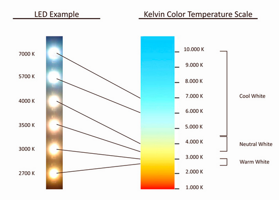
As the higher an LED is in terms of its Kelvin rating, the cooler and brighter the light will be. On the lower end, the light will appear warmer or more yellow akin to candlelight.
So, for example a warm light will dull a cool color and intensify a warm one.
Another elusive variable to the color selection process is surface texture. This is linked to a phenomenon called metamerism. The same color on two different surfaces will appear differently to the eye because of how the light waves are reflected back. This is a prevalent frustration when a sample color on a smooth surface (like card paper) appears different from paint on drywall.
These factors can help you understand the way color behaves as it does and narrow down the selection process. Ultimately though, the last stage of picking a color is to put up samples. This is the only way to really experience the color in its proposed setting and allows you to see it as it changes during different times of day.
Art For A Dark Corner
Print on LED mount. Art and Photo credit Nathalie Tierce
A client of mine asked if there was any way to light up a dark corner of her living room with one of my works of art. I thought she wanted to create a focal point for the room and light it with directional spot lights. That wasn't what she had in mind at all. She really wanted to light up the area with the artwork itself. I loved the idea, I just had to figure out to do it.
Inside workings of the LEDs within the light box frame mount.
After much research I found a graphics company that could print my artwork and then weld it to canvas. From there, a sleek frame would be built to mount the canvas. Within that frame were rows of LED lights, controllable by a dimmer switch to the side.
Bob finding where the joists are behind the drywall and preparing for the installation of the light box.
Taking back the canvas to attach the support to the wall.
Tucking the canvas back in.
With the dimmable switch, the glow of the art work can be changed to suit the mood of the room. As the lights are LEDs, they pull little power and last long time. Once the light box is in place, the print can be changed out, transforming the space again.
Tags: #artforhome, artlight, #artlight, #lightbox,#customizablelight, artinstallation, #newideaart,#darkcornerroom
A Happier Play Space
Pretty....Pretty grim. Using this fake brick in Peekabooplayland (www.peekaboopland.com) was a clever way to add some character to the walls. The down side was the color it came in was simply awful for the application. The dark brown and black was decidedly not in keeping with the rest of the space. Everything else in the indoor play area is fun and colorful without being tacky. What this looked like was a place to send kids for being naughty, not having a good time.
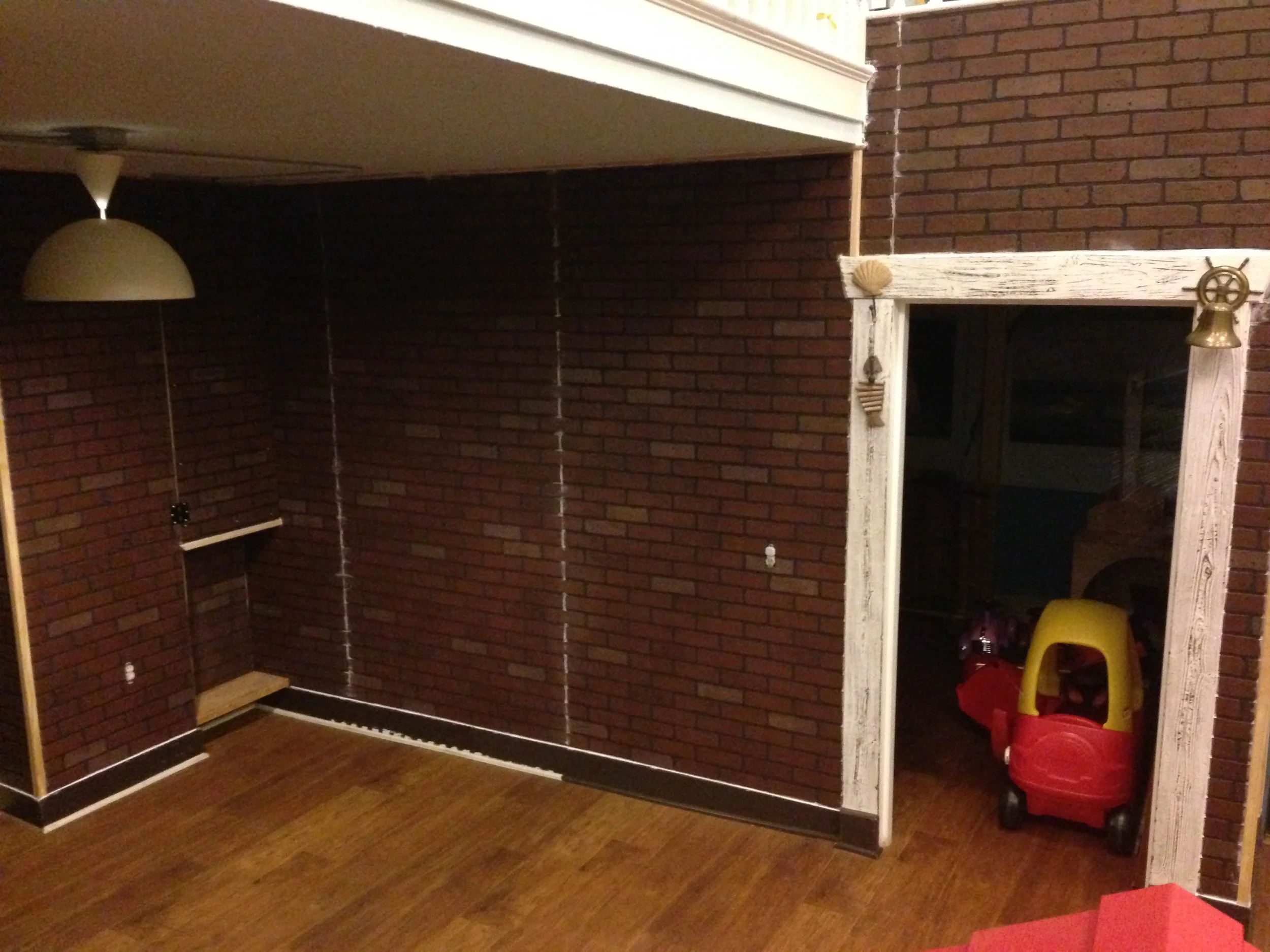
First things first, I had the painters prime the vac form plastic "brick" sheets grey. When that was dry, I roughly troweled on white paint. The purpose of this was to leave the majority of the recessed grout area grey and give the brick surface a light tone that had a lot of variation but would lift the the brightness of the next color that followed. This room received the least amount of natural light. In creating this effect wanted to make sure that it was a rich palette but not dark so that it would reflect the maximum amount of light.
Sharing the Playground with the crew from "New Girl"
Just to complicate things, a T.V. crew was using the space for shooting the series "New Girl" while we were doing the work. We tried to stay quiet and out of their way as best we could.
Next step was to apply the general red brick color. Mixed into the paint was 25% water based faux glaze. Using the side of a 4" chip brush in a technique called "scumbling" the paint on the brush only hits the high points of the surface. This creates a random pattern that accentuates the bricks's texture.
My son Joshua who is 7 has really picked up the knack of it and was a great help.
Another way of applying the paint to accentuate the surface's texture is to flit the brush back and forth quickly as Joshua is seen doing here.
The white color and terra-cotta does tend to end up in the grout, touching up the grey with a 1/2" fitch works well.
After coming back with some more white using the same scumbling technique to soften the red, it's done.
A Portrait of Joshua
"Joshua" (detail) by Nathalie Tierce
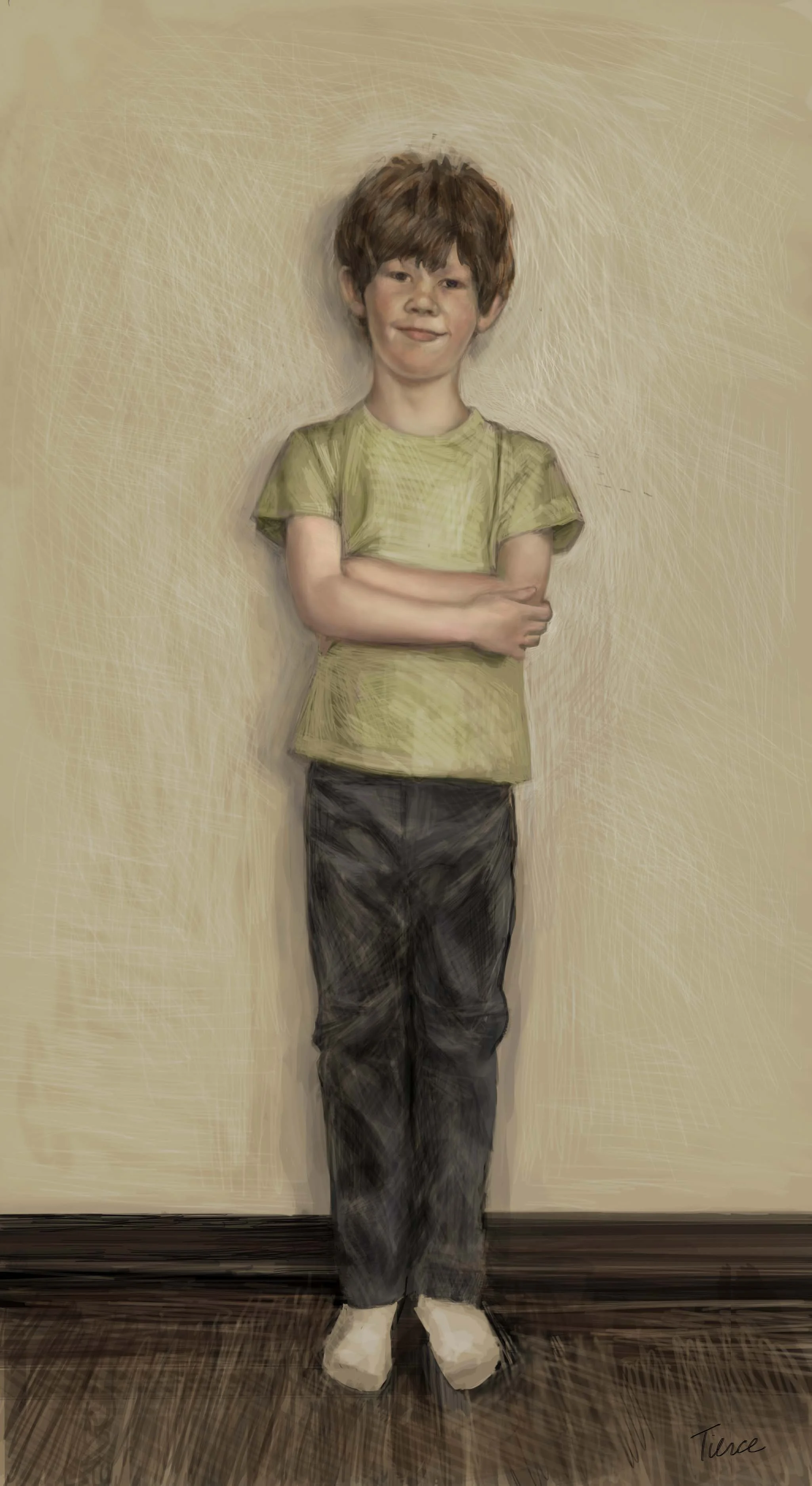
"Joshua" by Nathalie Tierce
It's always that way, when you do something for a living (even if you love doing it) you tend to not do it for yourself.
Suddenly enough time had gone by to make me realize it had been years since I did a portrait study of my own son, Joshua, 7.
When I asked him to pose for this, I didn't ask him to pose, because in general I find that makes people, kids and grown ups alike, freeze. So instead I talked to him about what I needed his picture for, how I would use it for reference for my painting.
I finally got a photo that I liked with an attitude and gesture that conveyed his character.
Although I liked the slightly James Dean stance he struck, once I began working on the composition, the length of his exposed sock was distracting so I changed it.
I've made a short video where you can see the progression from sketch to drawing to finished painting.
I'm so glad I did it, I see his humor and shyness mixed with humor come through.
Hedging for Privacy
Phase l : Hauling Stones
There's a small side garden to the side of our property that we've been meaning to properly tier for some time now. As it's a hillside home, a big part of any renovation project is getting the materials up from the street. In this case one ton of river rocks. Today, I personally hauled just under a half ton. Two stones at a time. 26 steps. Then artfully chucking them in a flat group so my lovely husband can choose the ones he needs to build the walls. Who needs a gym? Even worse this is supposed to be Chris' vacation while the show he's on is on hiatus. Some break.
Phase II of the side garden renovation.....the privacy hedge and of course it had to be during a heat wave. Undeterred, we arranged to have the 24" inch containers of "Podocarpus Gracilior" (also called "Fern Pine") delivered on Saturday morning.

On the subject of heat wave; let me backtrack a little about this choice of hedge that changed from bamboo.
After careful consideration and even having visited different nurseries for healthy specimens of "Golden Bamboo" I had a change of heart. Although bamboo is a fast grower, it does require a lot of water to become established. Right now we are in the middle of a drought.
So, not wanting the stiff looking effect of some other hedges, and something that doesn't mind being trimmed to a slim profile and will reach heights of 20ft, I found the family of Podocarp trees and hedges.
First, what drew me to this genus of conifer is the look of the leaves that are very delicate and light in color. A hedge that creates privacy that doesn't look like an oppressive wall. Secondly, while it doesn't grow as fast as bamboo, it grows faster than some other slow growing hedges and doesn't require excessive amounts of water once it is established. It is considered drought tolerant as well. The amount of trimming depends if you want a formal or informal look.
The Fern Pine Forest is planted.
Some of things to consider when planning a project like this are:
a) Choose healthy, full plants. Ask questions, "Are all the plants from the same crop?" "How wide / full are they?" If you can't visit the nursery ask to have pictures sent.
We chose to go with more mature plants about 7 feet high in 24 inch containers. We found a supplier with beautiful specimens in Riverside that was willing to deliver www.plantclearance.com (speak to Peter or George).
In a matter of months with water and care, we'll have our own wall of green and dappled light.
You may, for example be able to find trees in smaller containers and pay less but it may take them a full two to four years to catch up with the larger ones. If you don't mind waiting you'll save money.
b) Calculate carefully how many plants you need. This particular variety if being used as a hedge can be spaced 2 to 3 feet apart. for this project that means 8 plants.
c) Once they're planted give them Vitamin B-1 with the recommended amount of water to help them avoid shock from the transplanting. Be sure to give deep watering for the first week.
Framed Bark
"Bark Painting #5" by Nathalie Tierce
I just finished hanging on of my prints from the "Bark Paintings" series in my client's home.
Framed, it looks wonderful in this contemporary bedroom. They already had the woven red bedspread with embroidery as well as the some of the other pillows. I found the purple and silver / navy pillows to throw into the mix because it need a little bit a cool rich color to counter the warm bedspread.
The walls are Benjamin Moore's Simply White.
A Home with a View
It was after my father's funeral, I was packing my things to go back to Los Angeles and my stepmother came to me and said "why don't you bring your father's ashes back to The States with you?"
I didn't want to bring it up but it now that we were talking about it, it seemed to be a good idea. Although my father had been ill for some time, his passing came sooner then we thought it would. He was French and had gone back to live in France after my parents had divorced. If I brought the ashes back with me to California, family that was not able to be there could say goodbye in their own way.
Thinking about it, I remember my father saying years ago, that when he died, he didn't want to be in a cemetery or a crematorium. He wanted to be outdoors in a natural setting near trees.
When I got back home, I discussed what would be the best thing to do with the ashes with my husband Chris. My father had been a bit of a real estate enthusiast, buying, fixing up and selling many apartments and houses during the course of his life. Maybe we could meld the two ideas? Make a little treehouse that would house the urn and ashes? After we did a few drawings, Chris (who is a talented sculptor and prop maker) started to build the body of the house that the urn would go inside.
The view from the tree we had chosen to put the structure in would be so fantastic we thought a house that had windows going around 360 degrees would be ideal.
The beginnings of the base that would support the house and the ceramic urn
Sanding and finishing the edges.
Painting the house with primer before giving it two coats of exterior paint.
Chris, filing down a window that would be on the outside of the house. I found the windows and door at a store that supplies scale architectural components for dollhouses. They were the perfect scale, suitable for outdoor use and paintable.
The paint on main body of the house along with the copper paint for the roof both dry, the exterior details can go on.
Putting on the windows
All put together, with a little cupola on top, it's looking rather nice. I just had to find a little French flag for the top and it would be done.
Before the memorial, we had prepared the tree near a flat area on our hillside that had the base secured to it to support the urn and house.
The way Chris built the inside of the house was to attach three braces to the base that would hold the ceramic urn in place (seen here inside a satin outer cover).
Once in place Chris puts the outer house on the base.
Before we secured the house permanently to its base, family members could put mementos like photos in beforehand.
After my father was safely settled in his new home, we gathered at the bottom to remember him and just be together.
My mother wrote and recited a poem in my father's memory, which was lovely.
With a little French flag that I made, it really is a beautiful little house with an amazing panoramic view of the city and mountains. I think my father would have loved it.
At Home in Paris
Originally Posted in March 2015
Recently I needed to make a trip to France on a family emergency. The trip was an emotional roller coaster. At the end of it all, I was drained. Luckily, I had a few days with my relatives in Paris that was very healing. Having time to wander around Paris alone helped me collect my thoughts. London has a matter of fact way of pushing you along if you're feeling sorry for yourself. Paris lets you quite happily wallow in sadness.
The neighborhood of choice to drift around was the Marais. Having gone to art school there years ago, it still has a comforting feeling for me.
Courtyard at L'ecole Nationale Superieure des Beaux Arts
Somehow seeing the little shops with their colorful displays struck me as painfully beautiful.
Honore de Balzac was inspired by this perfume shop Jean Vincent Bully in his novel Cesar Birotteau.
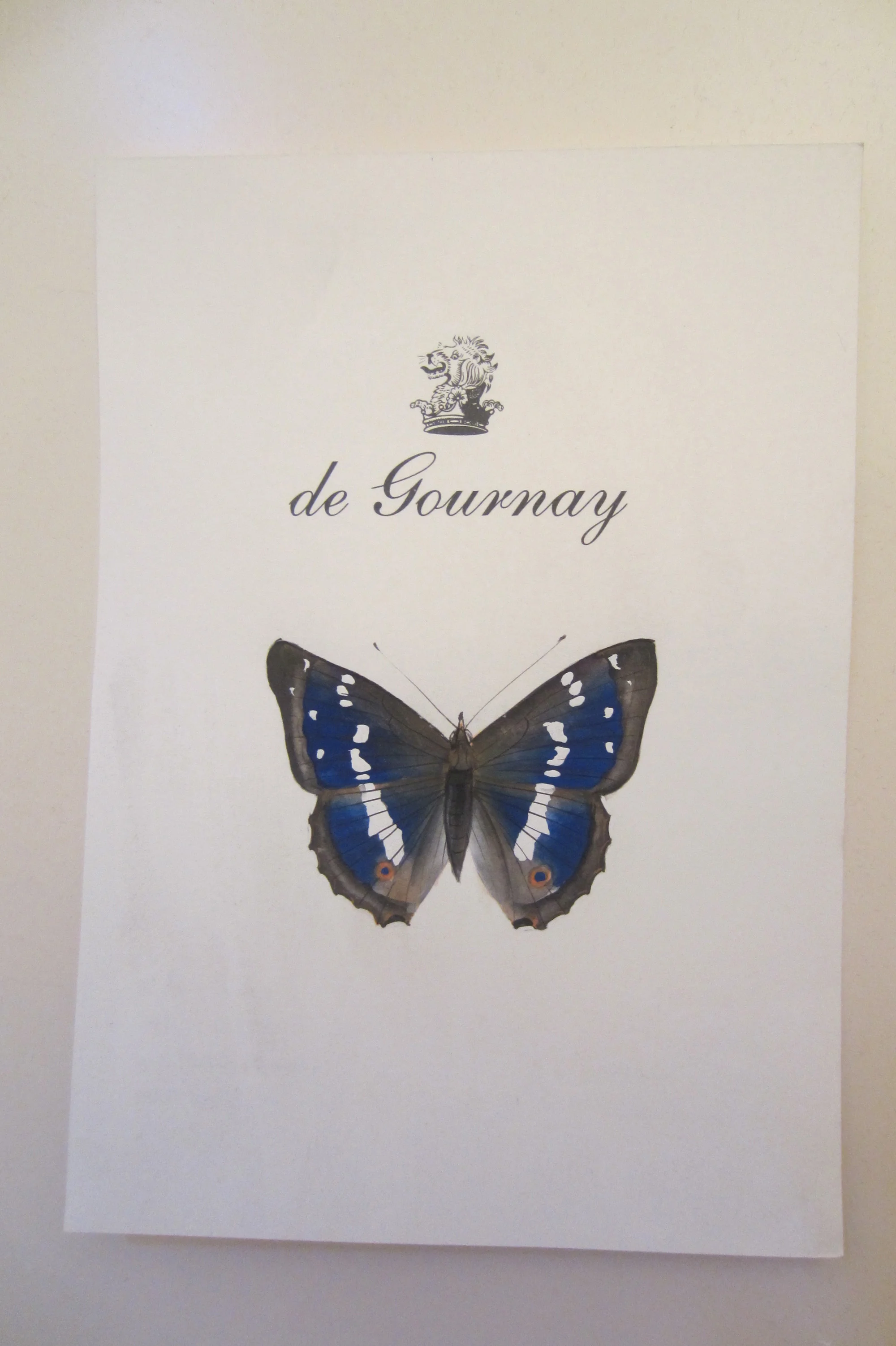
Home of exquisite hand painted wallpaper.
Showroom at De Gournay
My cousin Stephan and his partner Brigitte have created the most beautiful roof garden above their apartment in Paris.

What diet?
My Aunt Monique decked out in very Moroccan colors.
Twilight on the rooftop.
Bark Painting No. 6
"Bark Painting #6" by Nathalie Tierce
This painting that is the sixth in a series I've been working on called "Bark Paintings". This time, however, the result is a departure from the others.
Using textures I acquire through taking pictures of bark, I use those digital samples like brushes to create imagery, fine tuning shape, color and line with smaller digital brushes.
This is one of my photographs taken of a tree's surface that I extract texture samples from and use repeatedly. As I develop it, I paint into the forms giving more precise detail and color
Up till now, the forms within the paintings, although full of detail, were very subjective. Some viewers saw animals, architectural detail, it really depended on who was looking. The overall subject matter was open to interpretation.
"Bark Painting #5" Nathalie Tierce
While working on this piece, a narrative began to in my mind as I was painting it over many weeks. Little by little I discovered this particular character that was laid to rest and fossilized becoming one with a tree that had grown above.
As I painted, a face began to emerge that made me think of the Lion from the Wizard of Oz mixed with a strange solider whose elaborate uniform I spent much time embellishing.
The face and persona was really like a search and discovery mission. Sometimes my painting efforts brought me someplace that was just wrong. Without a solid preconceived idea of a title, story or theme I knew when I was getting closer or not.
The interesting part now is starting the next painting from where this one left me off.