

DESIGN BLOG
Thoughts
&
Musings
Once A Pond A Time
Racoons were making our life with a fish pond a struggle. We started the pond about 13 years ago with 10 fish bought for $1. So some of the fish had been with us for that long. The rest were the offspring or several generations from those original fish. At one time, there were so many, we had to find new homes for some of them.
But over the years the raccoons seemed to be able to pry off whatever barricades or deterrents we dreamt up. In the past 5 years they seemed to be really working hard to get to our fish friends and repairing the damage they'd do was a constant routine
Josh and his pal Raleigh sitting by the pond
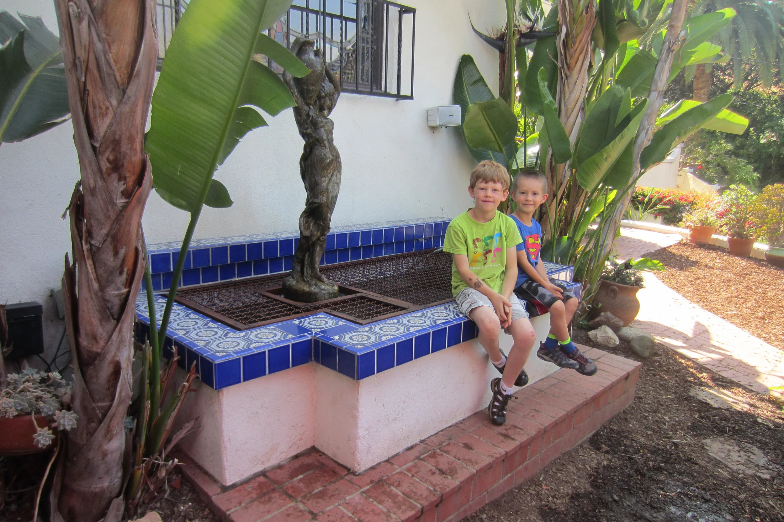
Try getting through this raccoons!
I did a drawing for a permanent grill that would be easy to remove in pieces for cleaning.
I found the name of Willy, at Willy's Ironwork in the Eagle Rock neighborhood of L.A. and showed him the drawing. We talked about how I wanted it to look and how it should come apart in pieces for access to the pond.
He said said it would take 2 to 3 weeks turnaround between making a template, construction, getting the patina on the iron right, sealing it and installation.
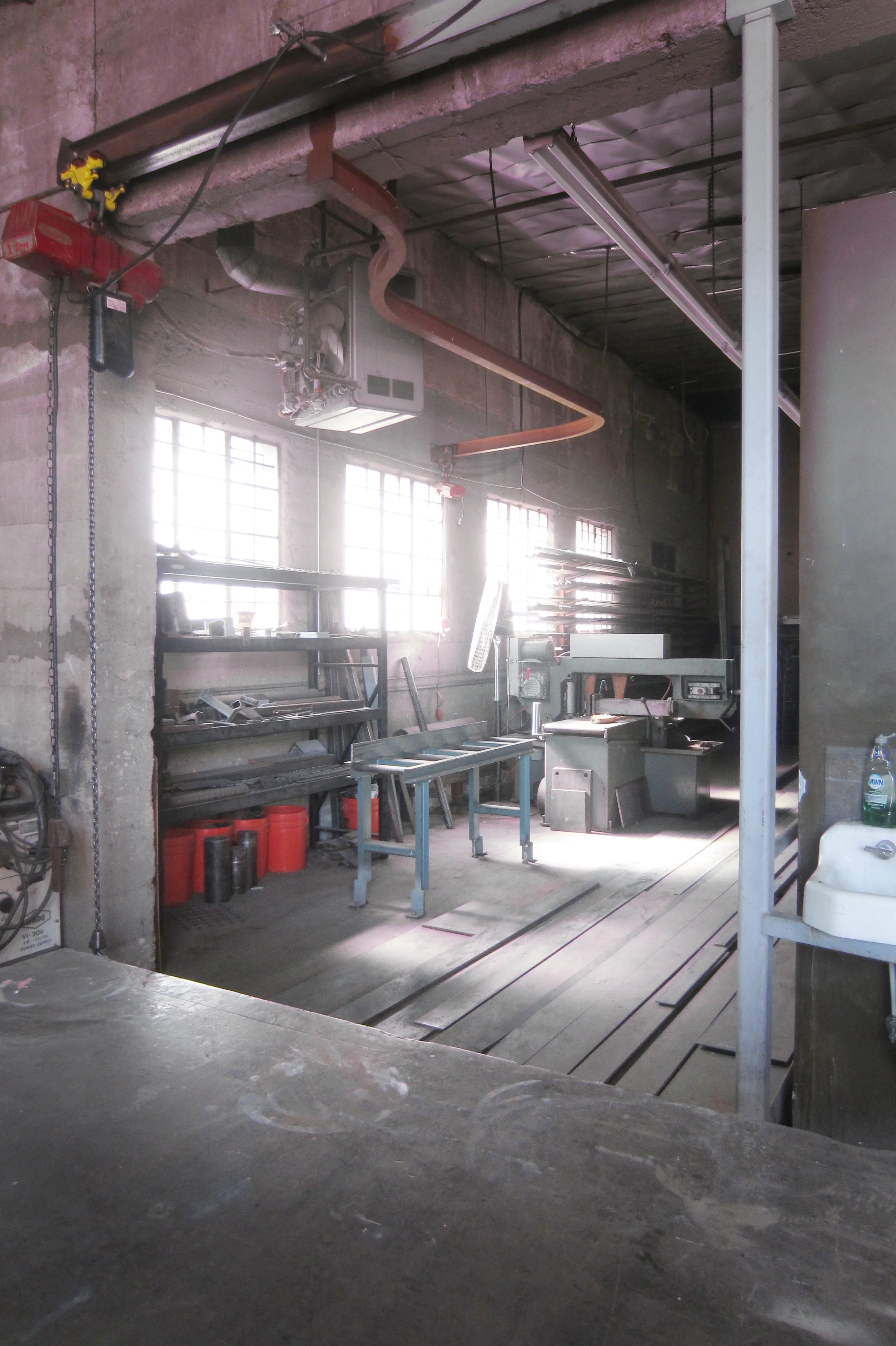
It's a great workshop, wonderful light in the late afternoon coming through the windows.
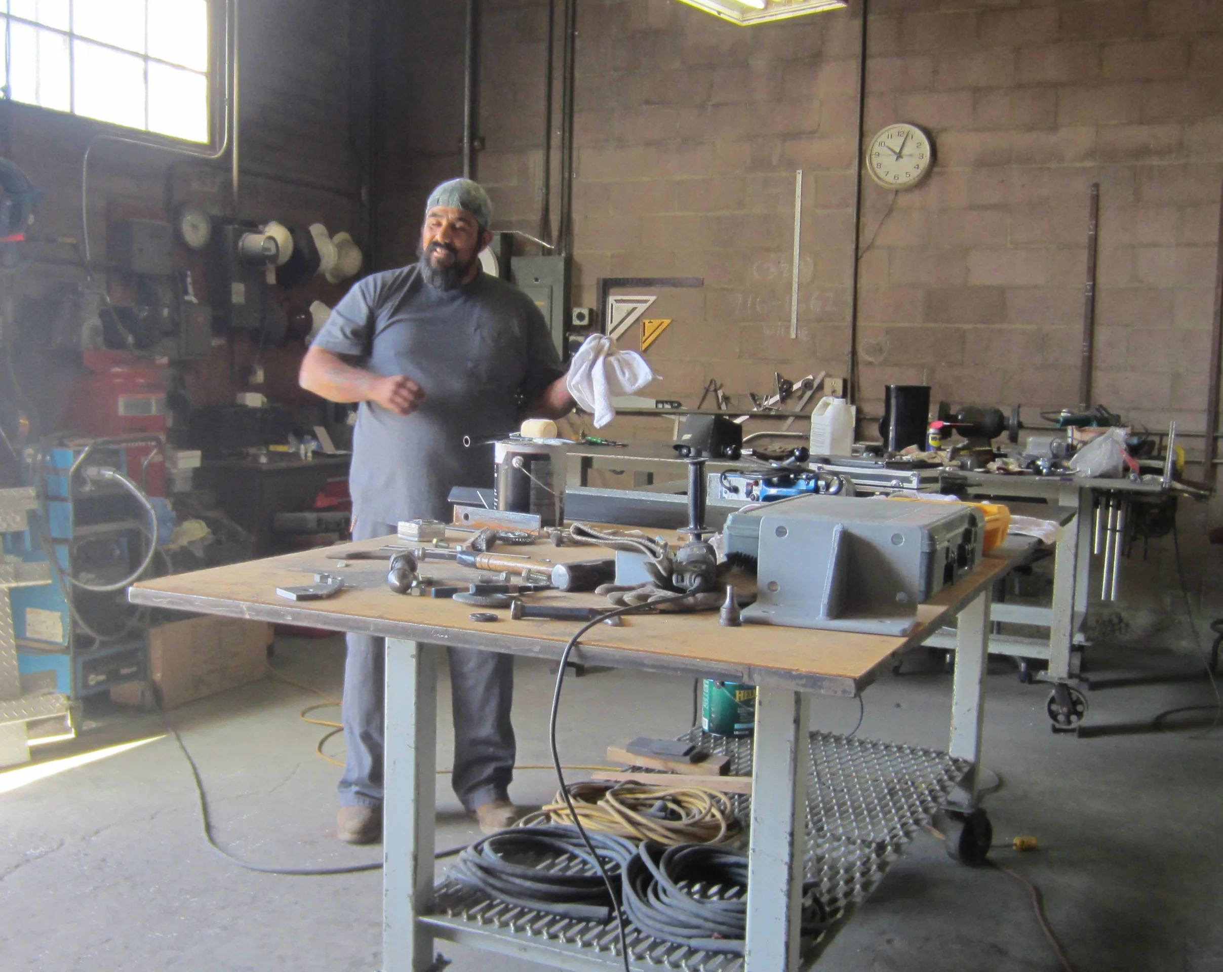
Julio setting up for work
Before he got started I went to go see the different styles of grills and expanded metals that be practical for keeping the raccoons out while allowing us to still see the fish. I also didn't want anything that looked too industrial as the house was a traditional Spanish from the 1920's.
I went to Sun Valley Metal Supply in Sun Valley. They have every imaginable gauge and style of metal mesh and grill in welded, woven, expanded, flattened or perforated sheets.
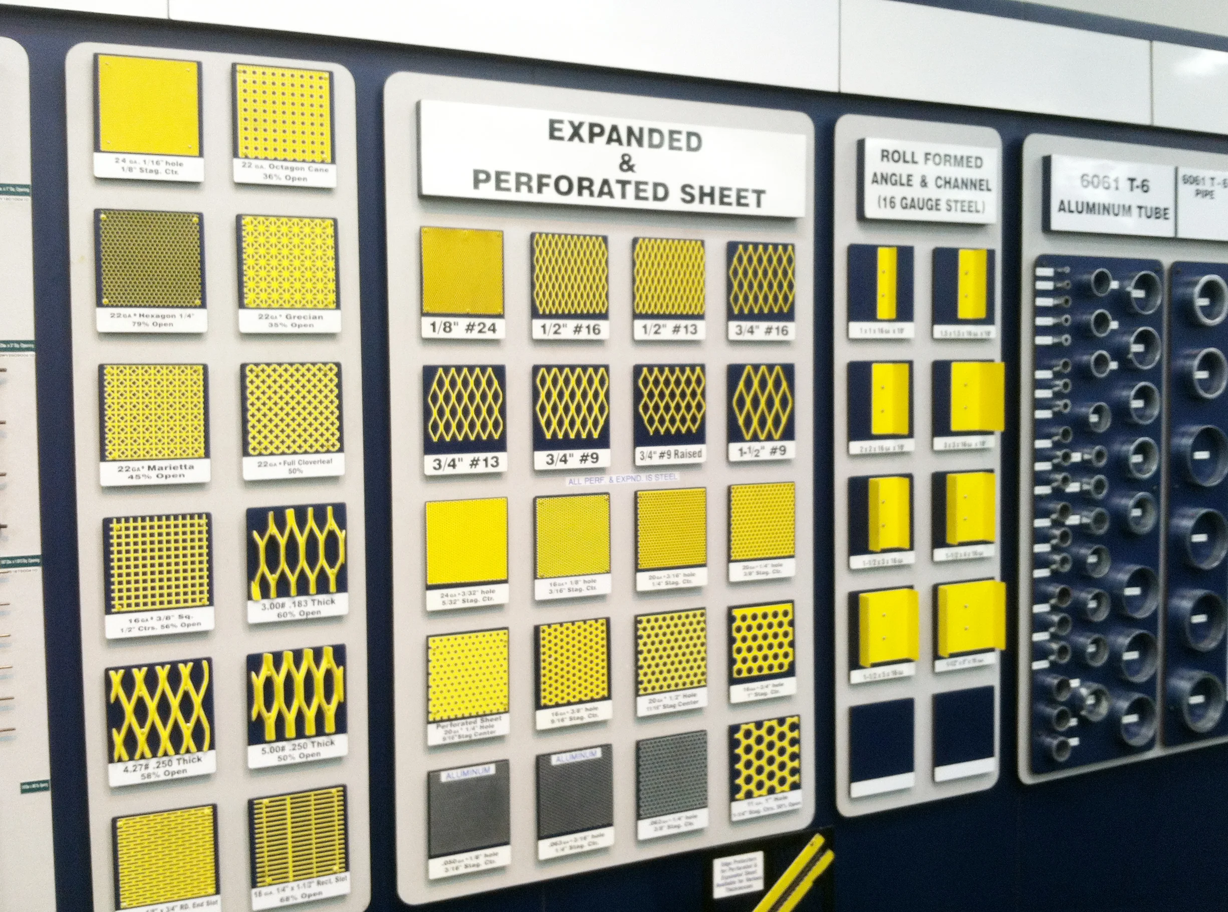

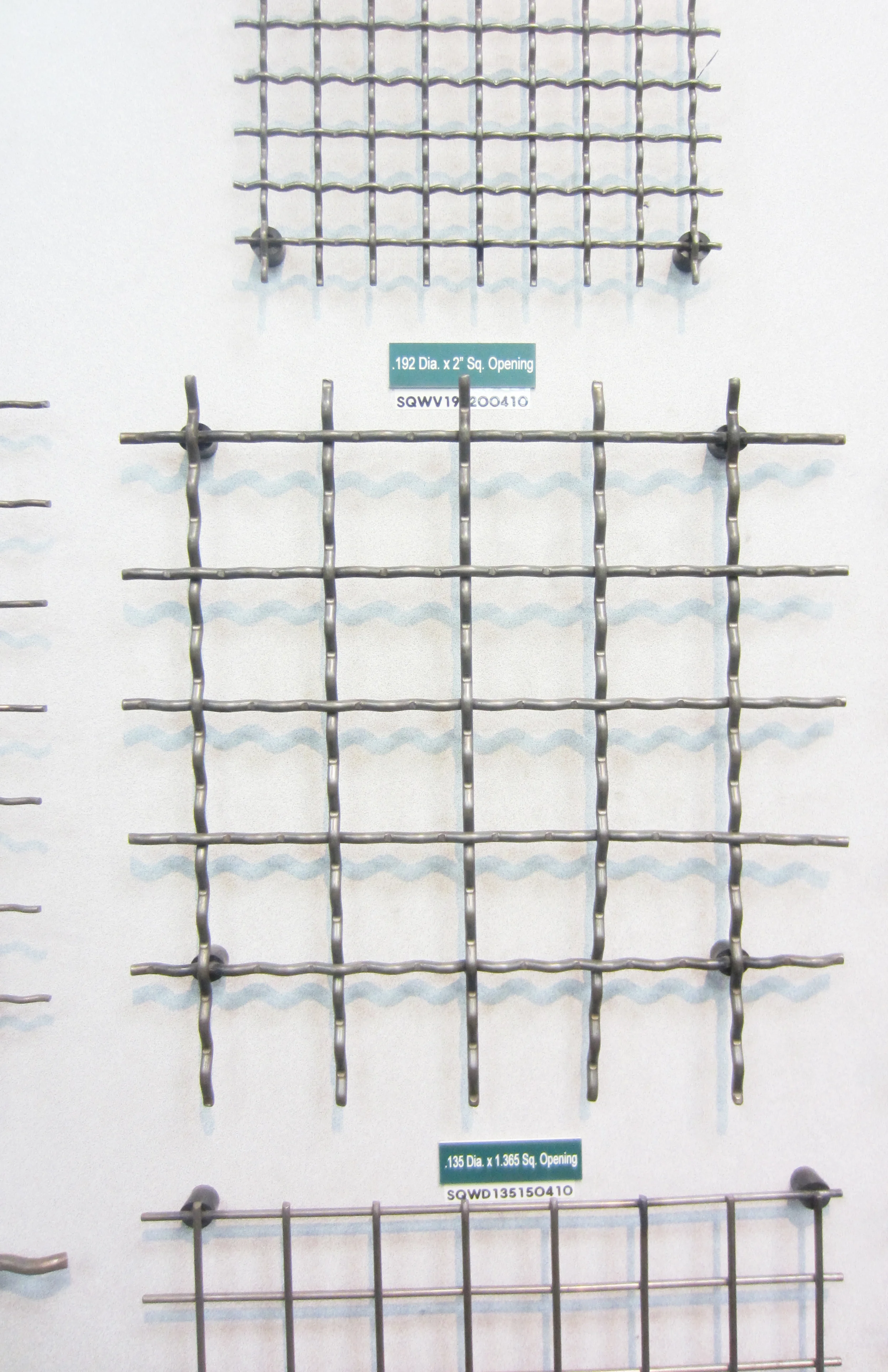
The square 2" woven wire in steel seemed perfect. The weave gave a nice texture without looking too industrial and it being steel we could create a nice rust color before sealing it.
So, the material and specifications decided, Willy and Julio could get to work.
In the meantime, we had to get to work getting the 20 fish out of the pond and into temporary tanks so we could empty and clean the pond.
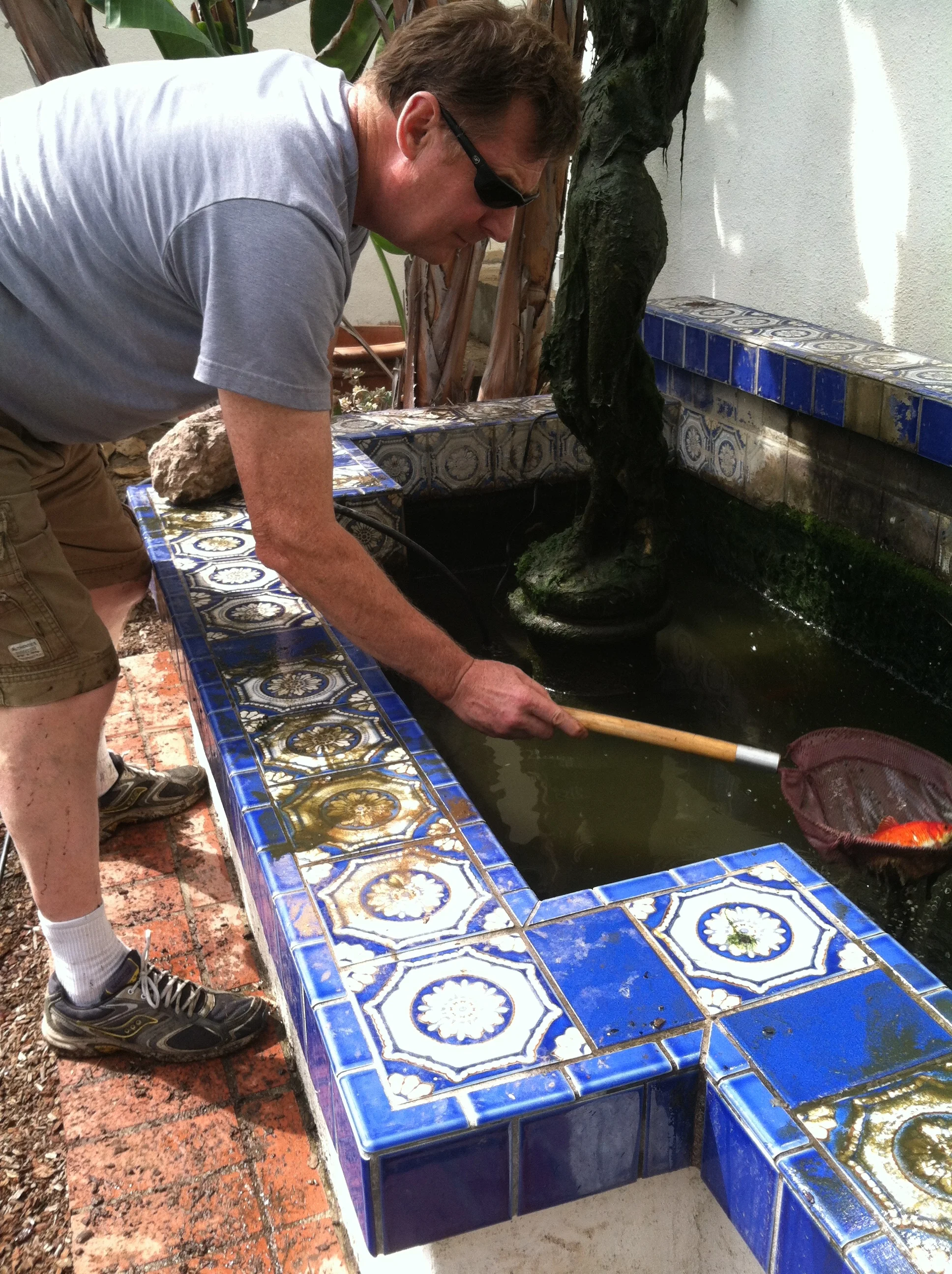
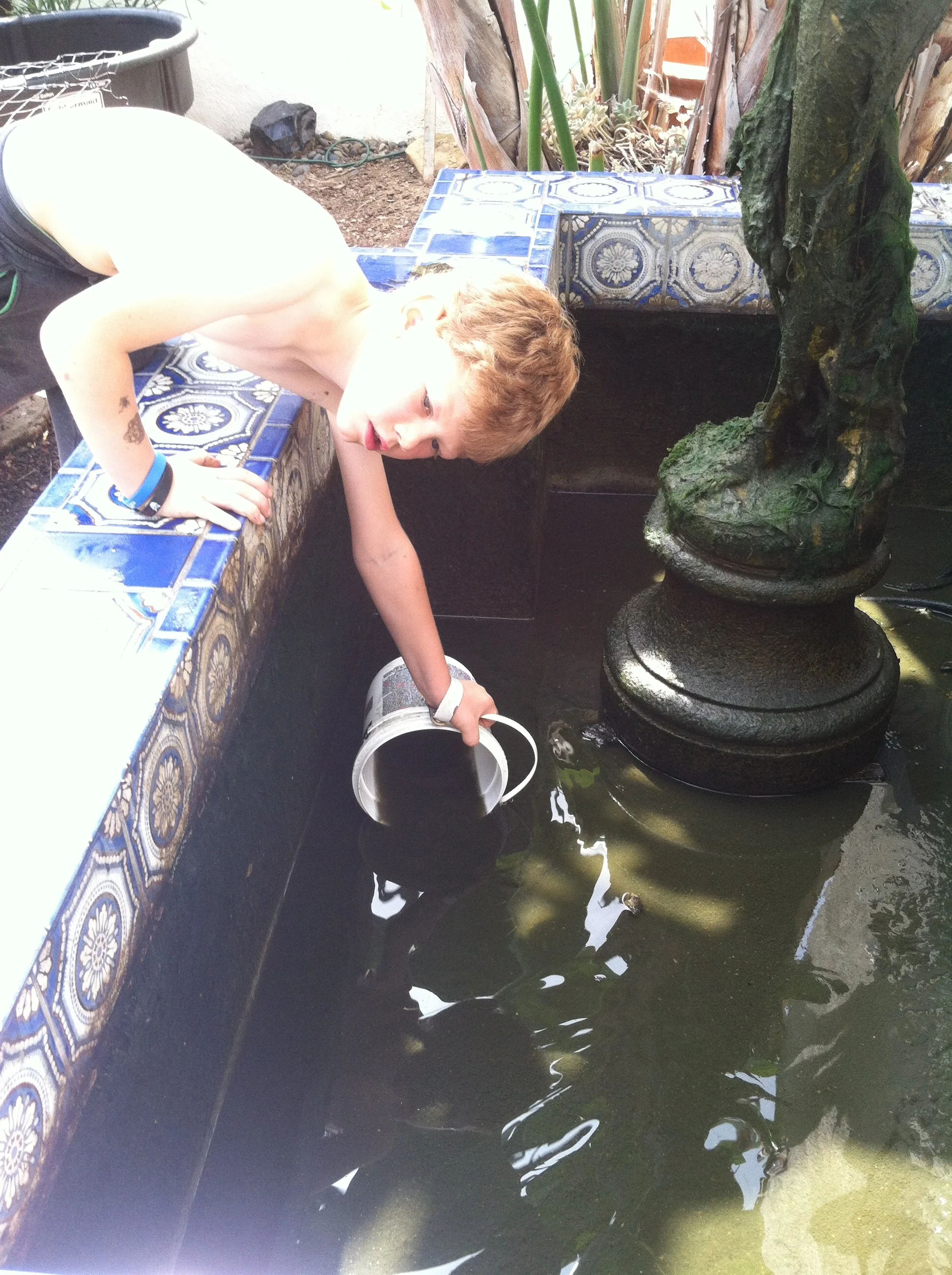
Dredging out the pond is pretty yucky work; so we all pitched in.
Three weeks later they showed up to do the install. Finished with details like Spanish style "clavos" in the corners, it looked great.
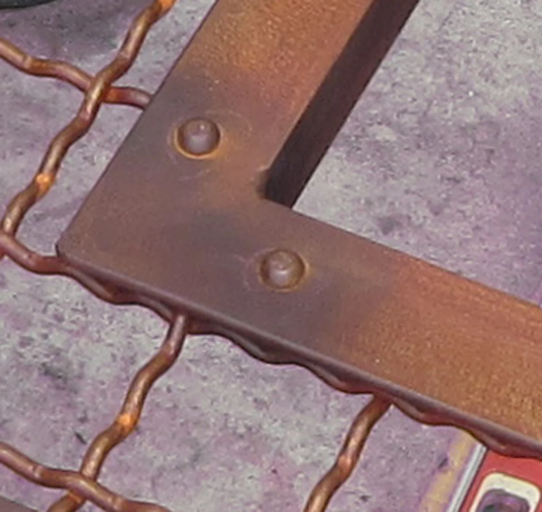
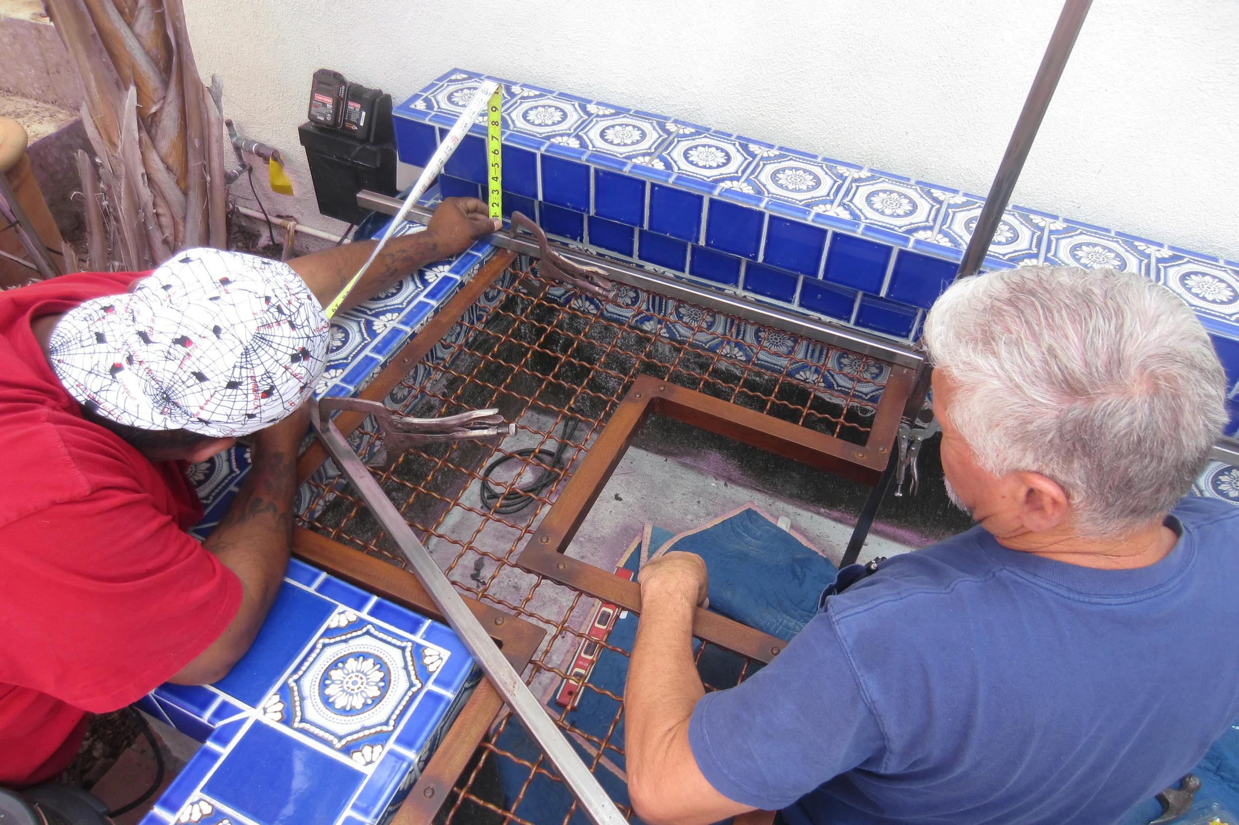
willy and Julio very carefully measured and calculated where they would be mounting the brackets to support the grill. By placing the screws in the grout no damage was done to the lovely tile surround.
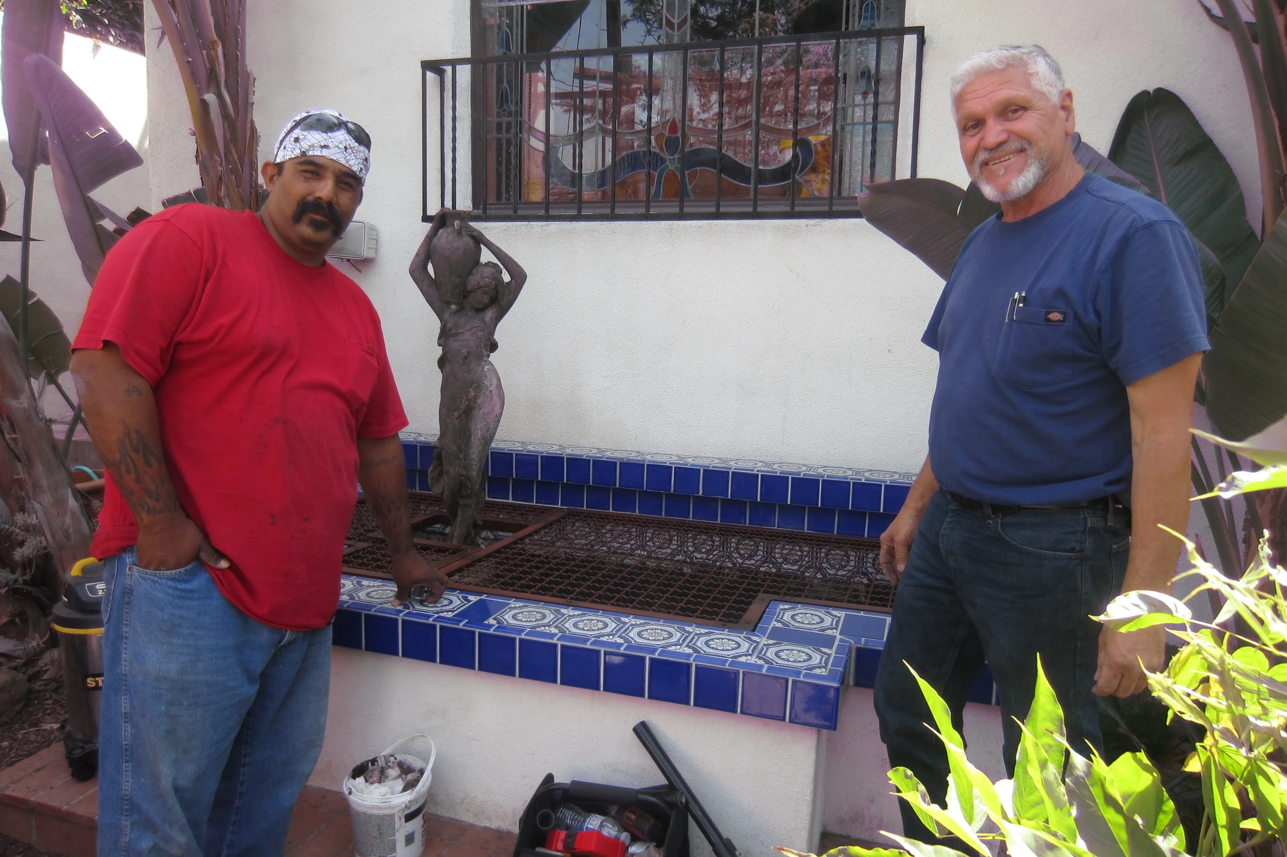
Julio and Willy standing proudly next to the finished grill
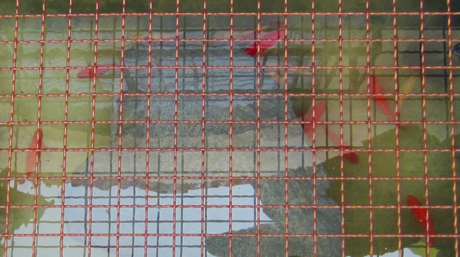
The fish are happy to be back in their home
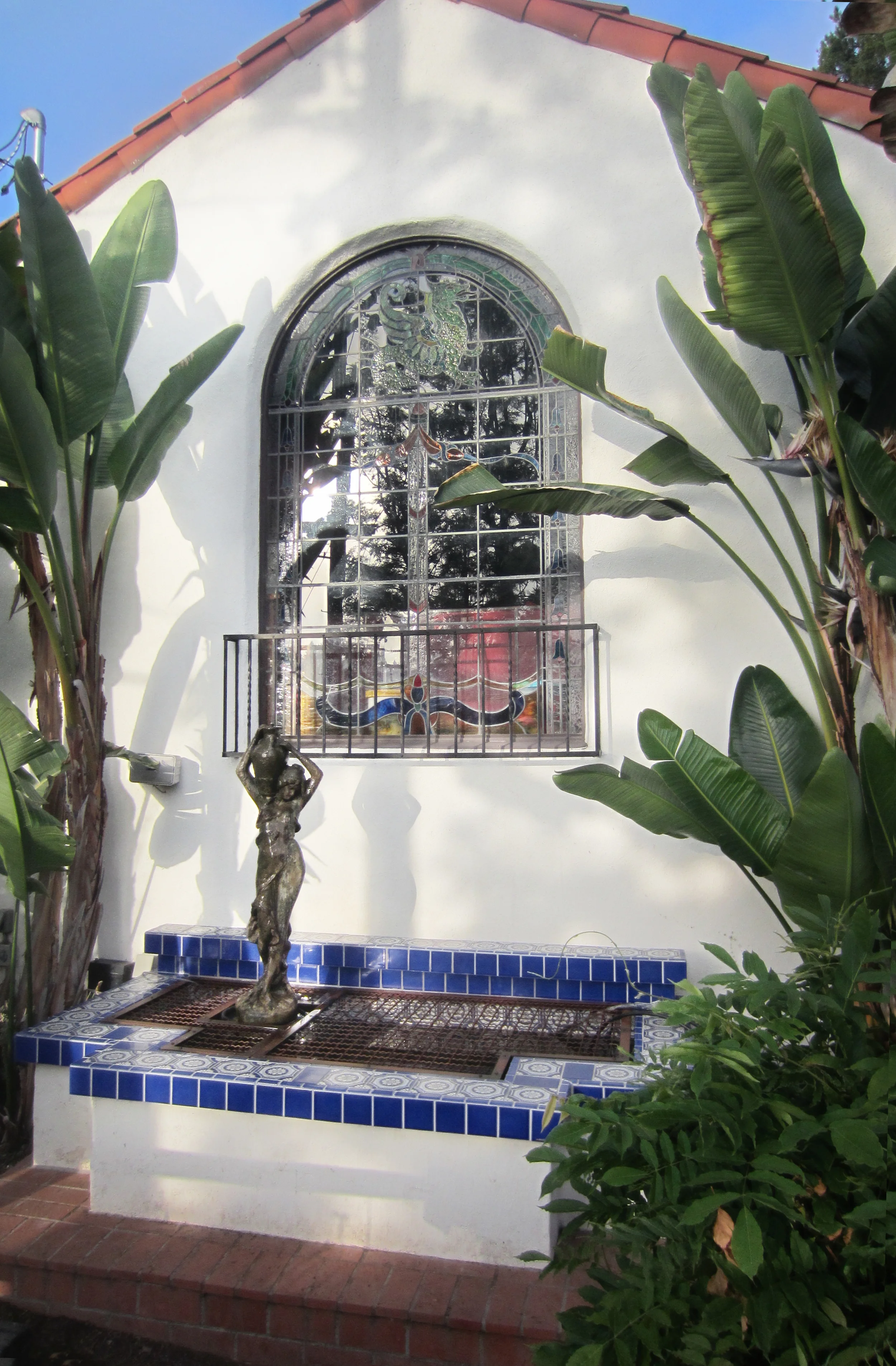
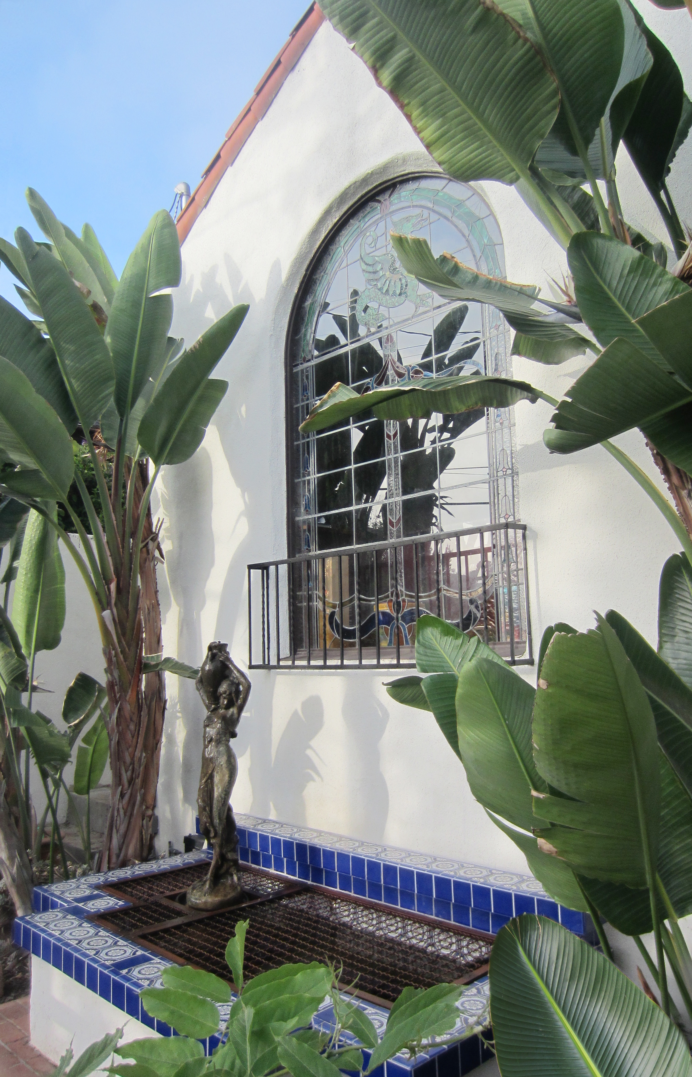
Now we have something that's beauty is a reflection of its function. In keeping with the look of it's environment, the addition to the pond looks like it has always been there.
Wildlife Painting
"A Cheetah for Maks" by Nathalie Tierce
One of the thrills I get when I start a new commission is I usually discover something new about the subject. Whether it's a place, a person or an abstract that needs to reflect and speak to a specific space where it will be hung, there's always the learning aspect to it.
This time the subject was wildlife, specifically a cheetah. In my mind I roughly had an image of what one looked like. As I started to study the subject I realized I had melded a leopard and cheetah into one animal.
In the excitement of wanting to get started; I jumped in and began a sketch of what I quickly found out was a leopard (as seen below).

"Leopard" sketch by Nathalie Tierce
Research and preliminary drawings are a crucial part of the process when I'm beginning a project so all is not lost when something like this happens. Outside of making sure that the details of the subject are correct (like getting the right species!) a quick painting like this is a handy guide for determining the mood, palette and style. In this case, a more restrained color range was chosen in the end which created focus on the cheetah's lovely pattern.
Hitting the Roof with Home Renovation
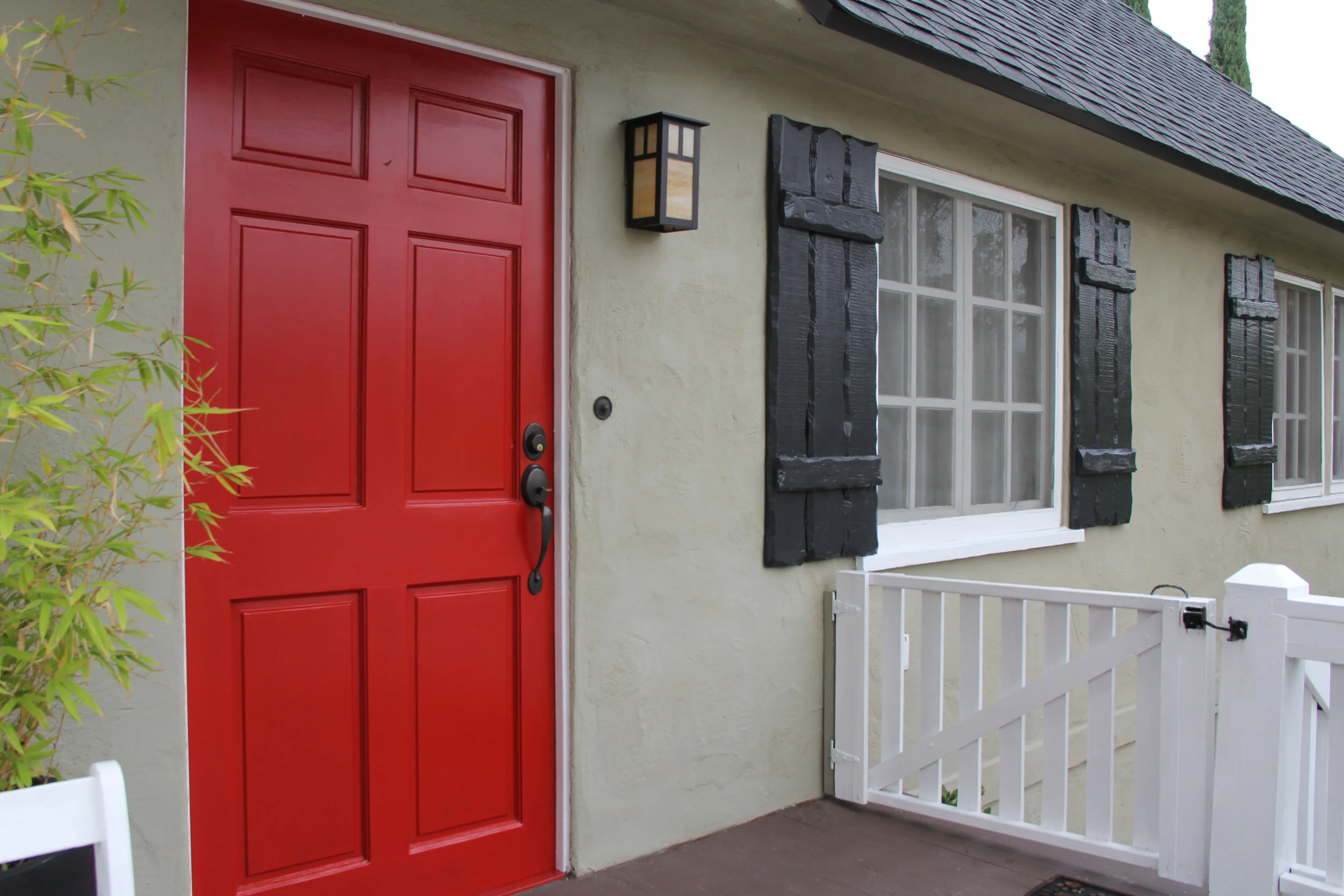
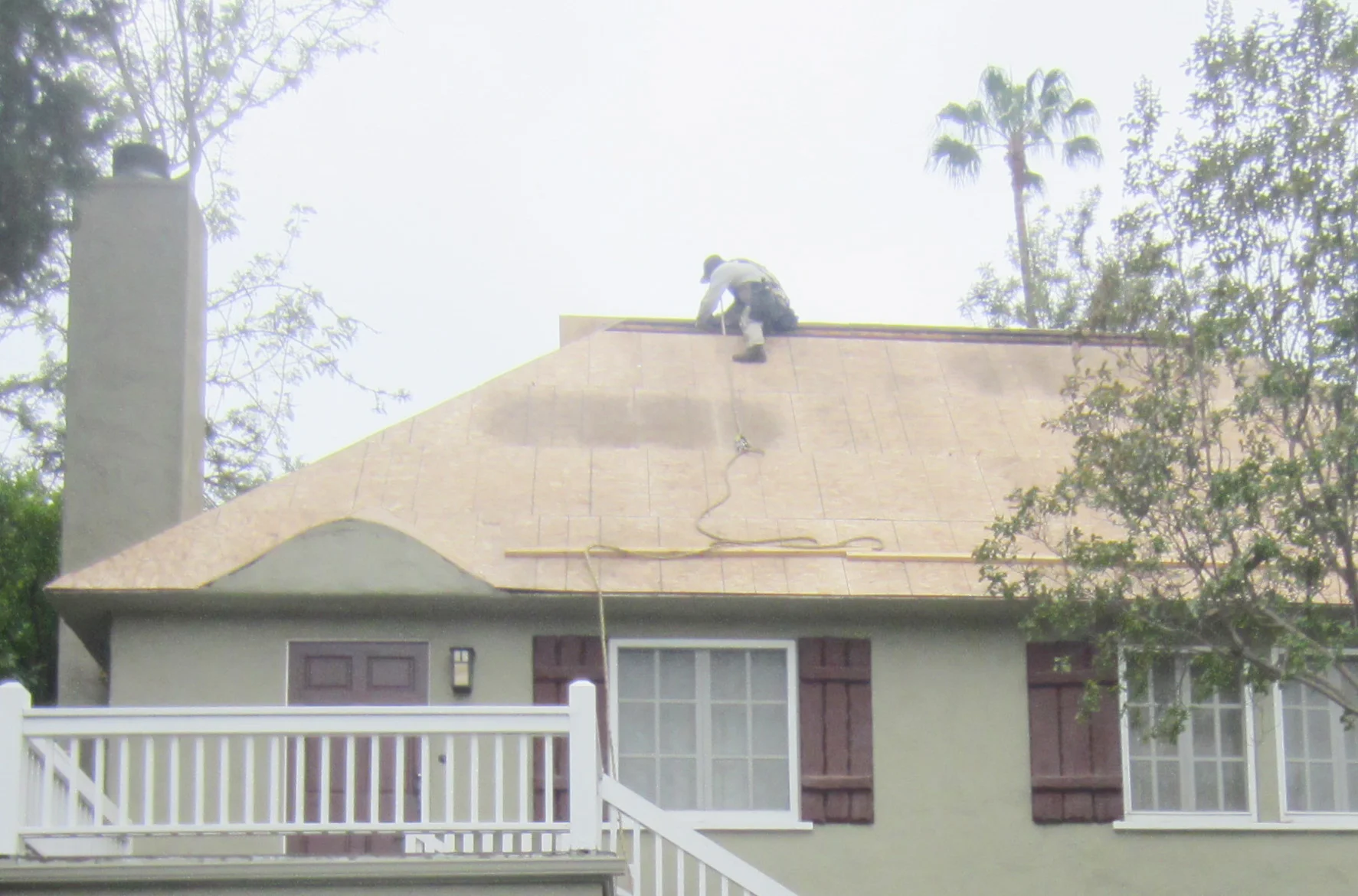
A client came to me with situation of having to completely change her roof. She was in an unhappy state of mind because the workman were making steady process and there was a dizzying array options for shingles. She needed to make a decision and fast.
She wanted help making the right choice for the roof but while we were doing that could we freshen up the front of the house? The exterior wall color was in great shape...could I choose roof shingles that complimented the main house color and change out some detail color on the shutters and front door to update its curb appeal?
The wine color of the shutters was not thrilling the homeowner. As a fan of simplicity she was even considering removing them altogether. I asked her to hang on and I would find a restrained palette that would suit her taste, work with the architecture of the house and hues of her drought tolerant garden.
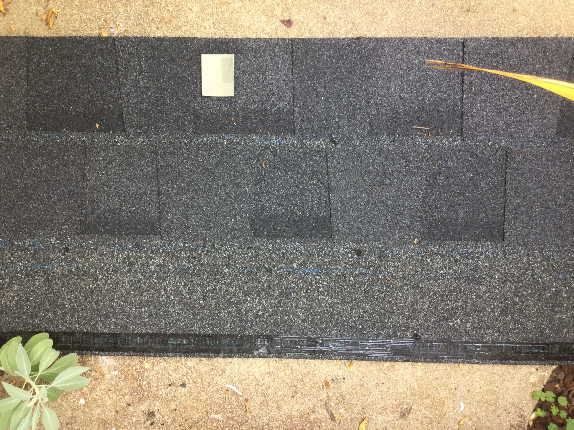
From the choices in the asphalt shingles I went with one that had variation to the cool / blue side of the spectrum as well as a darker bias. This would give a little weight to the silhouette of the sloped roof line and the cooler tones would bring out the yellow ochre aspect of the sage green more.
For the door I wanted a real pop of welcoming color and choose "Heritage Red" from Ben Moore. I choose Ben Moore's "Twilight Zone" for the shutters to make a real statement.
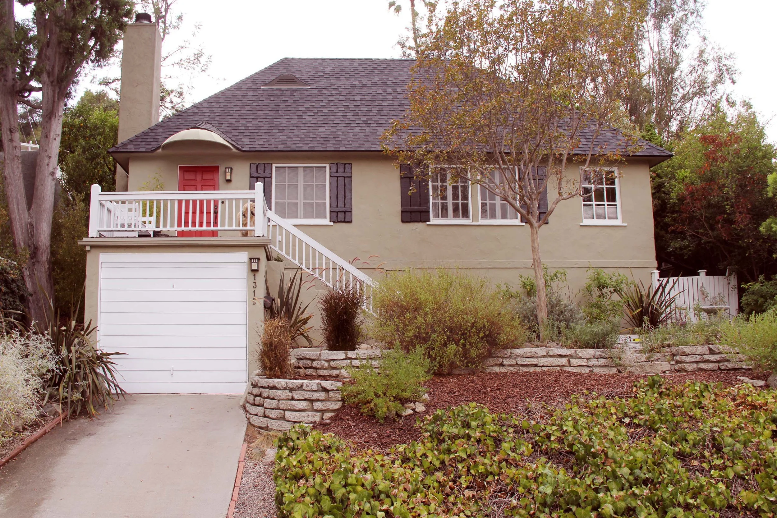
The look we were after was "clean crisp and elegant". The client is happy with the results and the curb appeal of the house is amazing.
The look we were after was "clean, crisp and elegant". The client is happy with the results.
Ugly Duckling Floors
Before we started gutting the kitchen of this 1920's home; it was evident that after all the people who had chopped and changed things over the years there would be, like all renovations some surprises along the way.
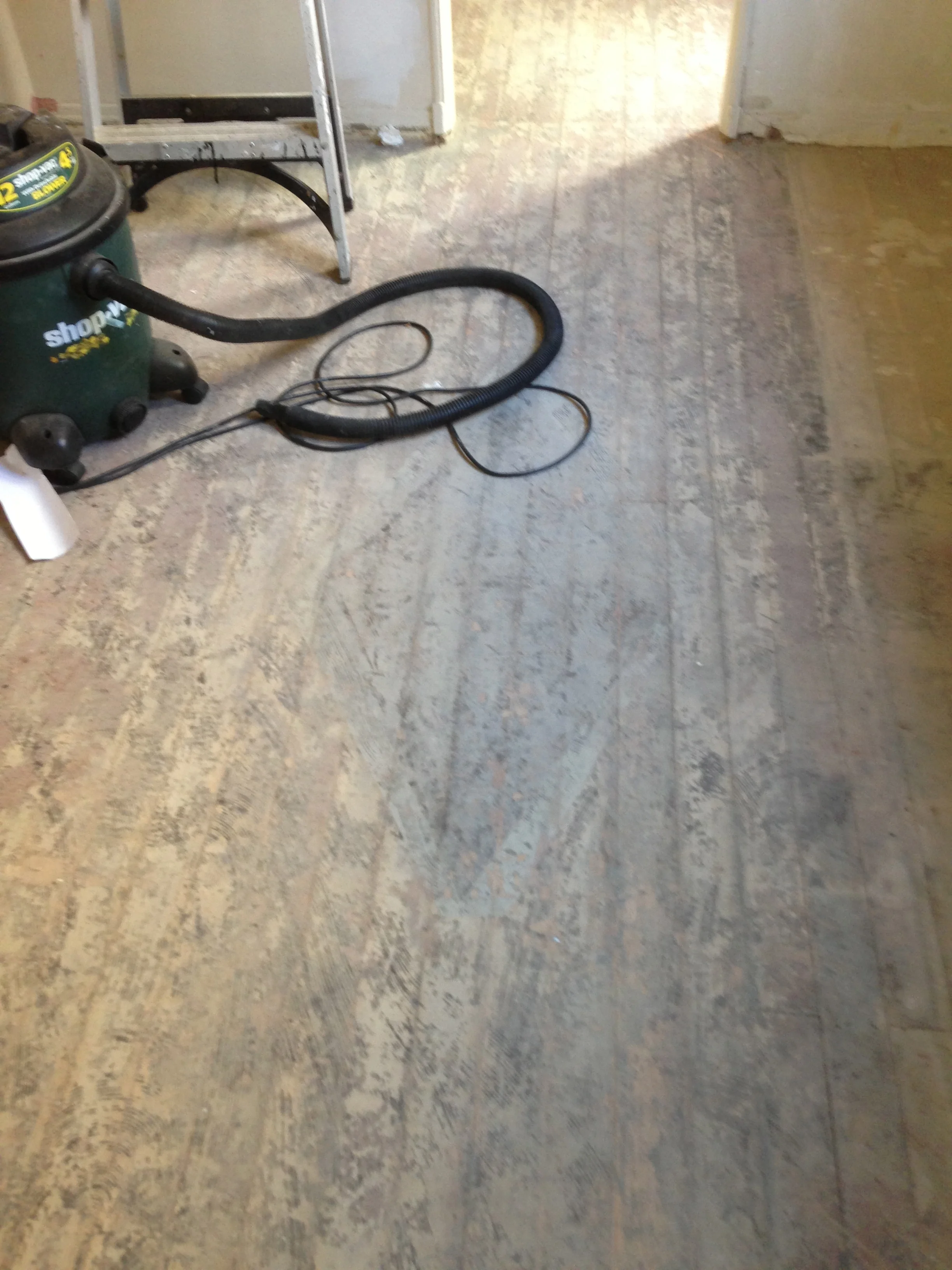
One question that lingered in the air was, "what was under the lino floor?" The answer to that was a subfloor and lo and behold… more lino! Under that, another subfloor and finally, linoleum glued to the original hardwood floors with a black tar adhesive.
It looks something like this:
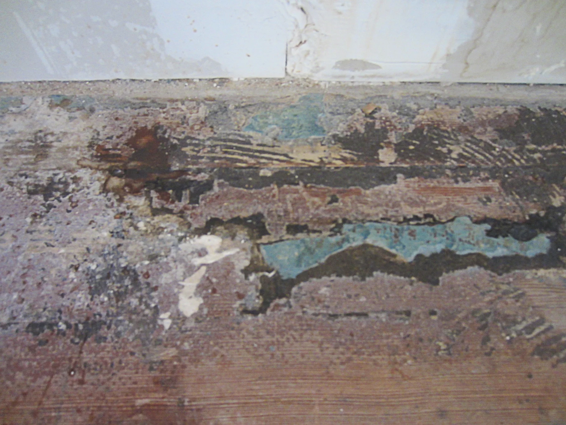
If you're wondering what that diamond shape is in the center, although difficult to read in the photo is the letter "A" scored into the hardwood and painted with enamel.
After pulling up literally hundreds upon hundreds of floor nails, sanding began. First with a drum sander hired from Home Depot. For a smallish kitchen like this we had it out for about 5 hours.
Then a belt sander starting with 60 grit paper and following the grain of the floorboards. Also handy was the wood floor edger for getting right up to the skirting boards.
Then a very thorough cleaning with a shop vac, wipe down everything with tack cloth.
For the staining, Zar "Dark Mahogany" was used in their oil based line. It was brushed on, then the excess was wiped of in the direction of the grain with a clean lint free cloth. After drying another layer was brushed on and wiped off as before.
For sealing, Zar Ultra Max Waterborne Oil Polyurethane was brushed on. After the first coat, holes were filled with wood putty; a color that most closely matched the area Miniwax's "Red Mahogany" worked well here. Three coats were used letting each dry with a light sanding and wiping down with tack cloth in between.
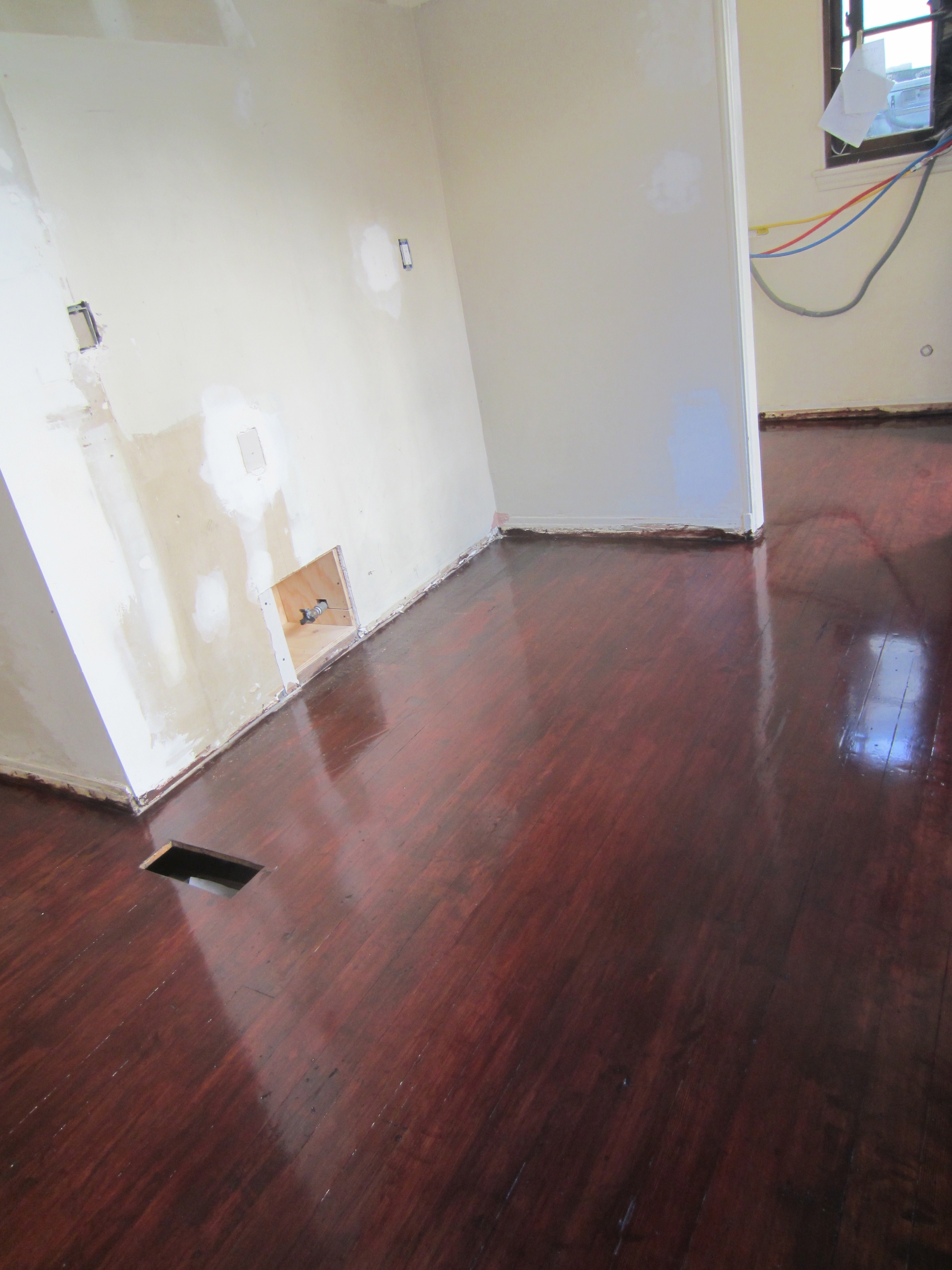
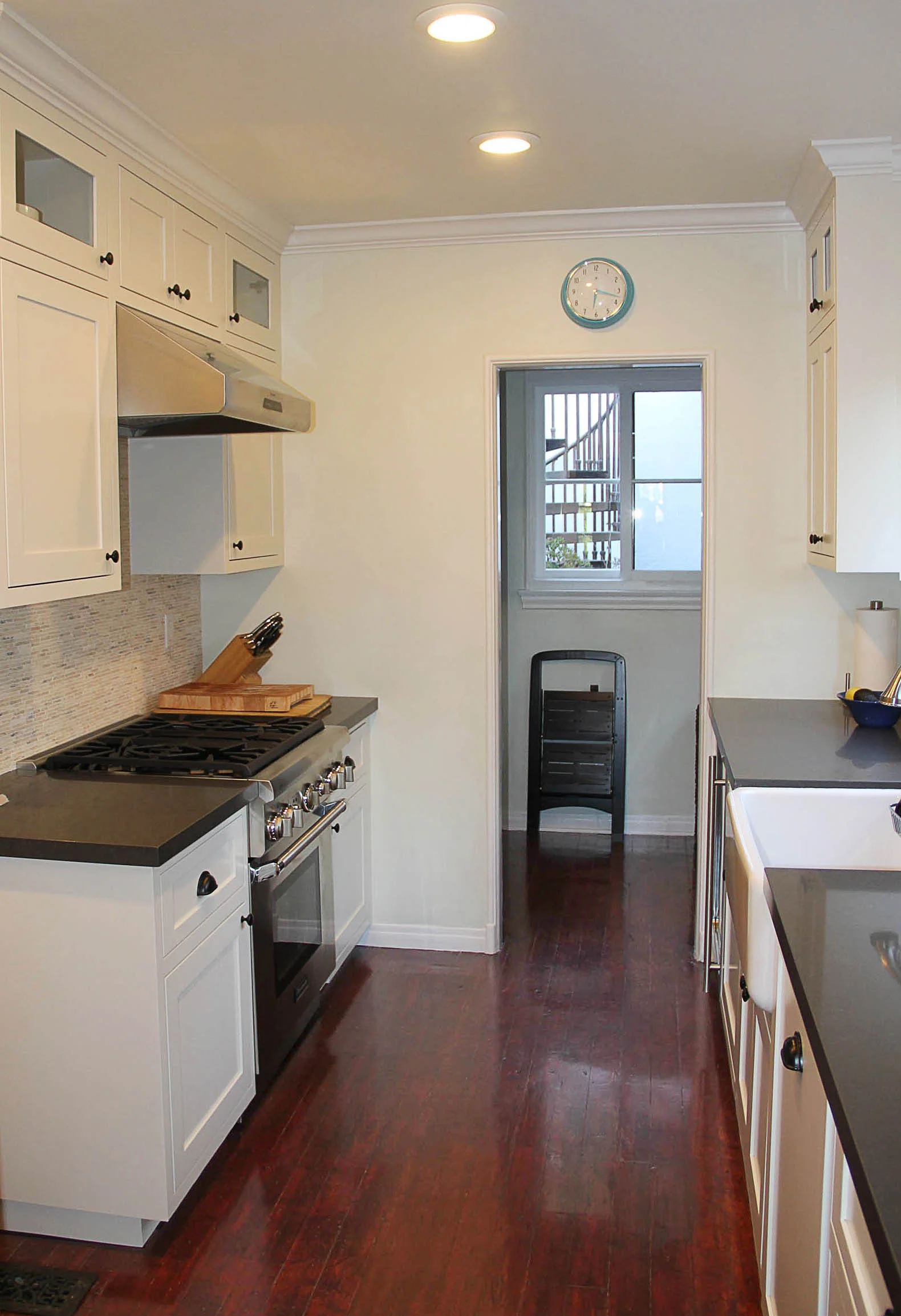
Refinishing the original floors has kept a piece of the house's history, saved money on the budget and looks beautiful in the new kitchen.
Stop Stairing
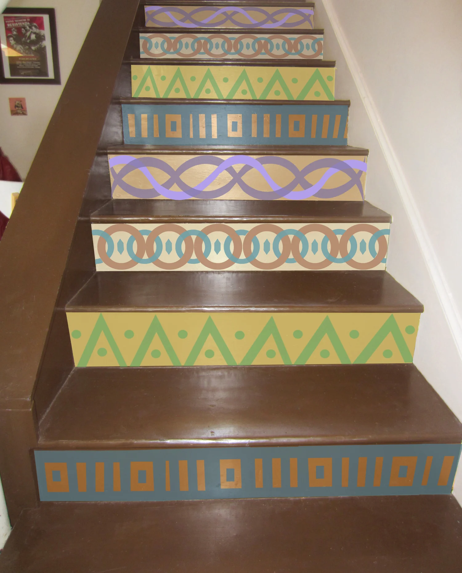
Stair riser design by Nathalie Tierce
A client of mine and her husband have an adorable house in the Hollywood Hills. They wanted to update some pretty blah stairs that didn't really say anything about their style nor were they particularly fun to look at. I looked around the house and found some other shapes and patterns that were in other fabrics and things they had and came up with this design for them.