Shades of Blue
The color blue in its most positive symbolism and psychological influence conveys intelligence, communication, trust, serenity, reflection and calm. Some of its negative connotations can be coldness, aloofness, and lack of emotion.
The skill of using color in design and art to its best advantage is knowing how much, where and why.
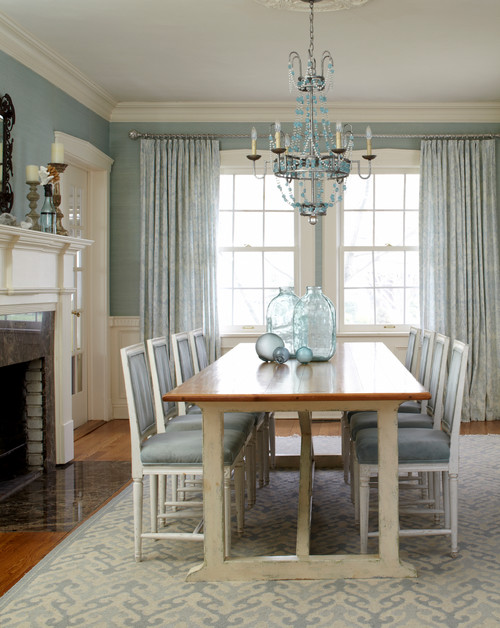
A good example and simple illustration is the difference between the two interiors above and below; the first uses a deep ultramarine blue as the dominant theme, below a lighter sea foam blue.
Even though the common denominator is blue; the difference in effect couldn't be more radical. The first conveys a strong, quiet, earthy, contemplative mood. The second although peaceful is far more delicate and ephemeral.
Below is Picasso's self portrait done during his blue period. His gaze is a faraway, pensive look. The surrounding blue creates a mysterious atmosphere; his coat in a deeper navy anchors the pale jaundiced visage of the painter.
Pablo Picasso, Self Portrait
Just as blue can be used as a device to create an entire mood, it can also be used as a way of balancing out the presence of a color such as this orange / red and stopping it from completely dominating a room. In this instance, the exciting warmth of the couch's color is countered by the cool blues in the water and sky of this landscape I created for a client's home, clearly illustrating using color in art as a design solution.
"The Queen's Necklace" by Nathalie Tierce