

DESIGN BLOG
Thoughts
&
Musings
Next Big Thing

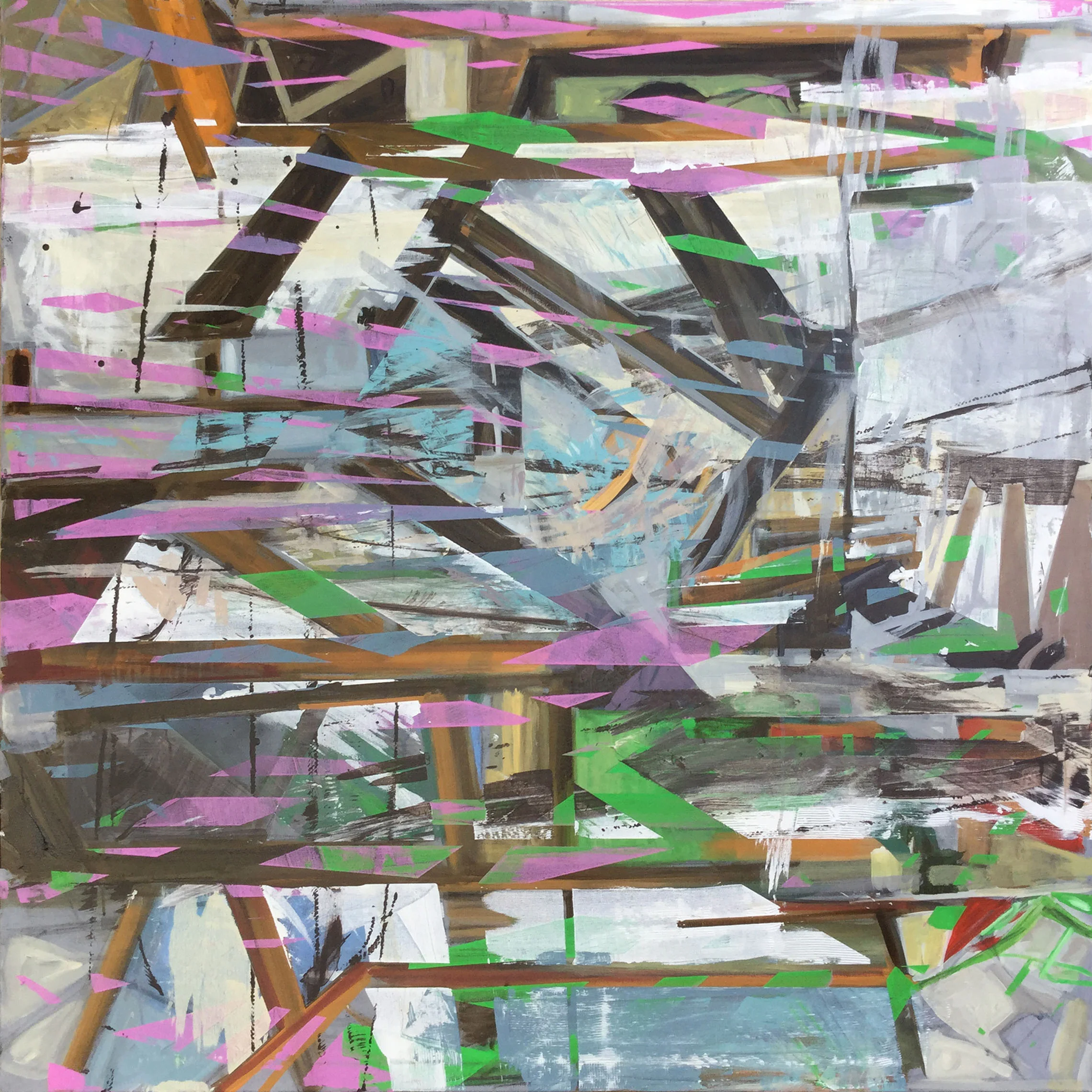
My painting "Fear of Falling" will be appearing in the group show "The Next Big Thing" at the Channel Island Studio Gallery May 18th through June 24th 2017.
Opening reception May 20th
Defining Mid Century Marvelous
Staging is the art of defining a space.
Case in point, this mid-century beauty sitting atop the Hollywood Hills in California.
Open plan, the house greets the visitor with oodles of luxurious space.
Ironically, the airy proportions could potentially overwhelm a prospective buyer. Where should the dining area be? How does seating work in what could be an area called the Living Room?
With careful thought given to the architectural layout and how people actually live; a story begins to unfold. By selecting relative size and style sympathetic furnishings; the flow and purpose of the space reveal itself.
Another helpful tool for setting the mood of a space is the artwork. Art can subliminally emphasis unique characteristics of a home (specific architectural features can be echoed in a painting) or compliment monochromatic decor can with a splash of a color.
All the artwork used in this particular staging was created by myself. The showing was a success, the home was purchased for 5.5 million.
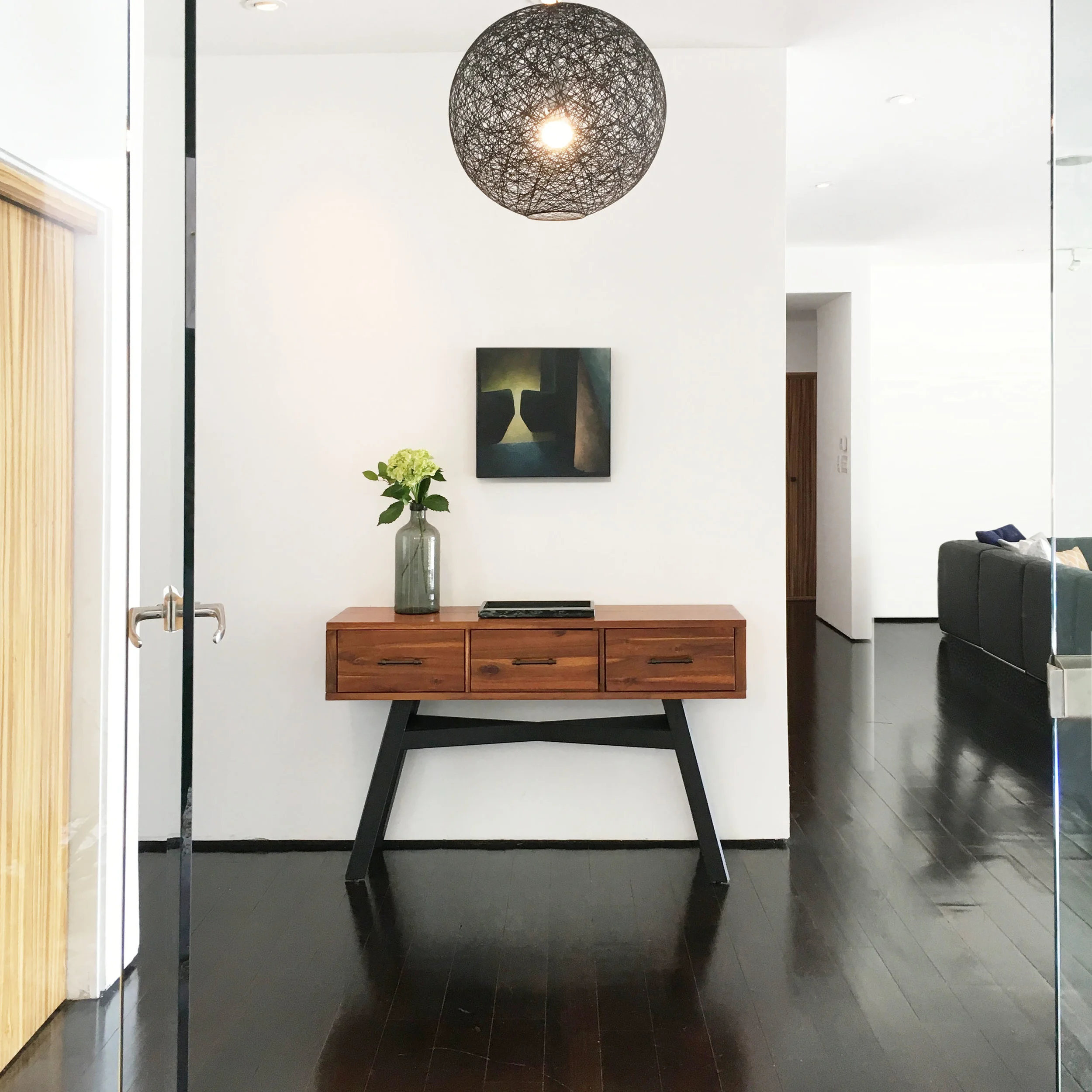
Entry way Hollywood Hills
When a visitor entered the front door, there was no entryway, foyer or transition space to greet them.
By using black to unite and ground certain aspects of the accent pieces, namely the legs of the table, light fitting and artwork, a focal point is created against the white walls.
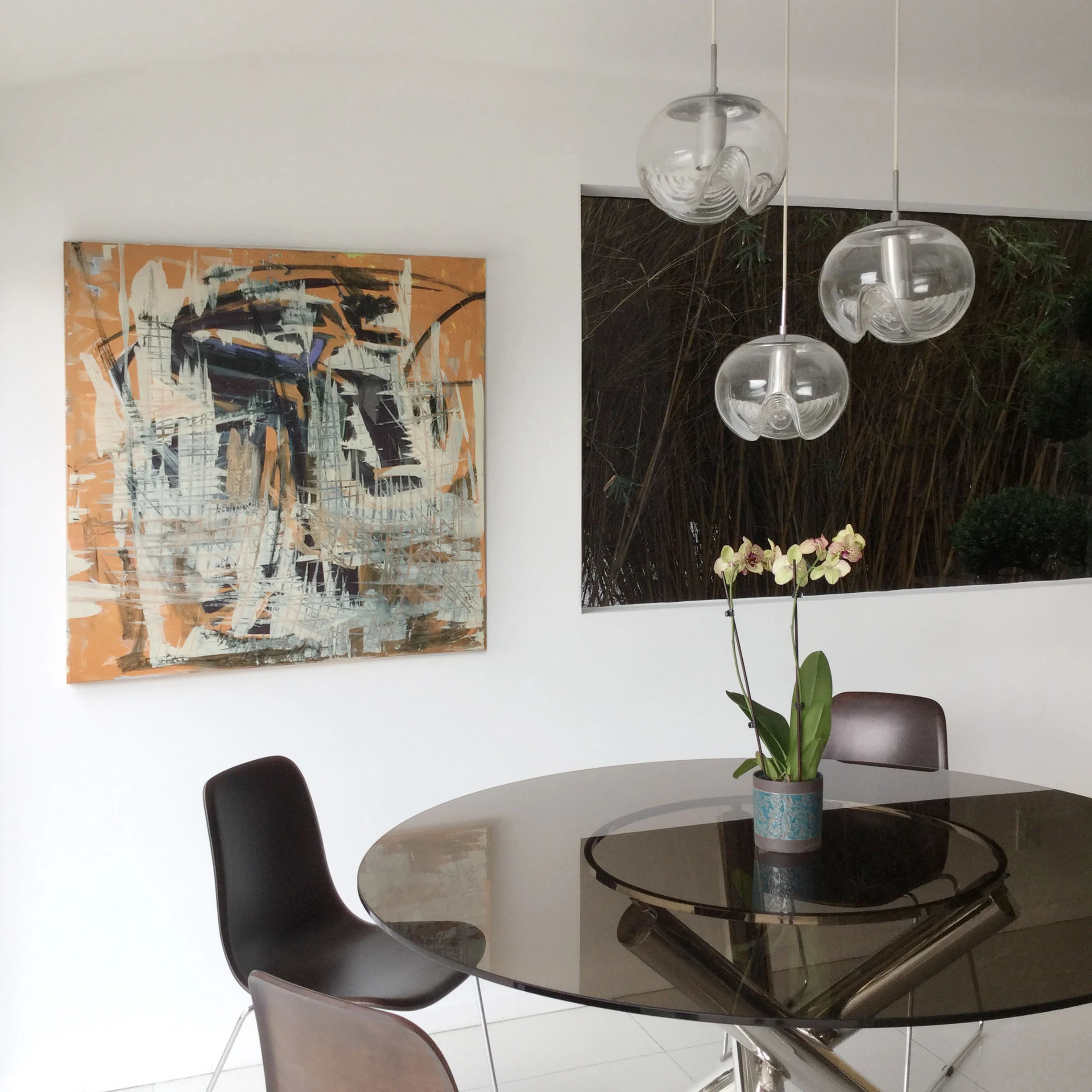
Breakfast Nook Hollywood Hills
Here, against the wonderful modernist geometric shapes at play, the rectangular window to the right was slightly ominous when in shadow. The remedy was the injection of some vibrant color and texture of the painting to the left.
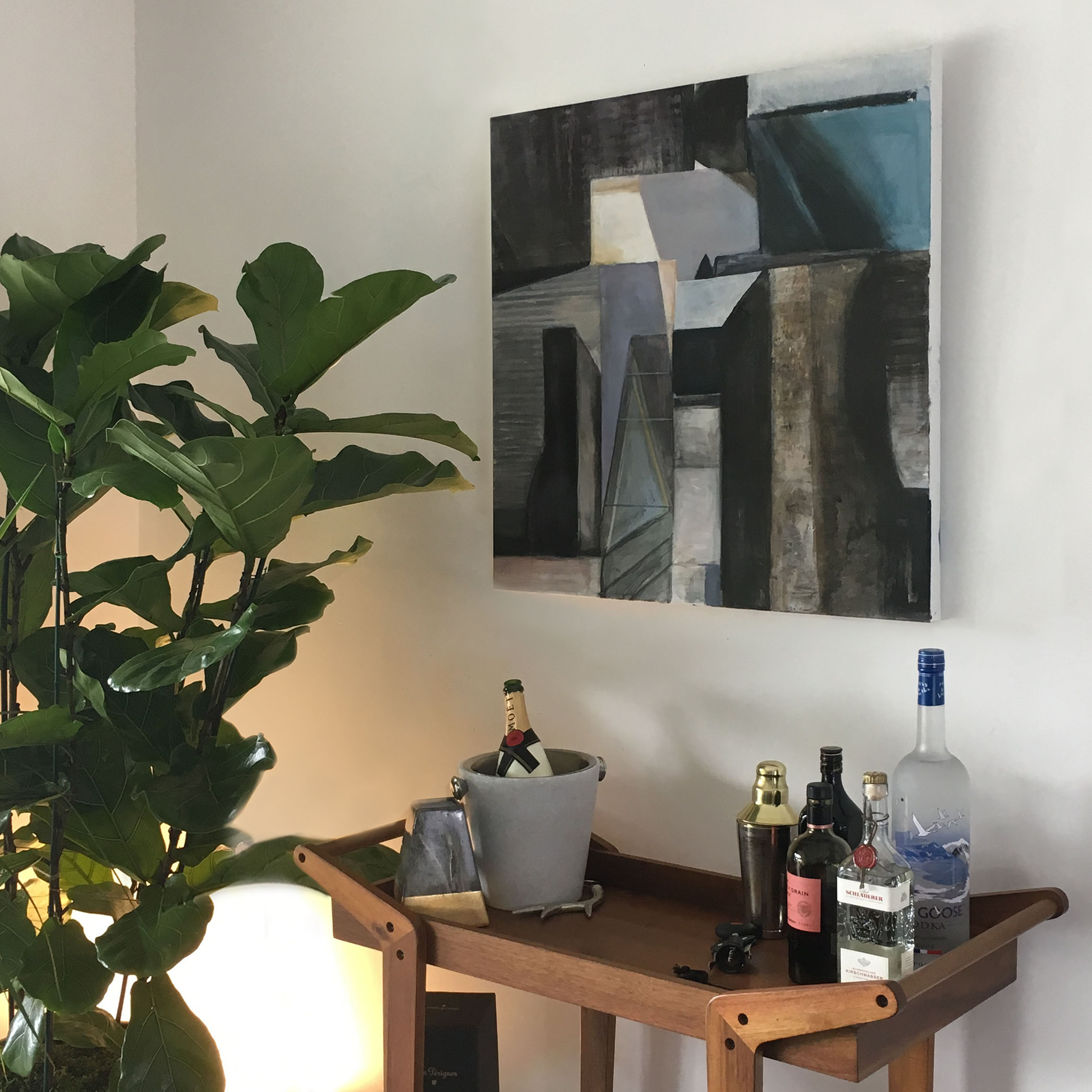
Bar Area Hollywood Hills
A non-descript niche became a soothing bar area, dressed with a discreet uplight that added warmth and intimacy. The painting above added architectural detail that complimented the organic curves of the tall plant to the left.
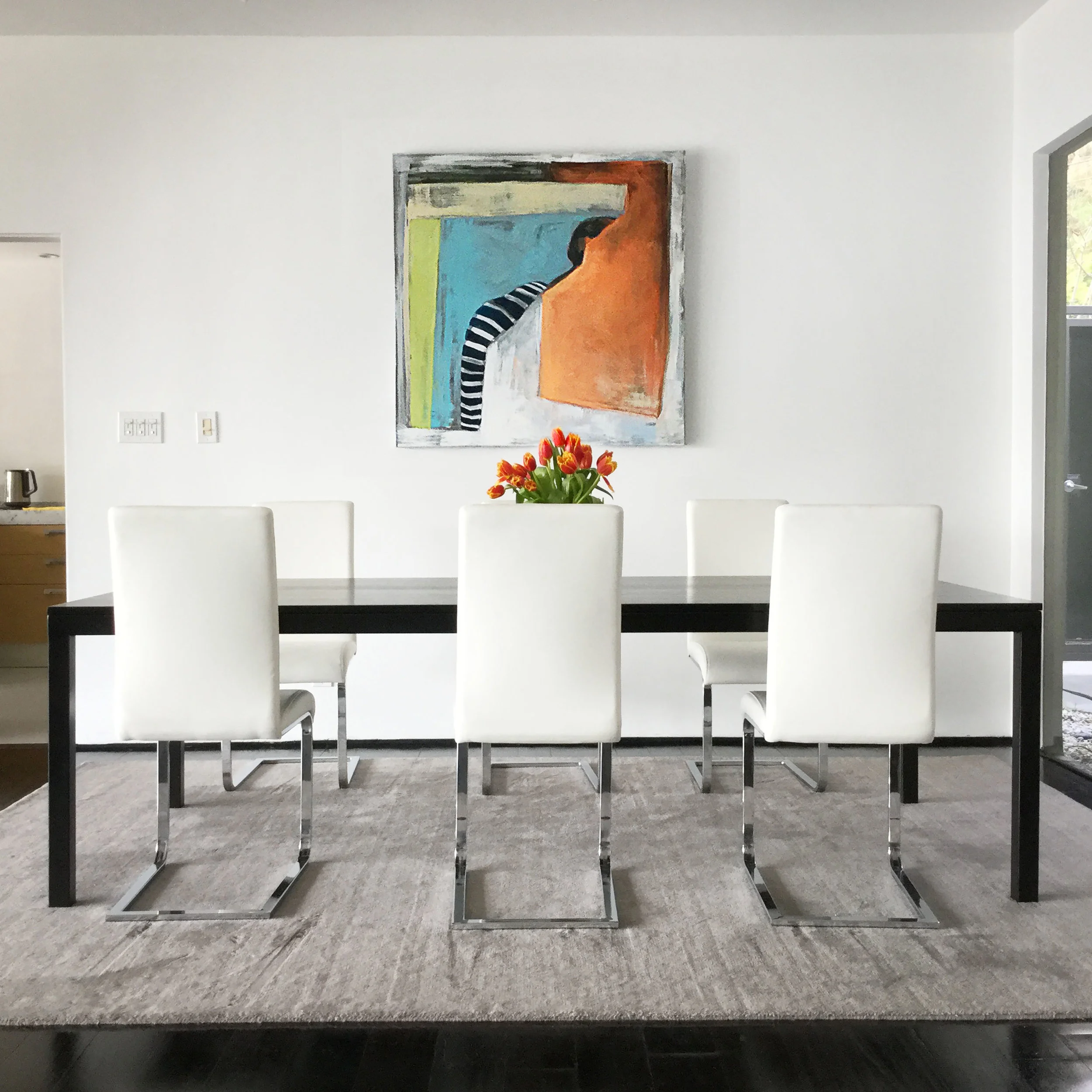
Dining Area Hollywood Hills
Clean, minimalistic and elegant was the result in claiming this area for the dining space with furniture that had simple lines. Here again, the colorful shapes in the painting add playfulness to the setting.
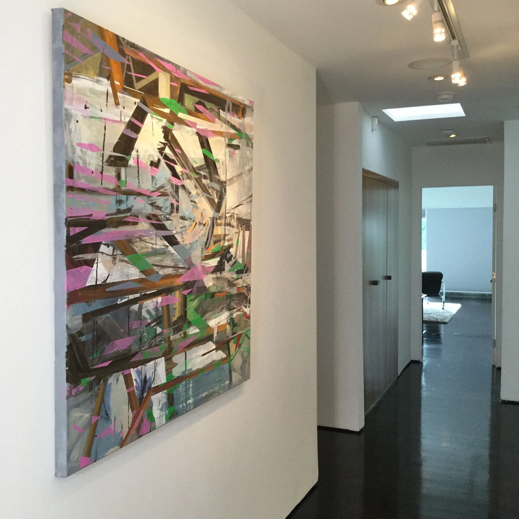
Hallway Hollywood Hills
The tone of the hallway as the transitional space from the communal areas to the bedrooms was quite staid. The art made walking through a more dynamic experience with its bold color and dynamic direction.
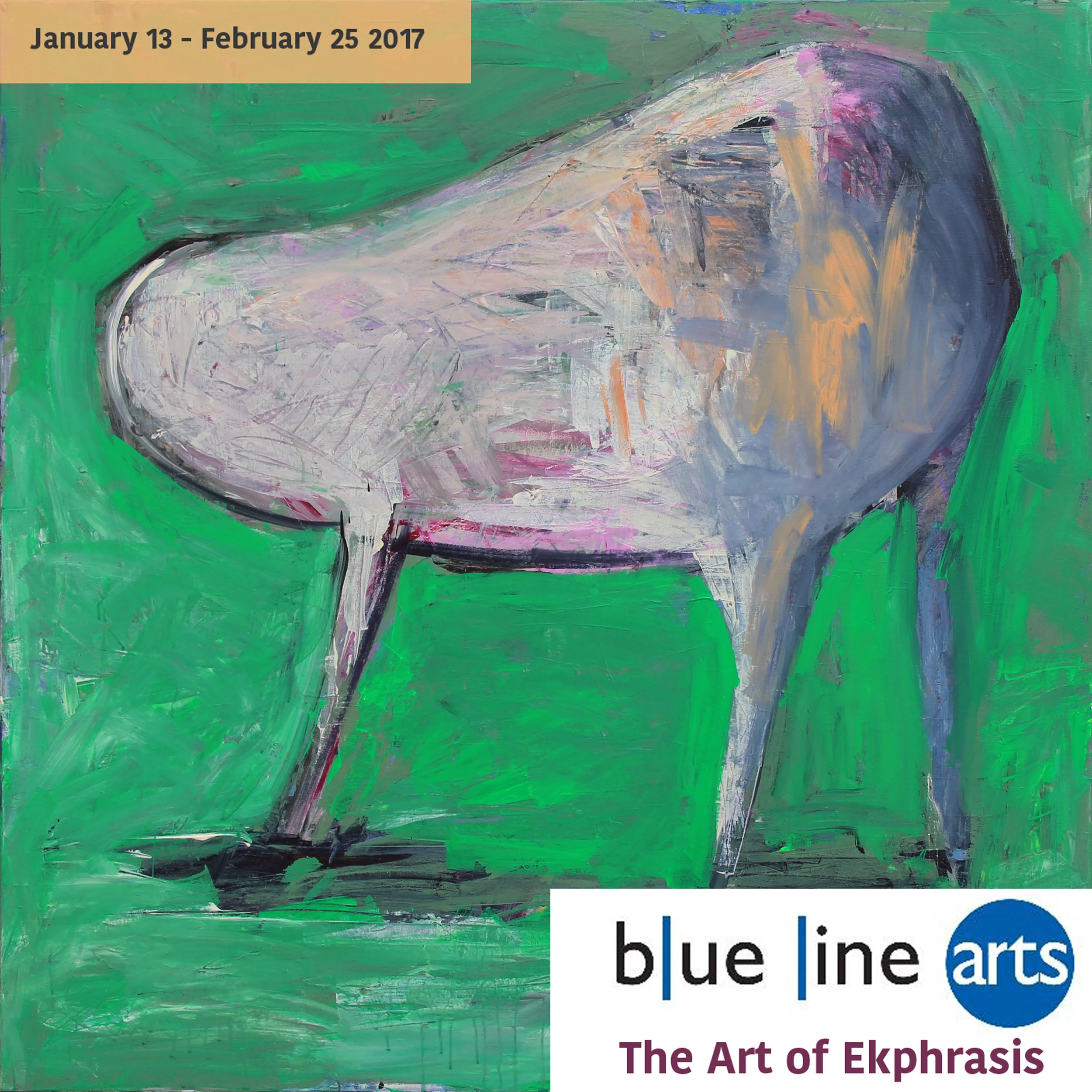
The Art of Ekphrasis
Very pleased to have my painting "Hapless Thing" included in the group show "The Art of Ekphrasis" at Blue Line Arts. The exhibit runs from January 13th to February 25th.
Ekphrasis from the Greek, ek and φράσις phrásis, "out" and "speak" is used for the verbal description of a work of art.
Each work in this show is accompanied by the artist's own response to the work in written form.
Saving Water Beautifully
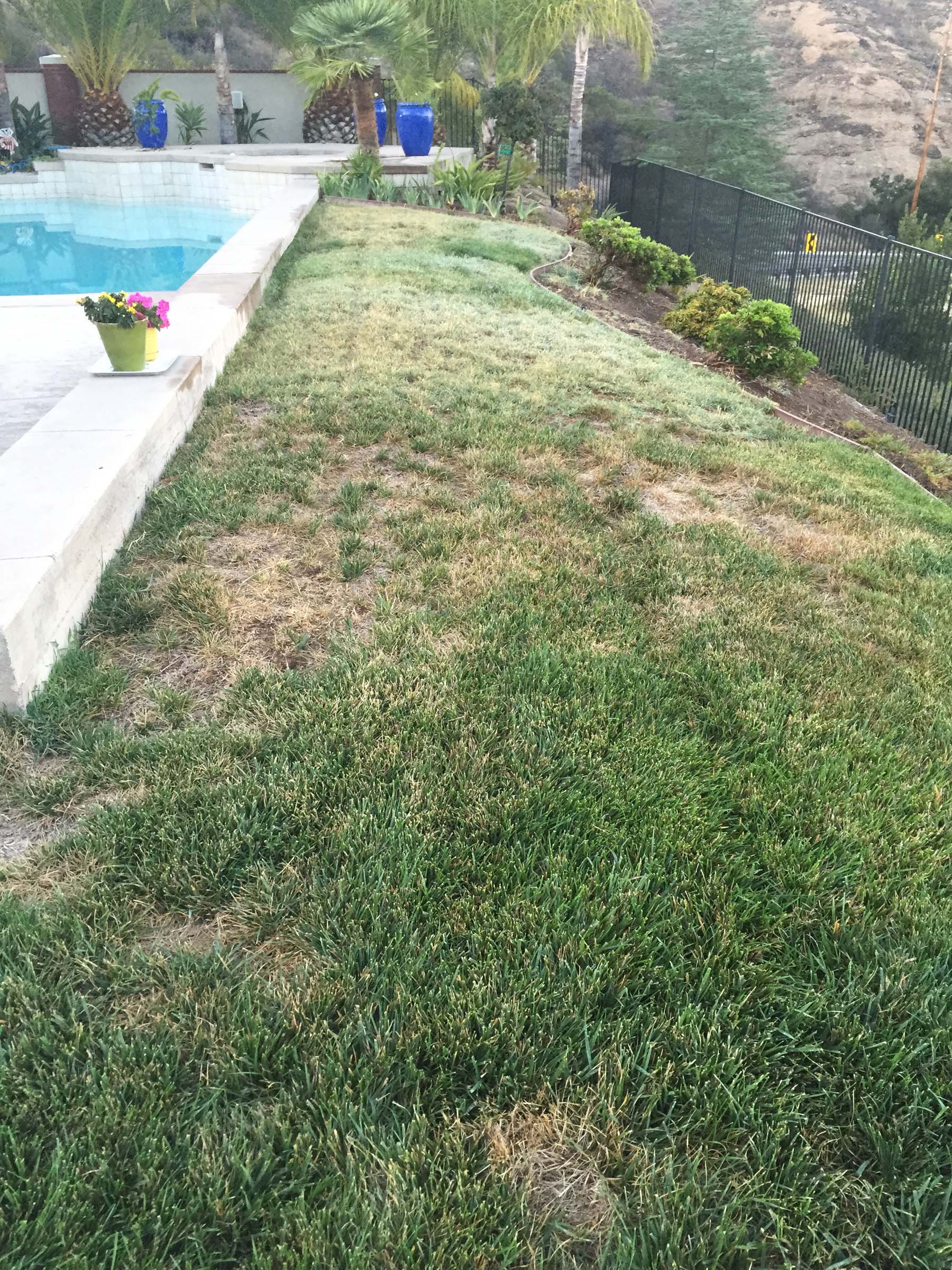
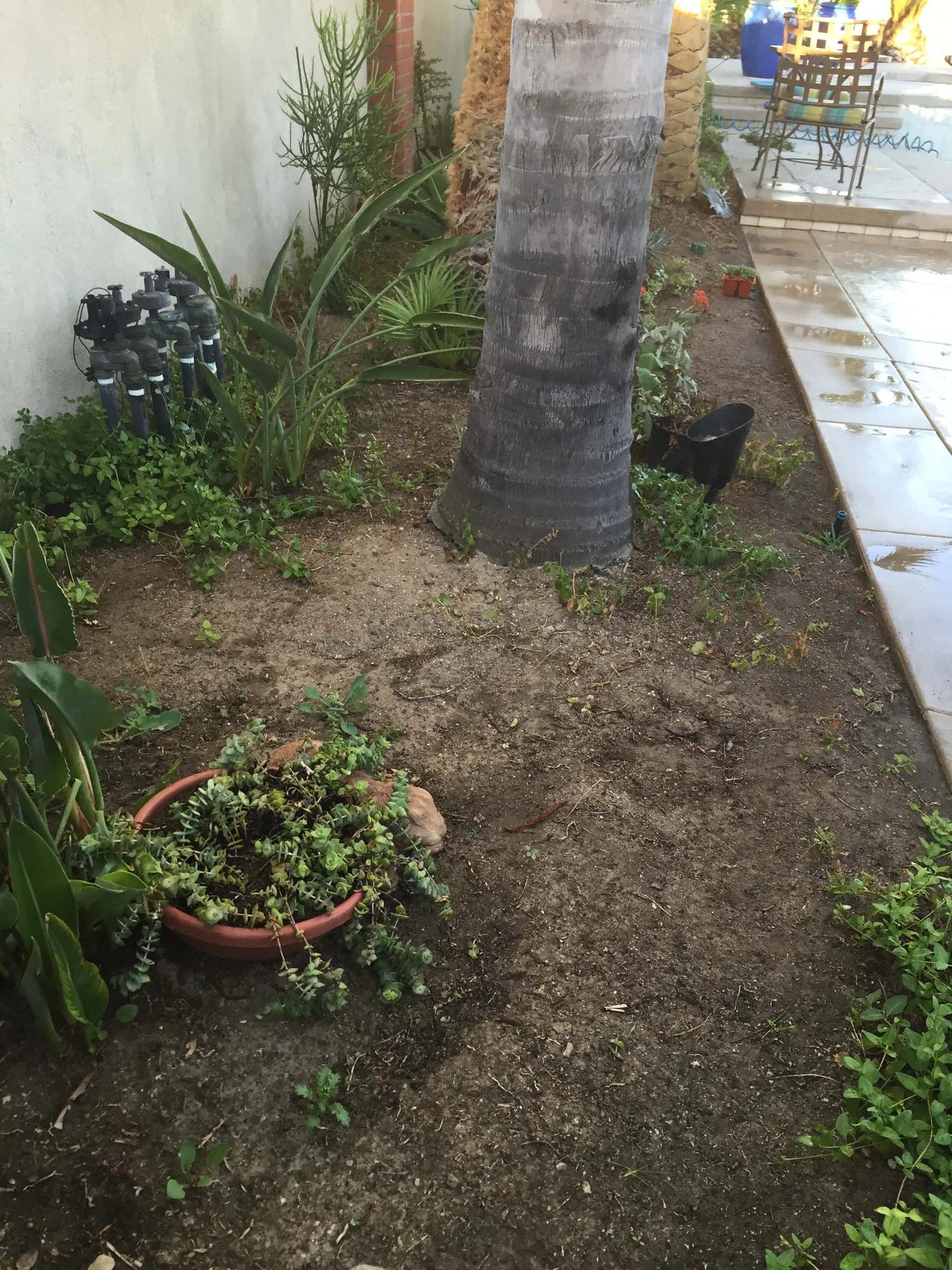
One of my clients whom I've done numerous art and design commissions for in the past came to me with a new request. In Southern California, everyone is (or should be) painfully aware of the drought situation. My client was surveying her rather large landscaped yard and seriously reconsidering the amount of water she was dispensing on maintaining a lawn as ground cover.
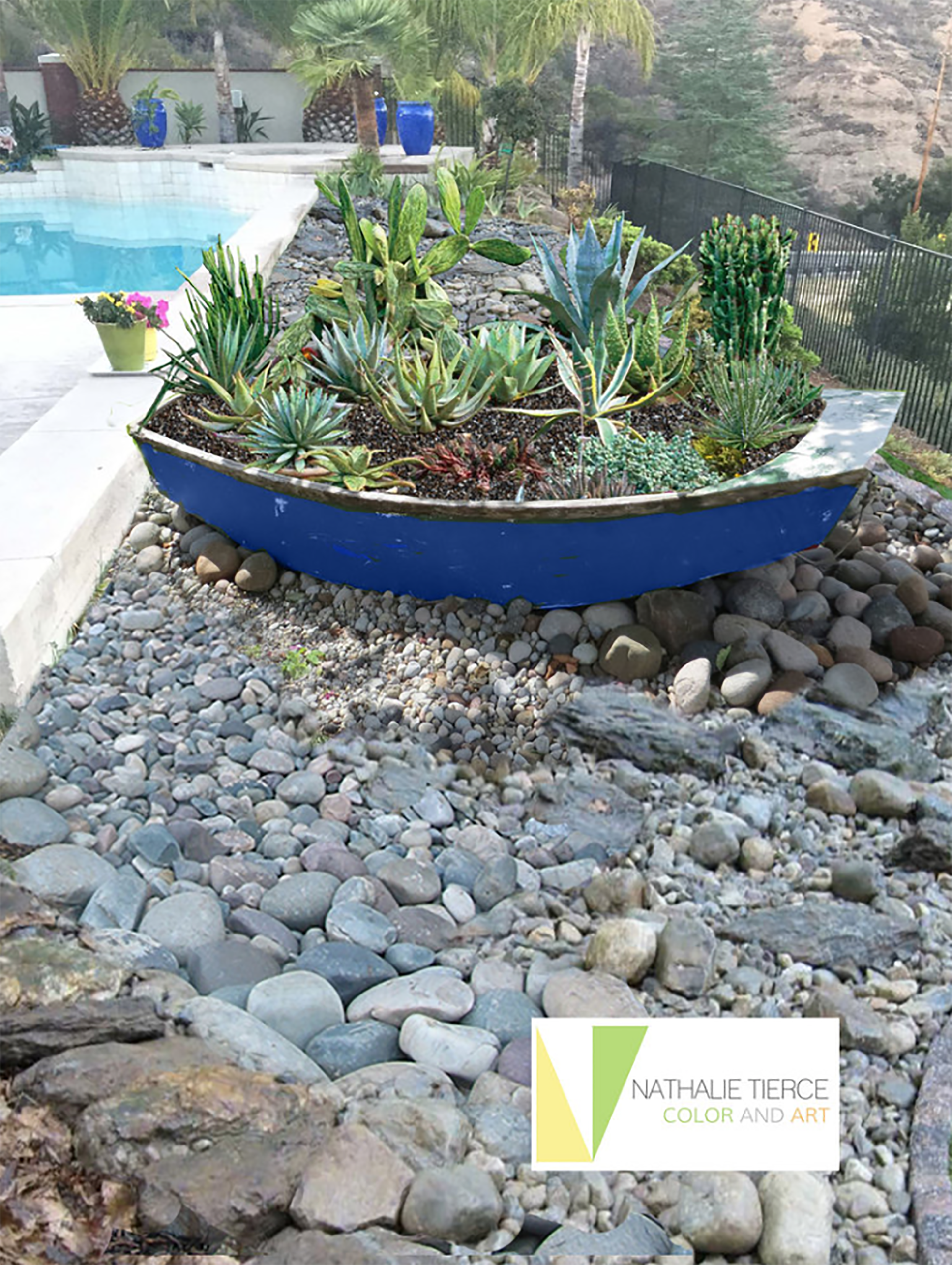
What I put together for the renovation were some visuals and a proposal for ditching the lawn and creating a xeriscape that used a mix drought resistant plants and succulents along with a combination of different river rock for ground cover.
In addition to creating a garden that used less water, visually, I wanted to carry through the color theme of a rich Mediterranean blue that had been used in pots that were already in the garden.
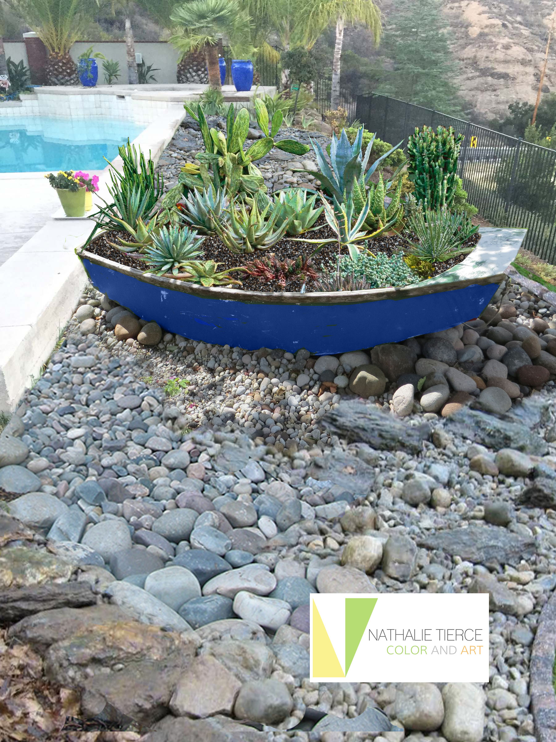
My idea to integrate the blue was twofold. The landscaping as it was had a beautiful view to the surrounding hills and mountains. What the garden was missing some mid height features in between the pool and far away vista. I would source some "props" like old row boats and wheelbarrows to create planters that could be painted and would pull the blue across as a color continuum.
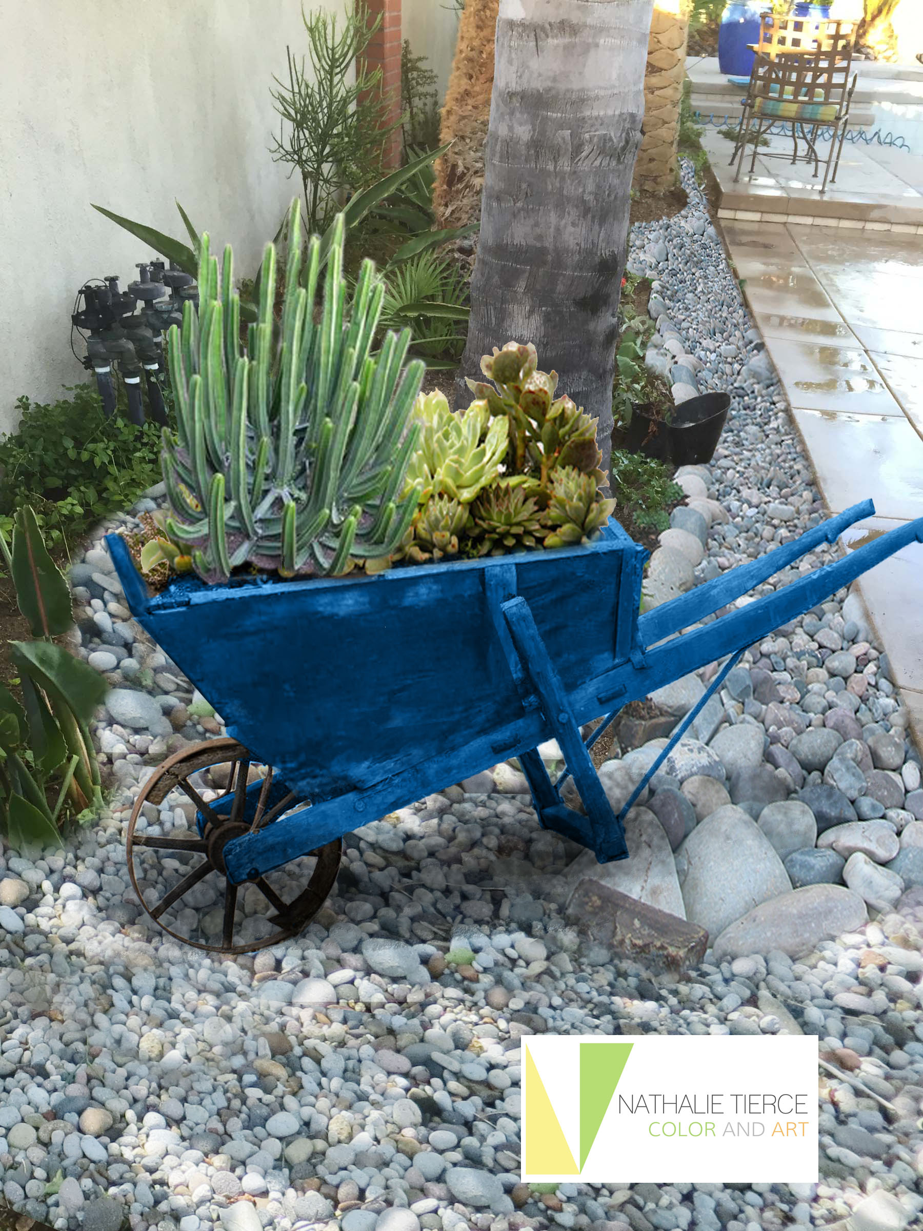
For the rocks, I had sourced granite river cobble and larger river rocks that had a bluish bias in color that would contrast with the largely tan hardscaped patio area.
A Table For All Reasons
Finding a table for a corner shouldn't be hard. When it becomes a bit more challenging is when it needs to be different things at different times. A piece that works with everything else in the room, is the right height and depth, is light enough to be carried to different locations depending on how many people are using the space and for what purpose.
This pair of Brancusi style tables could be stunning stacked when not being used.
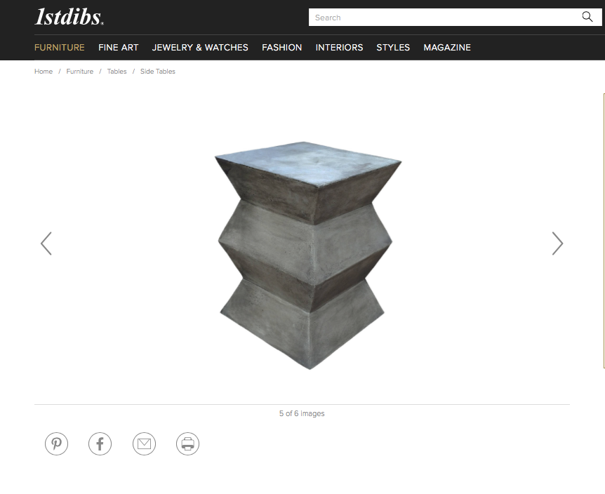
Cool Brancusi style side tables
Love this silhouette, but when I noticed the weight (55 lbs.) it just wouldn't be practical for shuffling around the room.
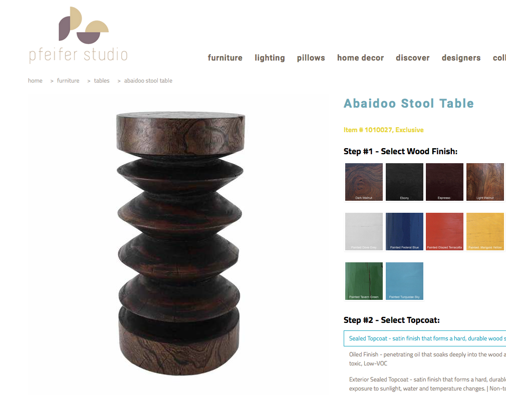
Also an interesting piece that reads like sculpture.
Found these on Houzz, lightweight and stackable, they also soften the right angles of a corner with the curves of its repeat pattern.

I like the delicate detail and the way these work, one slides out of the other, so no lifting.
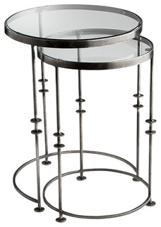
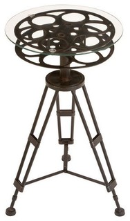
This is steampunk beautiful.
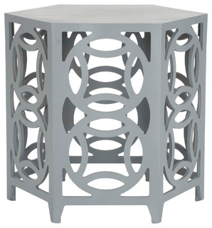
Clean and neutral, the geometry of the design adds interest to an otherwise dull corner without overwhelming it
A Better quality of Life Through Buildings
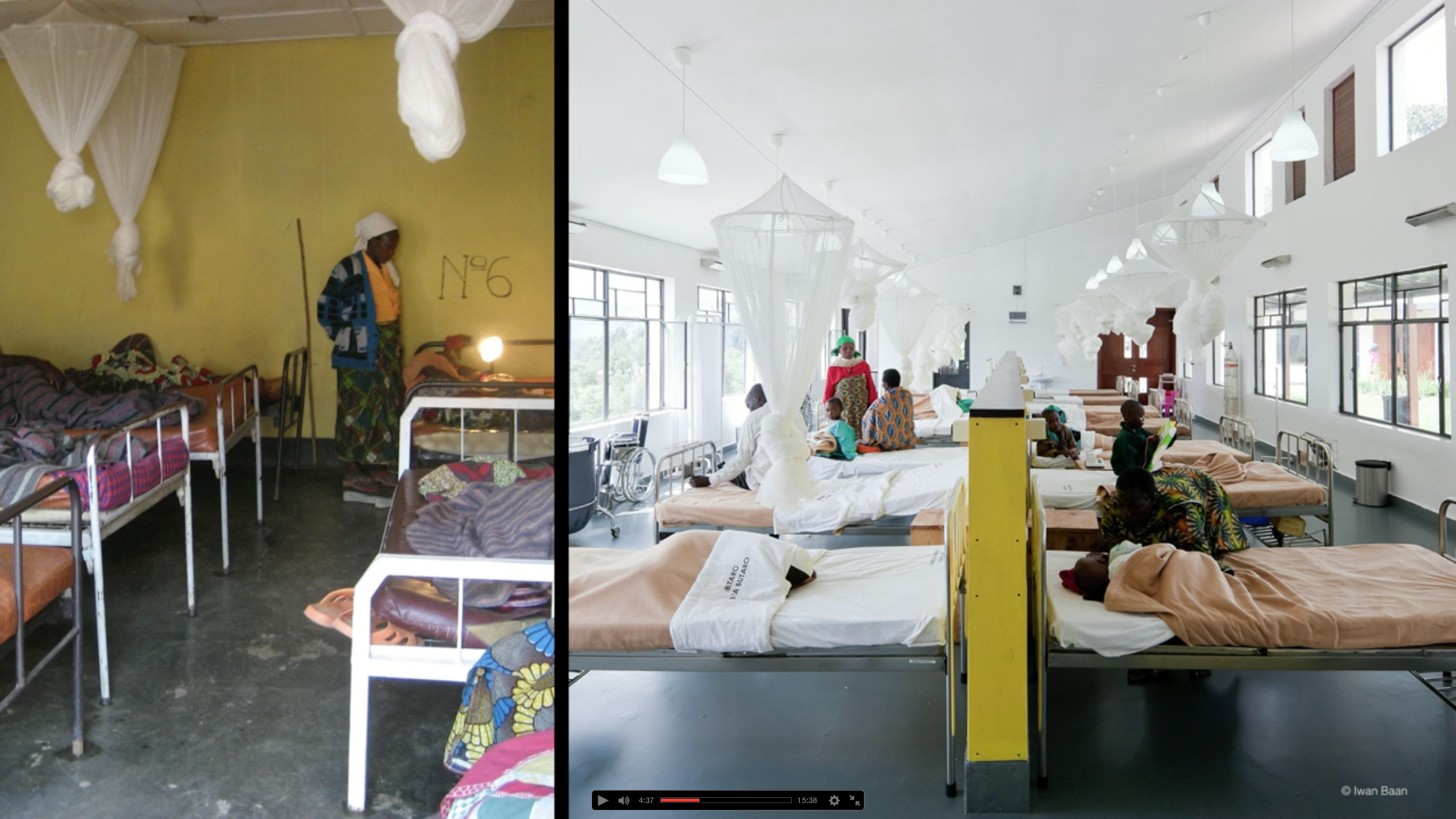
This talk touches on so many things that concern and interest me. How can we improve people's lives and solve problems by creating better environments? A very inspiring talk that gives examples in action of this concept.
On Not Designing Josh

Josh looking content in his new specs
My husband Chris and I are artists. We have been making and designing throughout our decades long career. Our passion, hobbies, interests, conversations revolve around form, function, color and other artsy preoccupations. As a result, it is our lead foot in whether it's what we find something aesthetically pleasing.
On a routine eye exam at the office of the wonderful Dr.Moradi in Glendale we found out our 8-year-old son Joshua needed glasses. The trepidation Josh had about wearing them vanished when we pointed out that many scientists wore glasses. Being a scientist, along with becoming a stuntman, is one of his dreams.
After the exam, we all shuffled into the area where there were racks of frames just for kids. Edie, the lovely optician there, concentrated on presenting Josh with different styles. Chris and I pulled our choices from the shelves. Chris leant towards the subtle, almost frameless. I picked some that had a classic Harry Potter look. Plonking different spectacles on Josh's nose, he looked handsome but unimpressed. Edie sat right in front of Joshua and asked, "What do you like Joshua? Do you like light or dark frames?" "Dark!" he responded without hesitating. She reached for a pair of heavy rimmed glasses down with a splash of violent lime green on the sides. My husband and I both cringed. She put them on Joshua; he said "cool!"
I spoke first after Chris, and I threw each other sideward glances of horror. "Really? Josh, are you sure? Wouldn't you like...." Edie stopped me right there.
"Look," she said, "this is the first time that Joshua has smiled during this whole process. He knows what he likes; he knows what kids wear. If he doesn't like them, he won't be happy and won't wear them."
There and then it became instantly apparent to Chris and I that it was not about how we would like to see Josh but who Josh wanted to be.
After letting go and standing back, looking at his beautiful smile in those glasses, we understood that he had made a perfect choice. We saw Josh in a way we would have never imagined. We saw Josh the way he wanted to be.

Art, Color and More Art
How I design spaces with color as probably has a lot to do with my background as an artist. Conversely, I've noticed these different design projects for clients, the spaces themselves; creep back into my art work. Fascination with architectural form fuels the subject matter of my paintings, while the particular way I try to enhance environments comes from the way I understand spatial composition, color and proportion learned from studying painting.
One example is the home of one of my clients in Santa Monica. It's a beautiful contemporary three-story building with open space that lets light spill in from the third floor all the way to the first. As you look up the upper ceiling forms a sweeping curve and is clad with a warm tongue and groove wood. Sailing down back to the ground floor is a large flue that extracts the smoke from the fireplace. The upper two floors look onto the main living area with half walls that not only let the natural light everywhere but give the wonderful feeling of expansiveness; the same way you feel the open sky when you lean over the side of a ship.
I tried to enhance these qualities with color. Two elements in particular that nagged at me were the wonderful orange tone of the vaulted ceiling wasn't relating to anything of the same color family. It had no one to "speak" to. For the flue, I designed a custom color metallic copper paint. Instead of apologizing for itself when it was painted the same hue as the wall in back of it, it is now a proud feature in the room.
Back to painting, some of the feelings I try convey in my painting are the moments that you feel standing in a new space before you become "used to it". The time when you walk up a staircase for the first time with the anticipation of what you'll find at the top of the landing.
There was a a particular place on the second floor that struck me enough to do a painting. It was a place where all the different planes, some enhanced by different colors, converged. The contrast of the zig zagging perpendicular lines, the wood ceiling curving to make an arch on the tallest wall gave me a serene feeling mixed with exhilaration, I wanted to capture it in a painting.
Crazy Colorful Video
Love the look and concept of OK Go's new video shot (in one take) in an aircraft experiencing zero gravity. Visually arresting and cleverly choreographed it is fun to watch.
The Perfect Match
This is a wonderful film made in 1968 about the process of handmade wallpaper and fabric in England. All printing blocks carved by hand, All colors matched by sight.
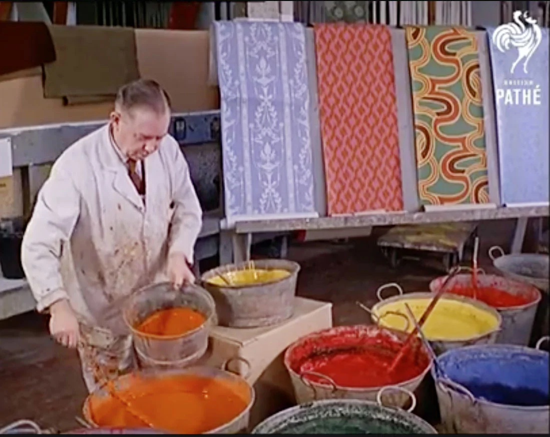
#pathe #artistry #documentary #process #handmade #colormatch #wallpaper #decorative arts