
DESIGN BLOG
Thoughts
&
Musings
Shout Out L.A. Profile - Nathalie Tierce Artist, Designer, Color Consultant & Visual Storyteller
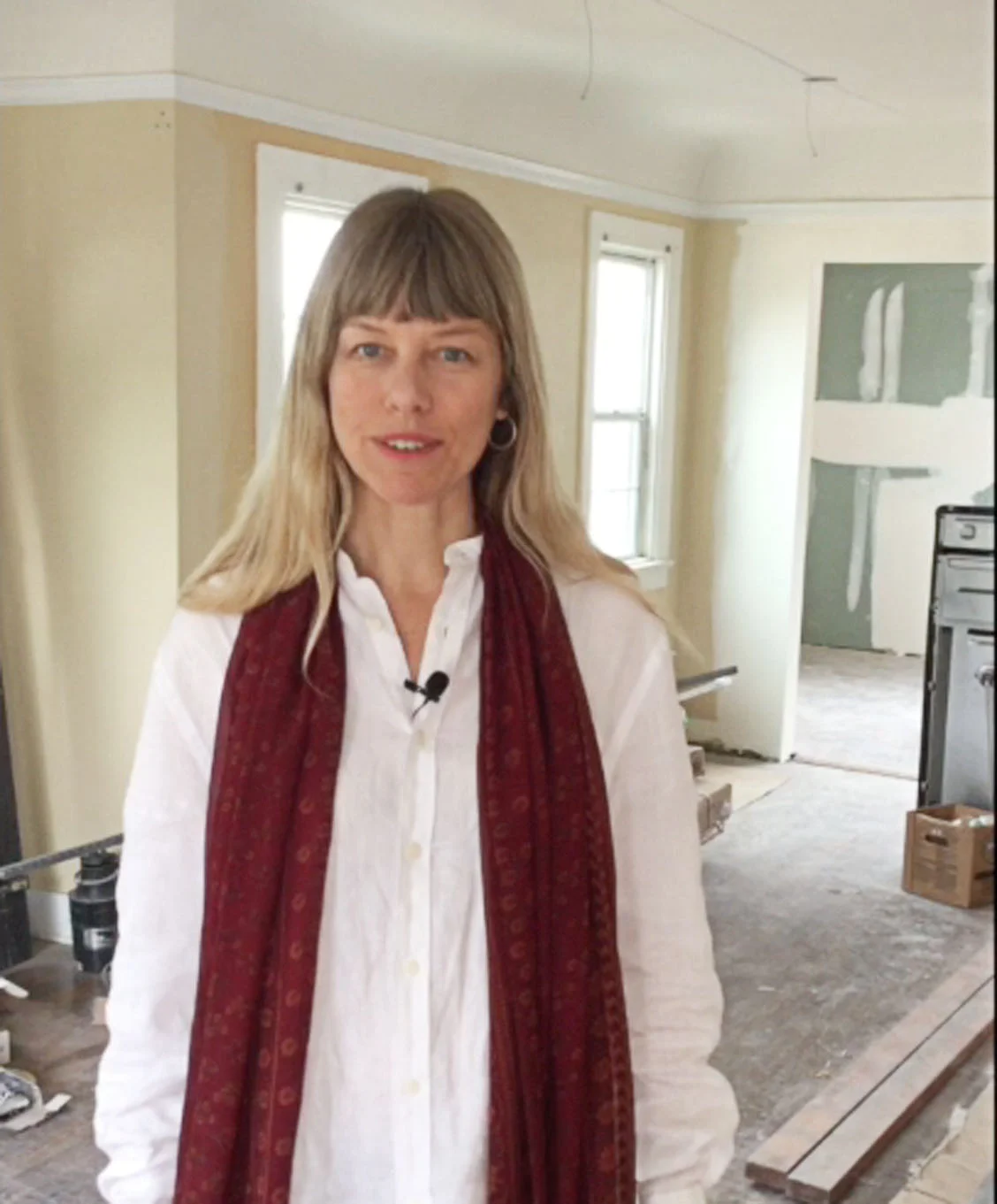
It was a pleasure to share the origins of my work today and how I help my clients with their renovation projects with Shout Out L.A.
My experience as an illustrator and artist heavily influences the color work I do with my clients. Color, form, proportion, and flow; elements that inform a painting's composition, also apply to a three-dimensional space.
Creating a visual impact in a room or exterior of a house that reflects the owner's personality, bringing them happiness in their home is one of the driving forces behind what I do.
Read the full article below.

When Bold Colors Go Wrong
This article written by Dominique Gebru featured in Apartment Therapy is an honest account of one woman’s experience of choosing a color for a room and foregoing the sample stage. By skipping this step, one misses out on understanding how the color reacts with light at different times of the day. This can result in some unexpected results.
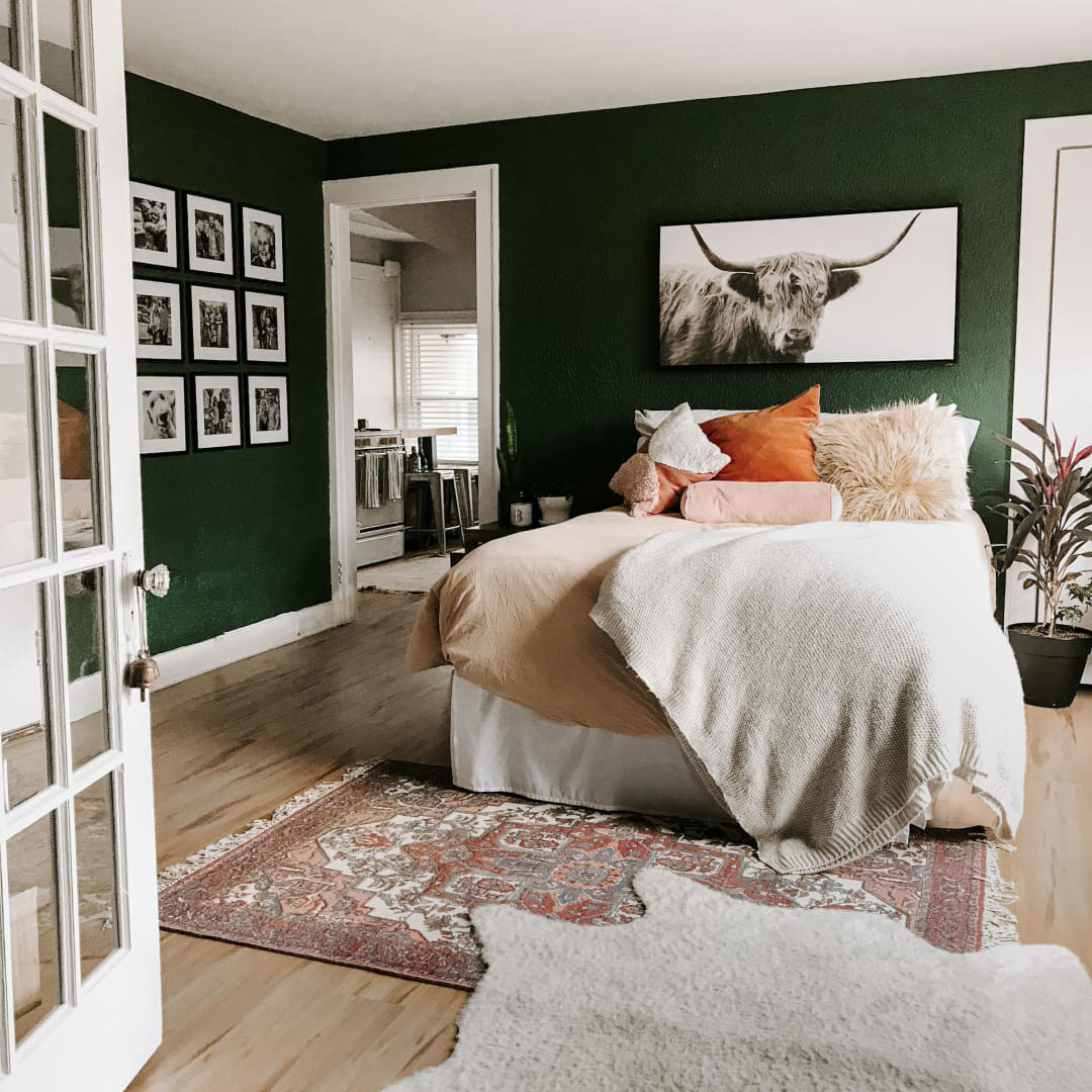
Photo Credit Dominique Gebru
I Painted My Bedroom a Bold Color and Immediately Regretted It—Here's How to Learn from My Mistake
by Dominique Gebru Aug 21, 2020
I’ve long lusted over bedrooms drenched in deep, moody colors. There’s just something about a room enveloped in rich color that screams romance. After years of pinning dark-walled inspiration images, I decided to just go for it. In fact, I chose a bold, moody green before I even moved into my new apartment. It was the perfect addition to my mood board, so naturally, I thought it would also be the perfect shade in my new bedroom.
Once I moved into my new apartment, I got to work painting. As soon as I finished the second coat though, I knew something was amiss. It didn’t look at all how I’d imagined; my room felt… different. And now how I’d wanted it to. It took a chat with Nicole Gibbons, founder of Clare, a direct-to-consumer paint brand, however, for me to put my finger on what wasn’t quite right.
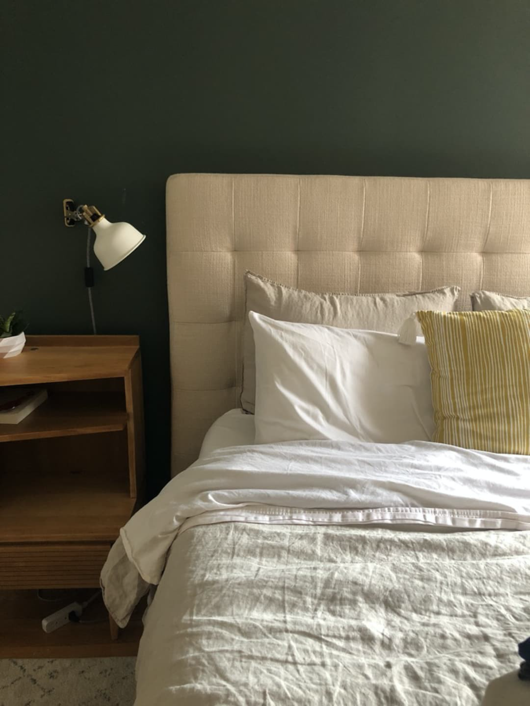
Photo Credit Dominique Gebru
“When choosing paint colors it’s important to consider how the light in your space will affect how the color appears,” says Gibbons. “Remember to observe your swatches at different times of day. The amount of natural light in your space, the direction it’s coming from, and the time of day can all impact the way color is perceived.” Whoops! While I had ordered a swatch and tested it out in my old home, I wasn’t patient enough to give it a true test drive in my new one. My bedroom only has one east-facing window in the corner, and for most of the day, the swatch was in the shadows. So I never really got a sense of what it would look like at night, when I’d be spending the most time there. “Make sure you love your color both in daylight and in the evening when the sun is down, and the artificial lights are on in your home,” adds Gibbons. (Her company Clare makes this easy with their repositionable peel-and-stick paint swatches.) Regardless of how large a room actually is, darker shades of paint can make dimly lit rooms like mine feel a bit closed in. That’s exactly what was happening, and I never really gave myself the chance to observe that beforehand. If you’re looking for something that will help a room counteract this effect, Gibbons suggests you opt for “an airy neutral such as a soft greige, which will not only make a dimly lit space feel brighter but will also help bounce around what little natural light is available.”
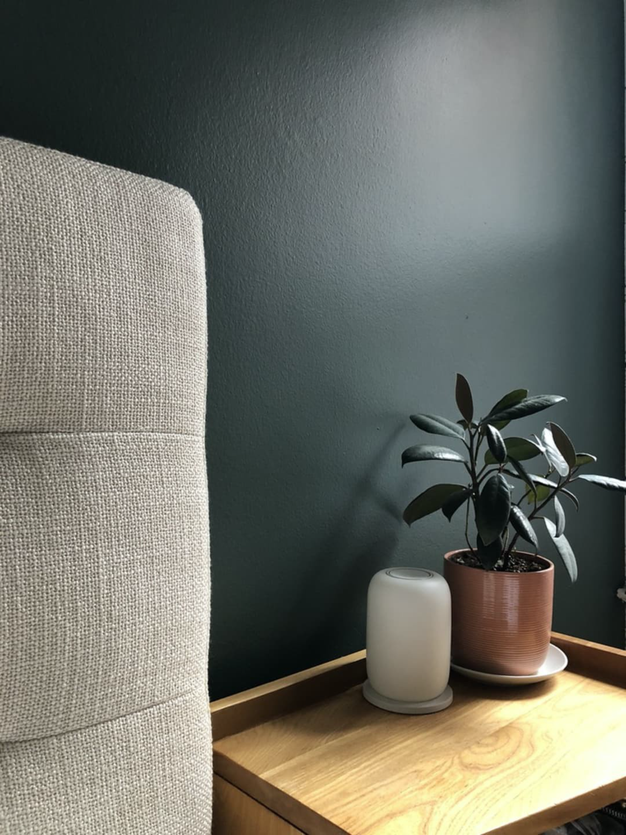
Photo Credit Dominique Gebru
Finding the Right Color for the Exterior of Your Home
I truly love working with homeowners and helping them create a place to live that exceeds what they thought was possible.
Recently, I met with a new client, Andy, in Los Angeles who had chosen the colors himself for the exterior of his Los Angeles Spanish style home then hired contractors to do the work. They did a brilliant job painting.
Sadly, every time he came home, he was disappointed. The result wasn’t the cozy, inviting, cheerful, classic Spanish he had hoped for but the color combination resulted in a depressing vibe. He was frustrated that he had spent money and effort trying to improve his lovely home and found the outcome to be so wrong.
After a few months of living with the results, Andy did a search on Yelp and found my listing and called me for a consultation.
The result is fabulous, but even more touching was his review on Yelp about his experience and my services. It made made me so happy that I had turned a bad situation around for him and helped him get the look he was after.
Here is his wonderful review by Andy S. from Yelp posted August 2, 2020:
Choosing paint color is NOT my strong suit. After 17 years in my home, I finally had the nerve to have the exterior painted this past March. After it was all done (bummer alert) I HATED the colors I chose. It turned out dark, drab and depressing -- not exactly the vibe I was going for. After a couple of months, I realized that I couldn't live with it, so I did a quick Google search for a local color consultant. Luckily I found Nathalie Tierce. I called her right away -- and in a bizarre twist of fate, we realized that she had done the color consulting for the house directly across the street from me (which I LOVE). It was meant to be! She came out to see me a few days later (with mask and proper social distancing, of course). Let me just say that she did NOT disappoint.
Nathalie is billed as a color consultant, but I would swear she's more of a color PSYCHIC. It sounds weird (yeah, I know), but it's almost as if the house communicates with her. She took one look at my place and instantly told me that the color I had chosen for the trim was a really "handsome" color -- but that the dark color I had chosen for the stucco was dragging the whole house down. She was certain that I could keep the existing trim color and we could just pick a new color for the stucco that would be a better complement. That scenario would also be far less labor intensive...and CHEAPER. I was ALL for that!
I might mention that Nathalie not only knows color, but she also has a downright scientific understanding of how light, shade, sun direction and landscaping AFFECT that color. Because my house faces North and never gets direct sunlight on the front, she immediately started looking at lighter/brighter options that would give my house a much needed "lift" (as she described). After deciding on two possible candidates and having me do the proper tests, we were in total agreement about which color worked best. Fast-forward a week later and my painters already had the new color up. What a difference (and what a relief)! It's GORGEOUS! Thank you, Nathalie!
And after just a couple of days, I soon came to realize that the new lighter/brighter stucco color brought with it a huge and unexpected extra added bonus. The interior of my house is now a full 5 to 7 degrees COOLER. No lie! My A/C barely even needs to kick on now. I never would've believed the exterior color could make THAT much of a difference on the inside. It's been life-altering for me -- and The DWP savings alone will far and away make up for the expense of repainting.
So, to recap: If you're getting ready to paint your house and are feeling a little (or a lot) overwhelmed, please don't be a dumb-a$# like me and waste a lot of time, energy and cash on avoidable mistakes. Call Nathalie FIRST and then relax and have a cocktail. You'll be SO glad you did. I know I am. :-)
A Surreal Life

What could be more bizarre than the times in which we live? Inspired by dreams, fantasy, and the occasional despondent nightmare, we embark upon a journey into destinations unknown, through surreal and figurative art. Curated by Dale Youngman, “A Surreal Life” runs from July 2 through November 30 by Castelli Art Space on Artsy. The exhibition includes the work of five artists, Nathalie Tierce, Randi Matushevitz, Luis Sanchez, Cory Sewelson, and Julie Gardner.
Founded in 2016 by Fred Goldstein, Castelli Art Space continues to provide contemporary exhibits in all mediums by local and international artists through Artsy. Featuring undiscovered and emerging through mid-career artists, their curated online programming is designed to be provocative, creative, thought-provoking, eclectic, and distinctive.
Setting the Right Mood
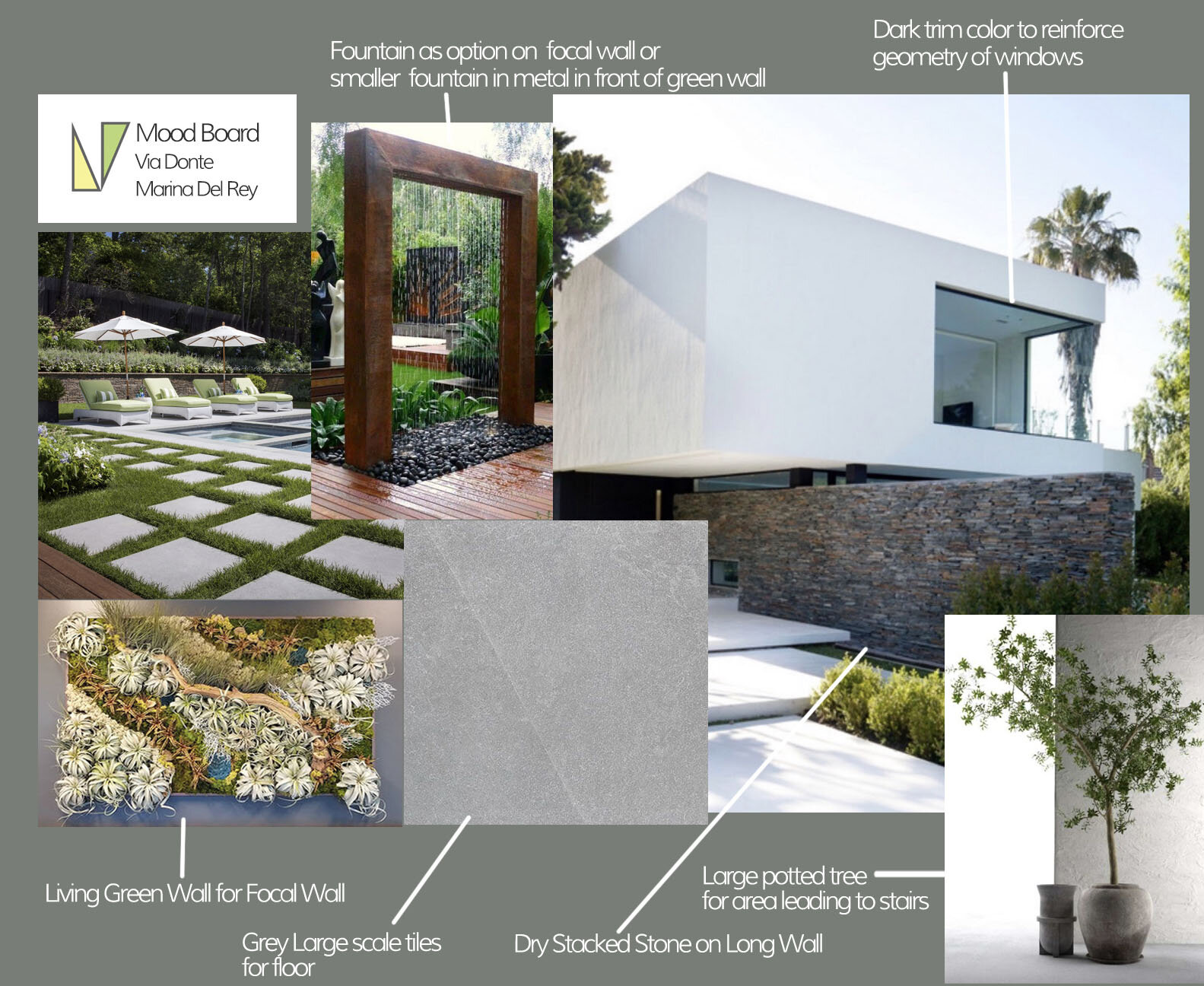
Establishing the style for a renovation project is one of the first phases of a renovation project. This Mood Board was created expressly for this purpose. A Mood Board illustrates the tone an environment will have by merit of the scale, textures, colors, materials applied.
In the conversations with this client embarking on a major renovation of their Marina Del Rey home, the strong geometry of the house was going to be complemented by a combination of smooth and heavily textured materials.
Using a palette of warm whites, greys, and terracotta/rust tones for the exterior paint colors and hardscaping to play against landscaping with special focal points such as an exterior living green wall.
The Mystery and History of the Color Red
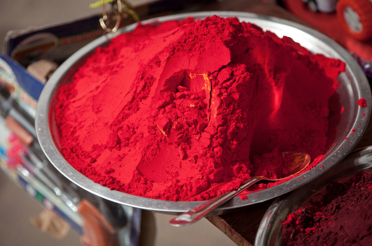
Passionate and exciting, the history of red, it’s uses, symbolism and procurement is as fascinating as the color itself.
Inspired Design From Nature's Palette
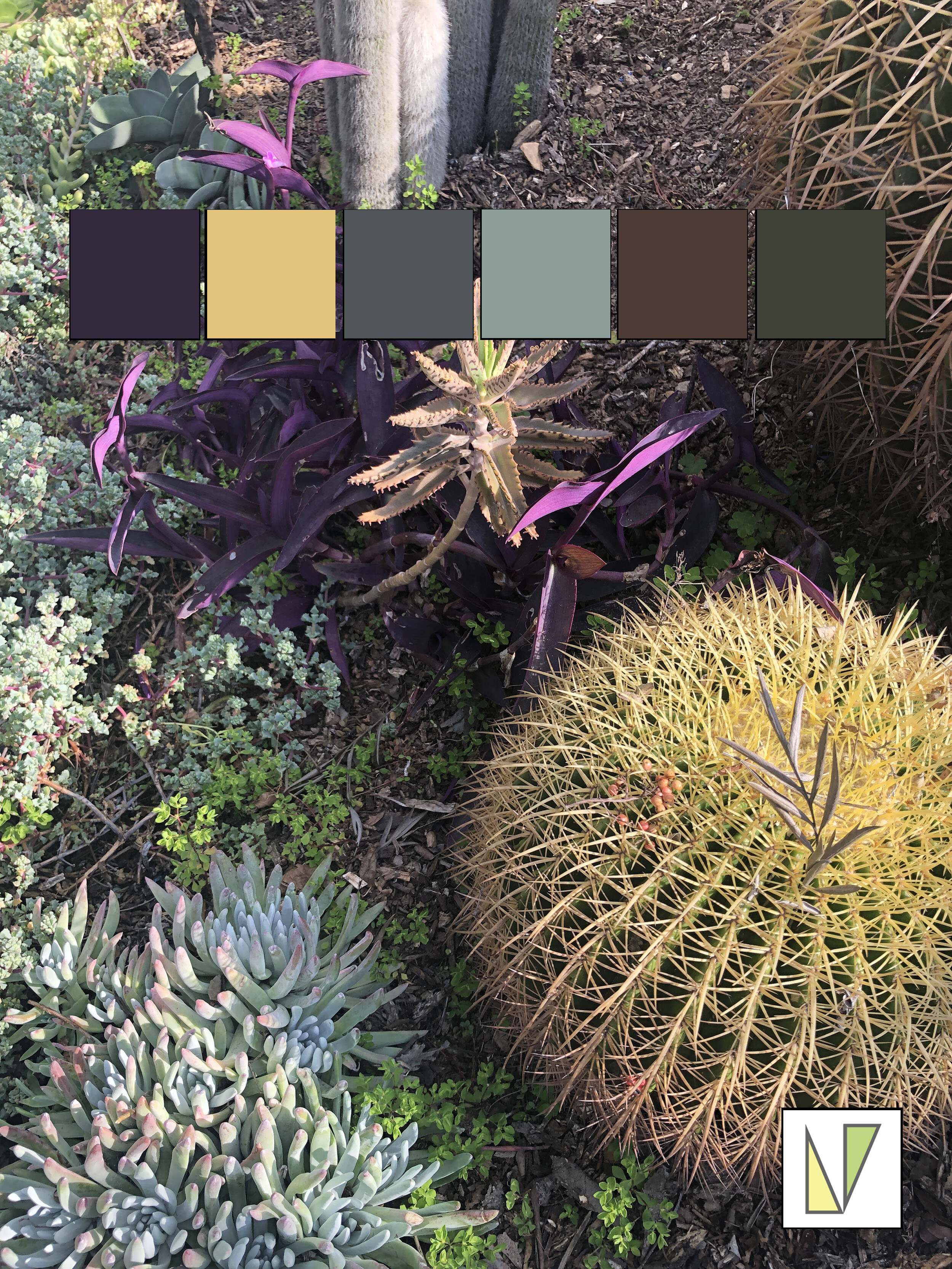
I love being in my garden. It’s a lot of work, but it’s all worth it. It’s an ever-evolving type of project, always changing. Plants need transplanting or pruning. It’s like a painting that I keep tweaking.
Another fascinating aspect of the garden is the things I notice about light and color and how they affect each other.
My take away from all this is are new ways of thinking about grouping hues and palettes. It recharges me and gives me further insight into the power of color in a design.

Understanding How Color Changes Through the Day
Part of the struggle people have with choosing colors for the exterior and interior of their homes is not understanding the subjective quality of color in relation to the light it receives.
Here, I've done a time-lapse film that illustrates the magical, transformative affect the time of day has on local color. The color in question, "Abalone" by Ben Moore can be seen changing in all it's glory on a partly cloudy day, facing West. this was filmed from 9am to 5pm.
Mid Century Charm and Style in Palm Springs
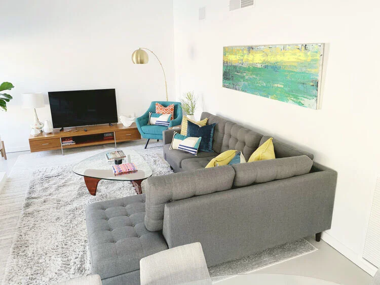
My clients wanted a second home in Palm Springs and found it in this gem designed by the famed architect William Krisel, AIA. Built in 1961, the home has an iconic butterfly roofline and loads of curb appeal. The bones of the house were there, they just wanted to make it their own.
Keeping the furnishings clean and simple, we stayed with light neutrals for the walls and furnishings with pops of color for accents.
Hung in the main seating area is one of my abstract paintings that pulls in the gold color that is used throughout the house and green that pulls the outside garden landscaping inside.
More pictures to come…

#vacation #losangeles #design #color #color consultant