

DESIGN BLOG
Thoughts
&
Musings
Defining Mid Century Marvelous
Staging is the art of defining a space.
Case in point, this mid-century beauty sitting atop the Hollywood Hills in California.
Open plan, the house greets the visitor with oodles of luxurious space.
Ironically, the airy proportions could potentially overwhelm a prospective buyer. Where should the dining area be? How does seating work in what could be an area called the Living Room?
With careful thought given to the architectural layout and how people actually live; a story begins to unfold. By selecting relative size and style sympathetic furnishings; the flow and purpose of the space reveal itself.
Another helpful tool for setting the mood of a space is the artwork. Art can subliminally emphasis unique characteristics of a home (specific architectural features can be echoed in a painting) or compliment monochromatic decor can with a splash of a color.
All the artwork used in this particular staging was created by myself. The showing was a success, the home was purchased for 5.5 million.
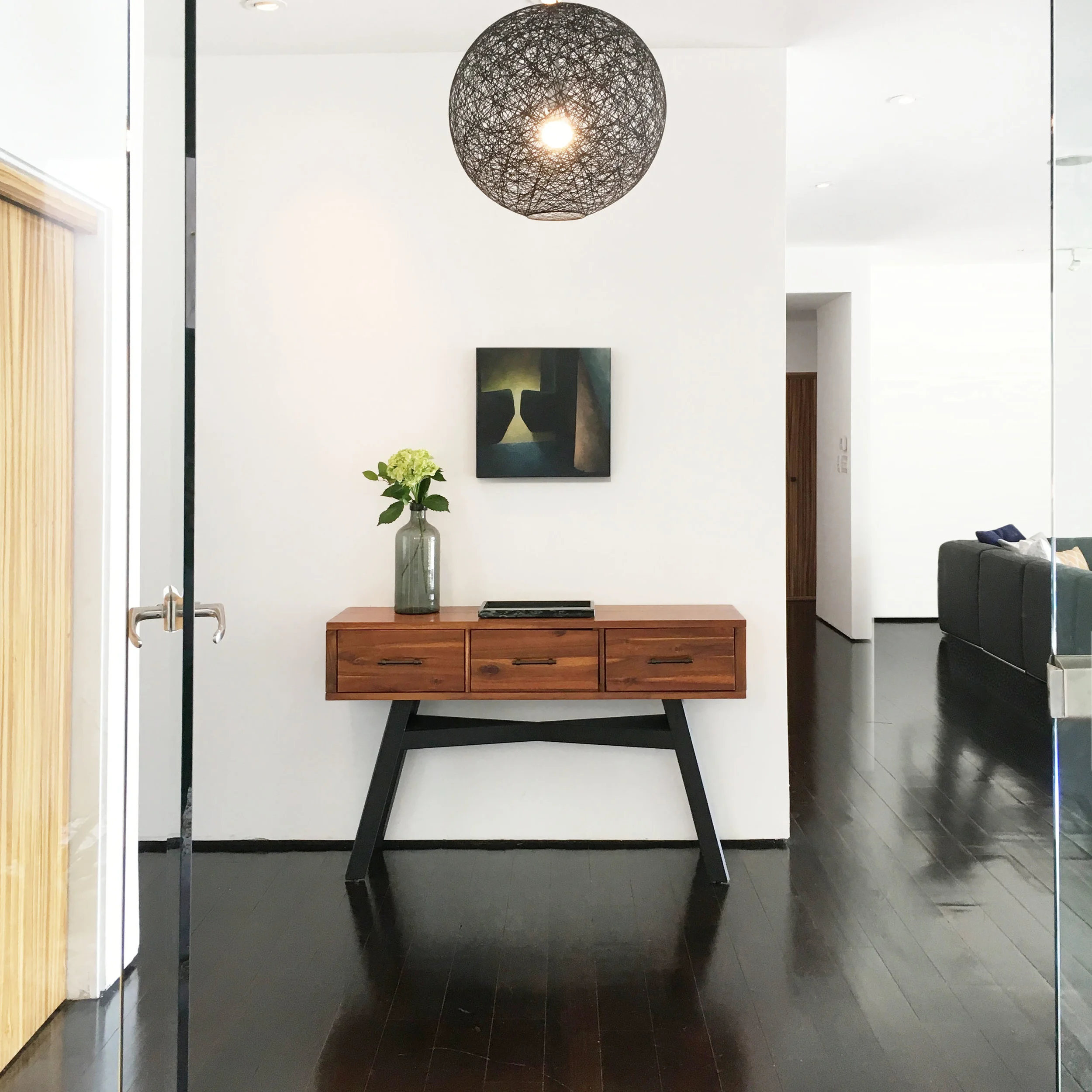
Entry way Hollywood Hills
When a visitor entered the front door, there was no entryway, foyer or transition space to greet them.
By using black to unite and ground certain aspects of the accent pieces, namely the legs of the table, light fitting and artwork, a focal point is created against the white walls.
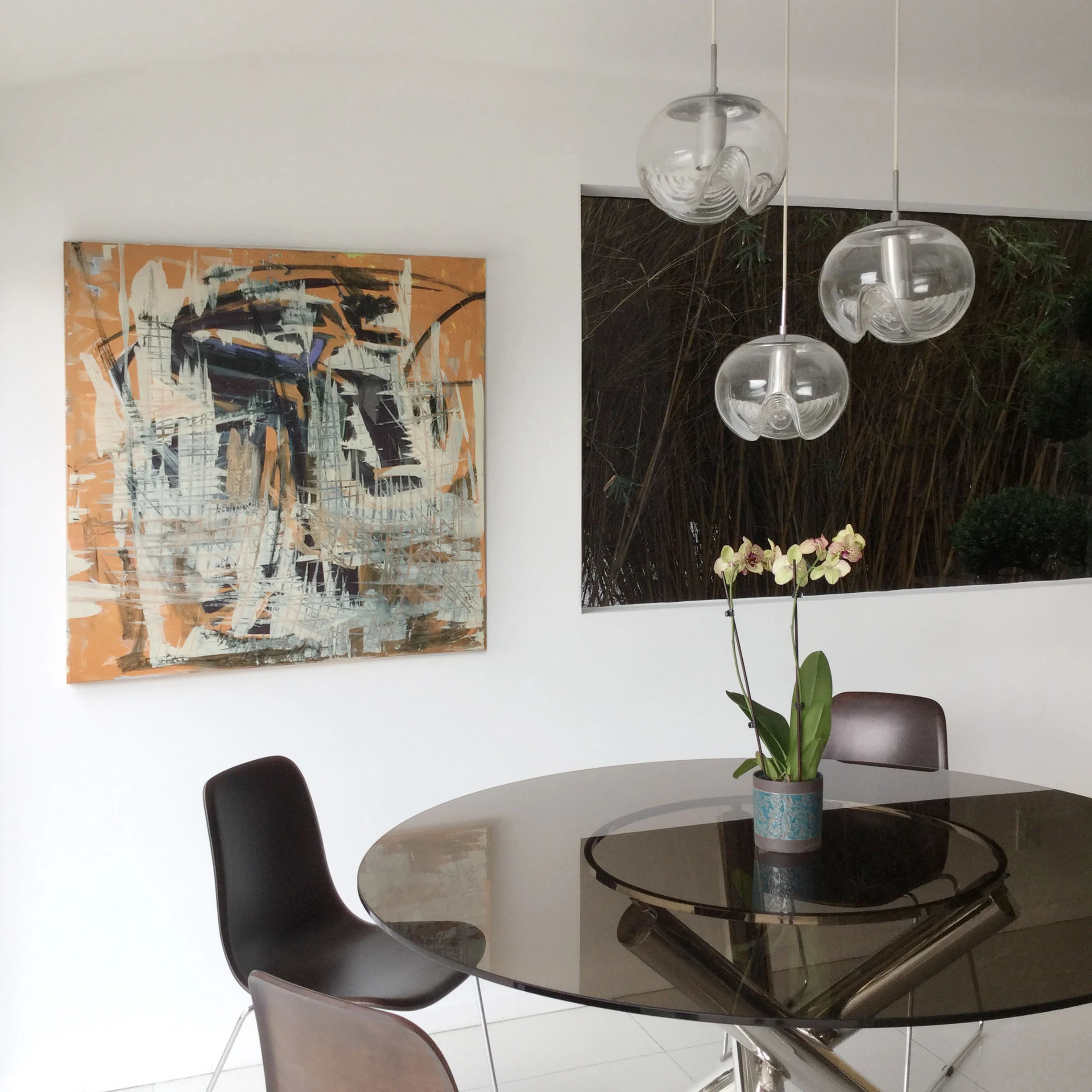
Breakfast Nook Hollywood Hills
Here, against the wonderful modernist geometric shapes at play, the rectangular window to the right was slightly ominous when in shadow. The remedy was the injection of some vibrant color and texture of the painting to the left.
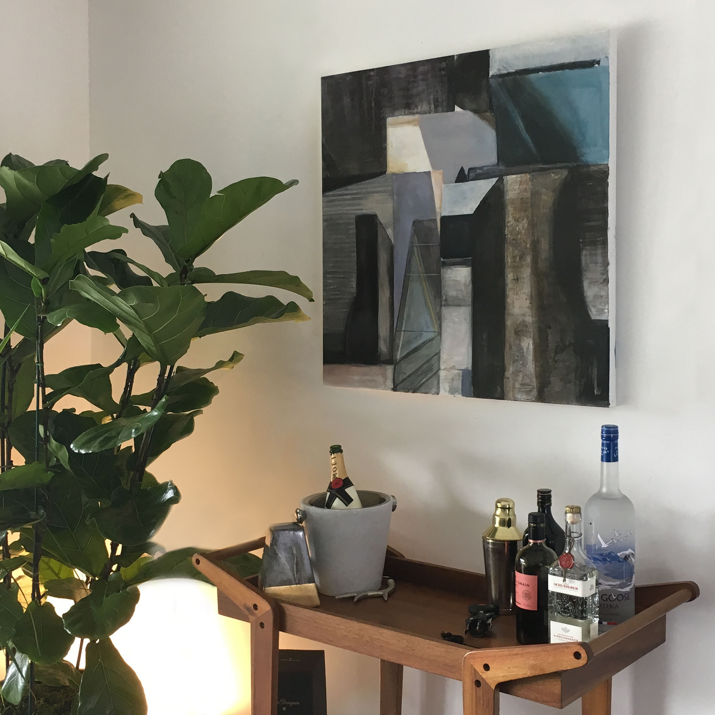
Bar Area Hollywood Hills
A non-descript niche became a soothing bar area, dressed with a discreet uplight that added warmth and intimacy. The painting above added architectural detail that complimented the organic curves of the tall plant to the left.
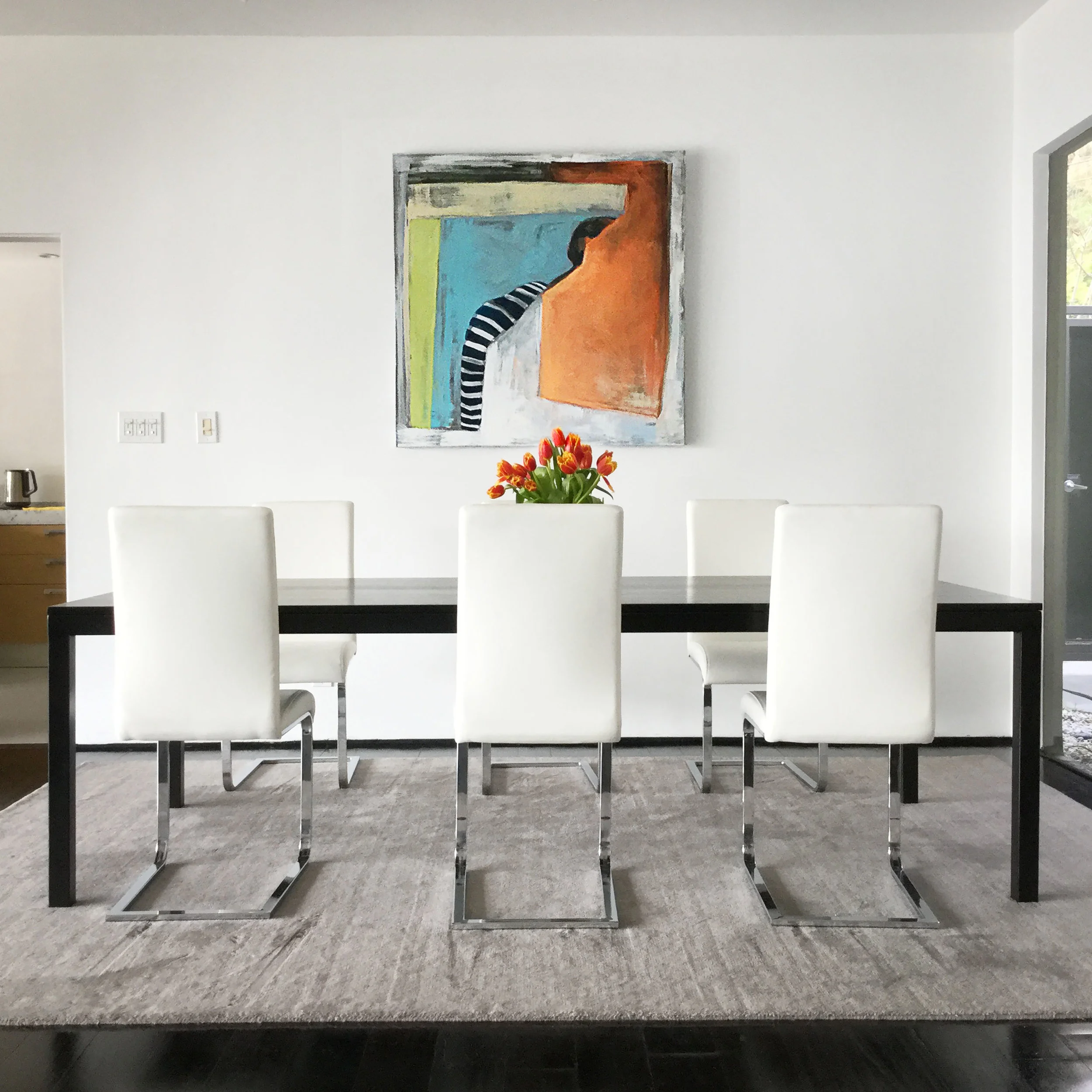
Dining Area Hollywood Hills
Clean, minimalistic and elegant was the result in claiming this area for the dining space with furniture that had simple lines. Here again, the colorful shapes in the painting add playfulness to the setting.
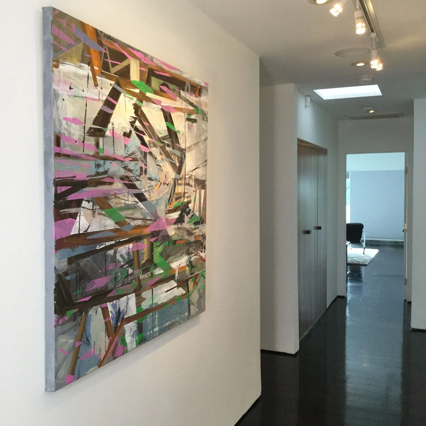
Hallway Hollywood Hills
The tone of the hallway as the transitional space from the communal areas to the bedrooms was quite staid. The art made walking through a more dynamic experience with its bold color and dynamic direction.

Art, Color and More Art
How I design spaces with color as probably has a lot to do with my background as an artist. Conversely, I've noticed these different design projects for clients, the spaces themselves; creep back into my art work. Fascination with architectural form fuels the subject matter of my paintings, while the particular way I try to enhance environments comes from the way I understand spatial composition, color and proportion learned from studying painting.
One example is the home of one of my clients in Santa Monica. It's a beautiful contemporary three-story building with open space that lets light spill in from the third floor all the way to the first. As you look up the upper ceiling forms a sweeping curve and is clad with a warm tongue and groove wood. Sailing down back to the ground floor is a large flue that extracts the smoke from the fireplace. The upper two floors look onto the main living area with half walls that not only let the natural light everywhere but give the wonderful feeling of expansiveness; the same way you feel the open sky when you lean over the side of a ship.
I tried to enhance these qualities with color. Two elements in particular that nagged at me were the wonderful orange tone of the vaulted ceiling wasn't relating to anything of the same color family. It had no one to "speak" to. For the flue, I designed a custom color metallic copper paint. Instead of apologizing for itself when it was painted the same hue as the wall in back of it, it is now a proud feature in the room.
Back to painting, some of the feelings I try convey in my painting are the moments that you feel standing in a new space before you become "used to it". The time when you walk up a staircase for the first time with the anticipation of what you'll find at the top of the landing.
There was a a particular place on the second floor that struck me enough to do a painting. It was a place where all the different planes, some enhanced by different colors, converged. The contrast of the zig zagging perpendicular lines, the wood ceiling curving to make an arch on the tallest wall gave me a serene feeling mixed with exhilaration, I wanted to capture it in a painting.
Framed Bark
"Bark Painting #5" by Nathalie Tierce
I just finished hanging on of my prints from the "Bark Paintings" series in my client's home.
Framed, it looks wonderful in this contemporary bedroom. They already had the woven red bedspread with embroidery as well as the some of the other pillows. I found the purple and silver / navy pillows to throw into the mix because it need a little bit a cool rich color to counter the warm bedspread.
The walls are Benjamin Moore's Simply White.