

DESIGN BLOG
Thoughts
&
Musings
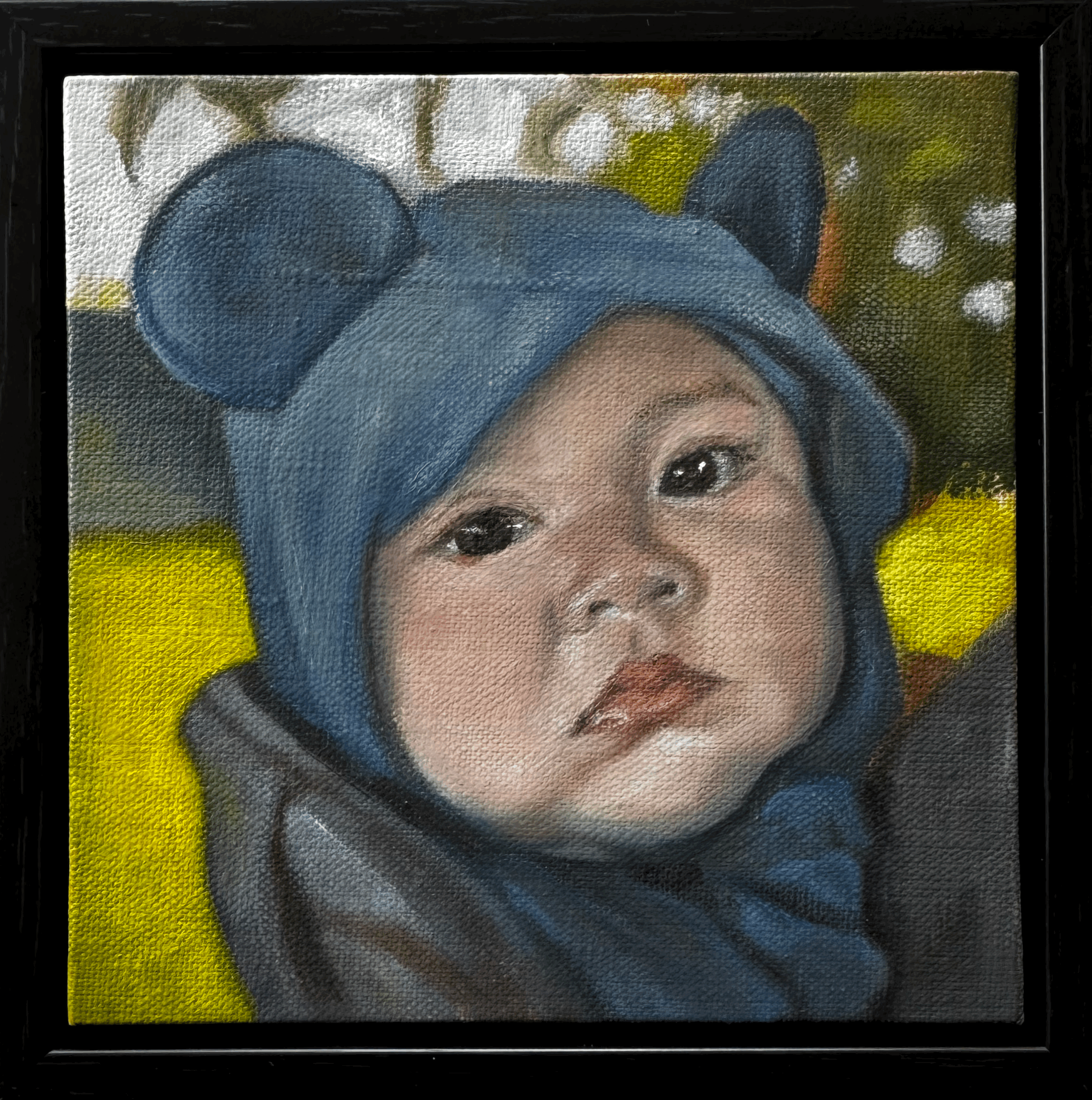
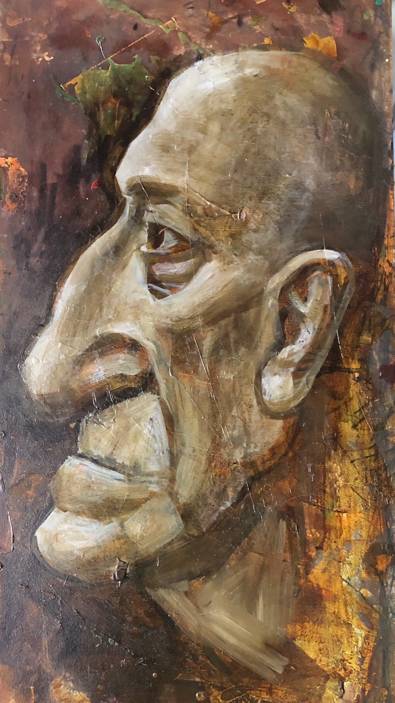
A Portrait of a Moment
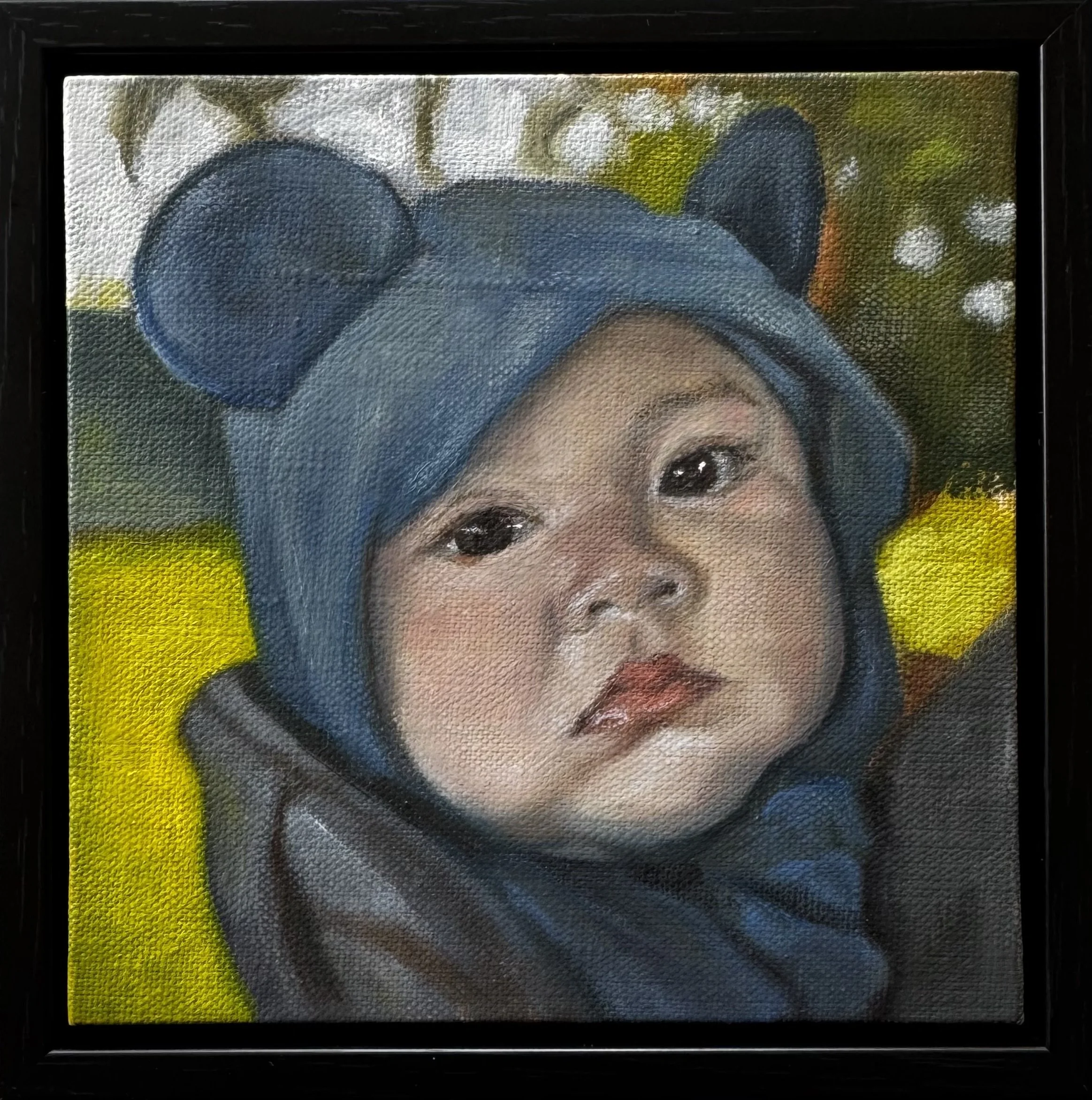
Today I had the pleasure of delivering this small oil portrait to the parents of a beautiful boy.
One of the things I love most about portrait painting is that it preserves more than a likeness. A painting does not simply record what someone looked like at a particular age. It holds something harder to name: an expression, a gesture, a quality of presence, the feeling of knowing someone in that exact season of life.
Children change so quickly. Their faces shift, their personalities unfold, and the version of them we know today quietly gives way to the next. Photographs capture those changes instantly, and we all have thousands of them on our phones. But most of those images remain buried in a camera roll, glimpsed briefly and then forgotten.
A painting occupies a different place in a family’s life.
It asks to be seen slowly. It becomes part of the room, part of the home, part of the family’s story. Years from now, this portrait will not only remind his parents what he looked like at this age, but something of his curiosity, his sweetness, his seriousness, his particular way of being in the world.
That is what interests me about portraiture. It is not only about resemblance. It is about recognition.
Every portrait begins with someone deciding: I don’t want to forget this version of them.
Sometimes that person is a child. Sometimes it is a partner, a parent, a friend, or a beloved dog, cat, or animal companion who has become part of the family. The subject may be small, but the feeling behind the painting is never small.
A portrait is a way of saying: you mattered here, in this moment, exactly as you were.
And that is always worth preserving.
Portrait commissions are deeply personal, and I take on only a limited number at a time so that each painting can be approached with the attention it deserves. If there is someone in your life whose presence you would like to preserve in paint, you are welcome to inquire about availability through my contact page.

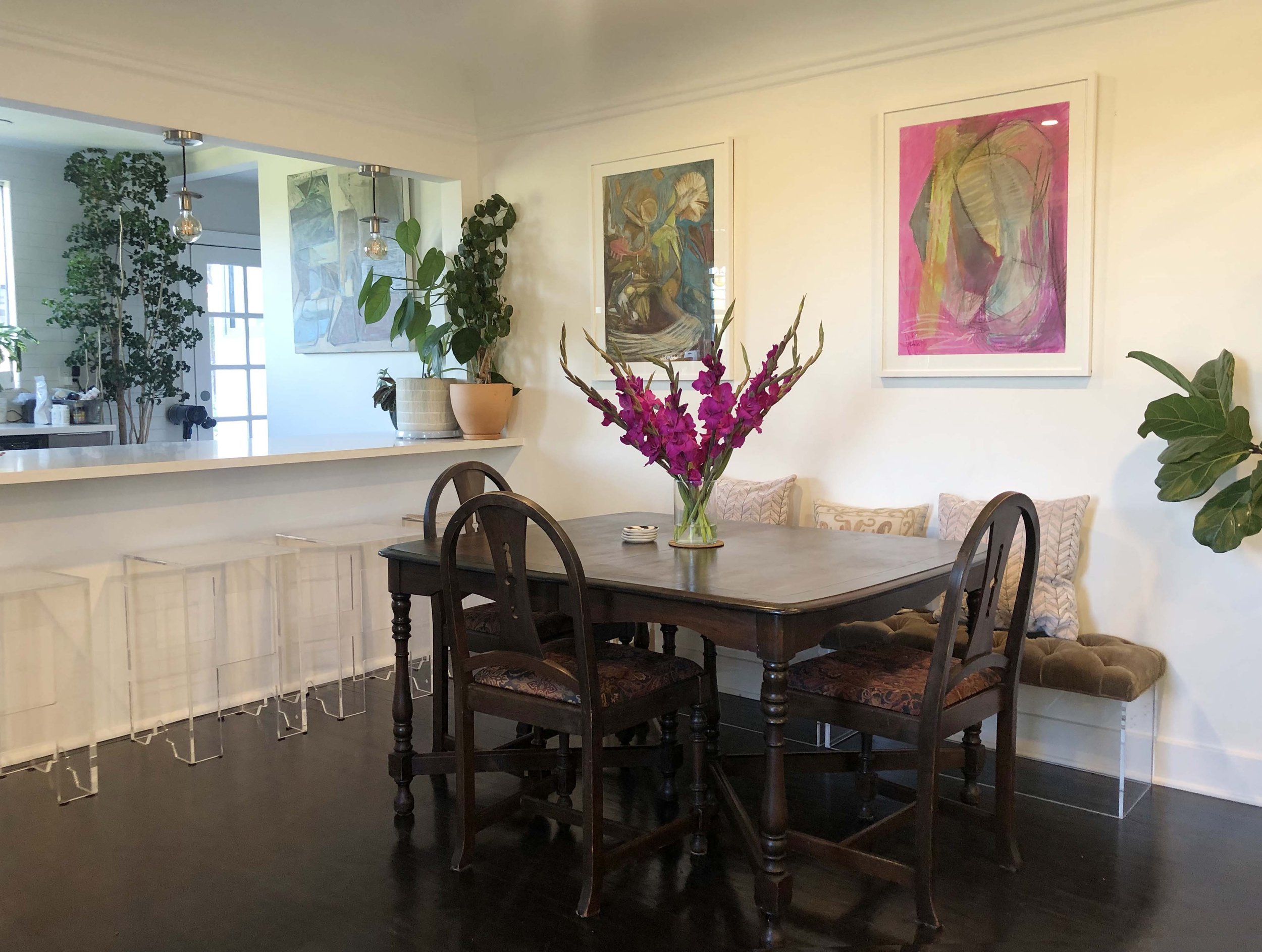
Why Original Art Matters in Residential Design

When people think about creating a beautiful home, they often focus on paint colors, furnishings, and finishes. While these elements are important, original artwork is often what gives a space its emotional center.
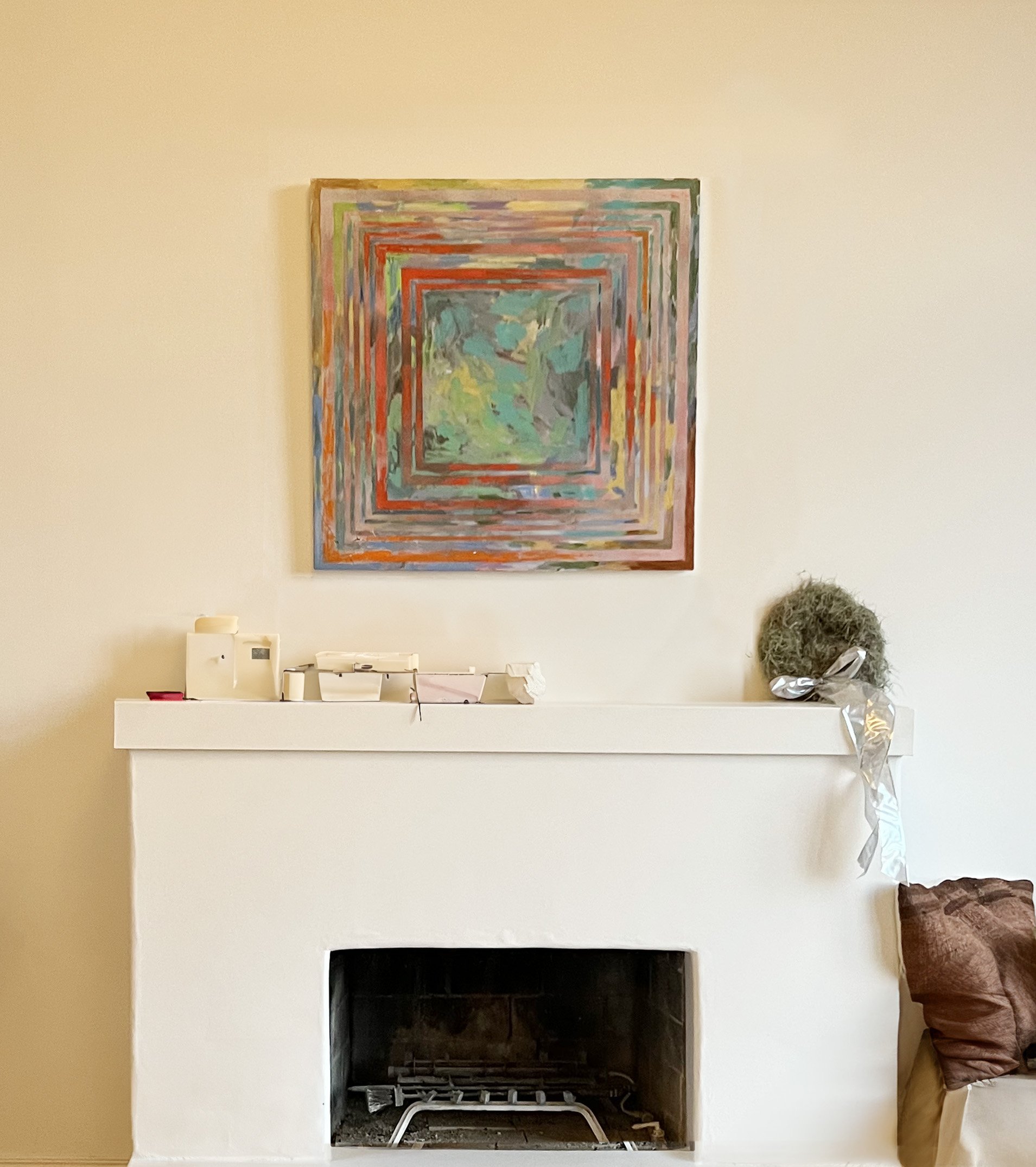
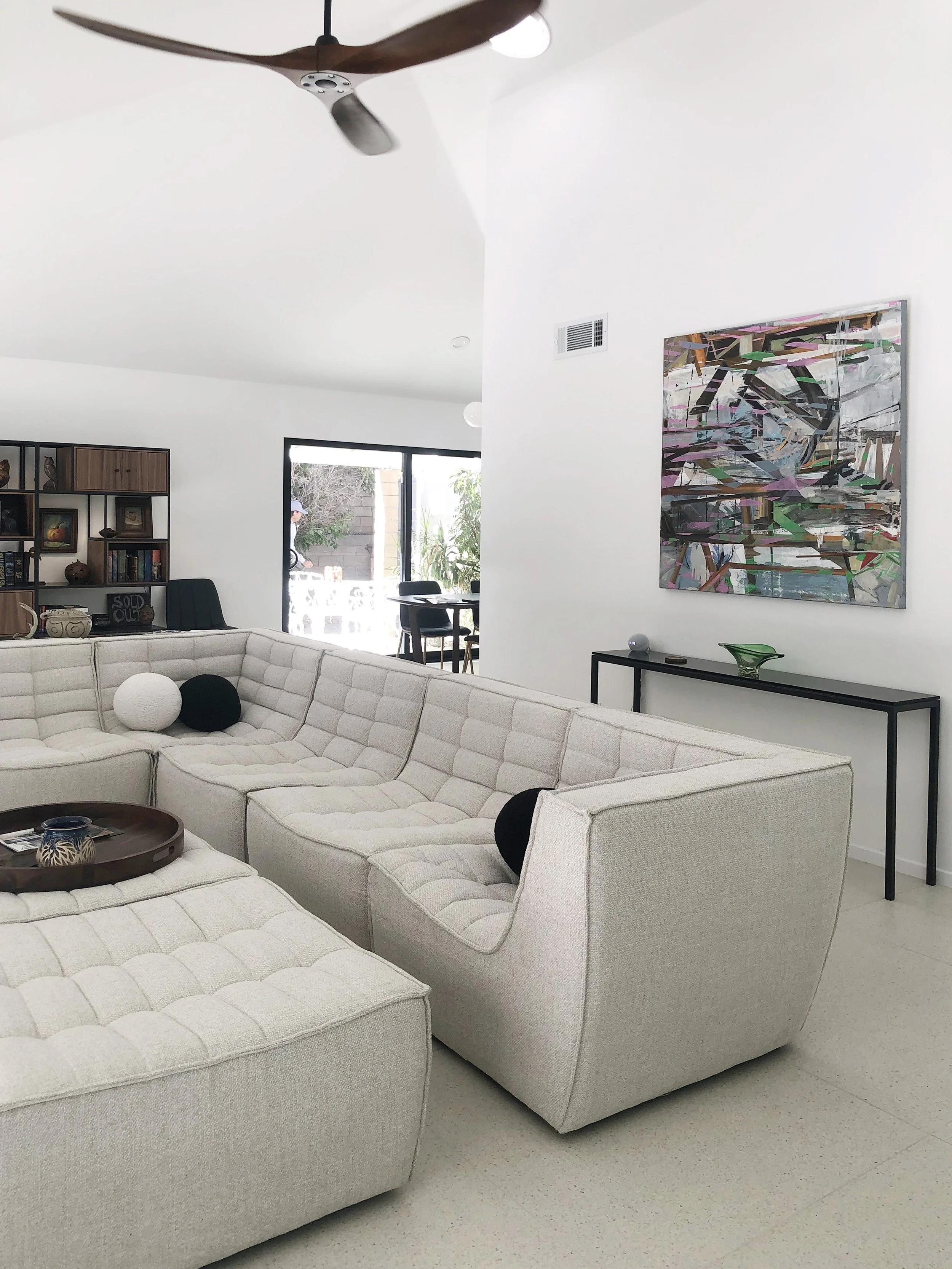
Recently, I had the opportunity to see my painting Moment installed in a 1931 Spanish Revival home in Eagle Rock represented by realtor Aiesha Bailey Mannle. It was a reminder of how powerful the relationship between architecture, color, and art can be.
Throughout my work as a color consultant, I often encourage clients to think about artwork early in the design process rather than treating it as an afterthought. A strong piece of art can influence color decisions, establish mood, and create a focal point that ties an entire room together.
In this Eagle Rock property, the warm tones of the original hardwood floors, soft wall color, and historic architectural details provide a quiet backdrop that allows the painting to become a point of emotional engagement. The room feels complete not because every element matches, but because the elements are in conversation with one another.
Great interiors are not built around perfection. They are built around character.
Original artwork is often where that character begins.
Special thanks to realtor Aiesha Bailey Mannle for her continued commitment to presenting homes with both architectural integrity and artistic vision.
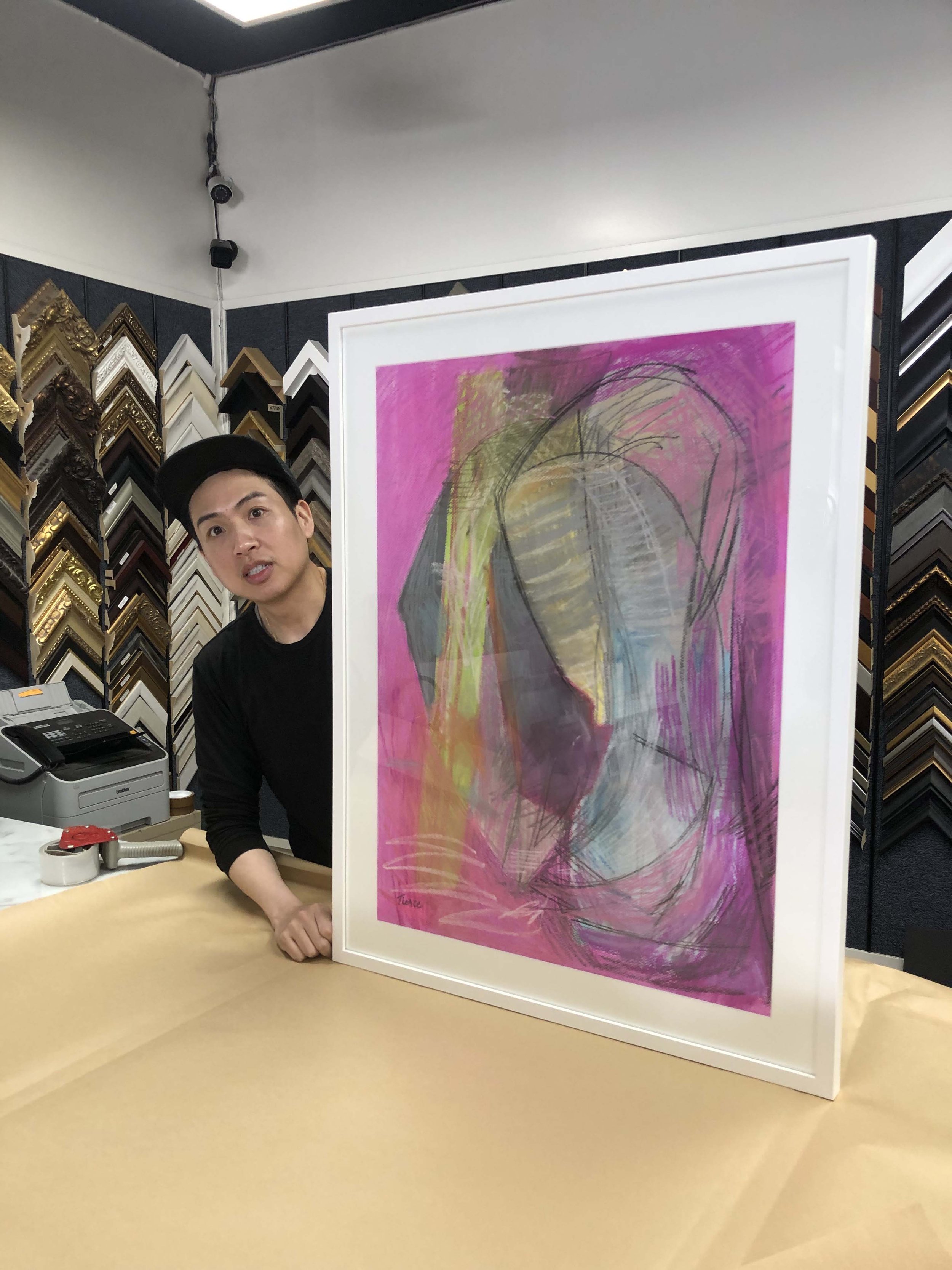
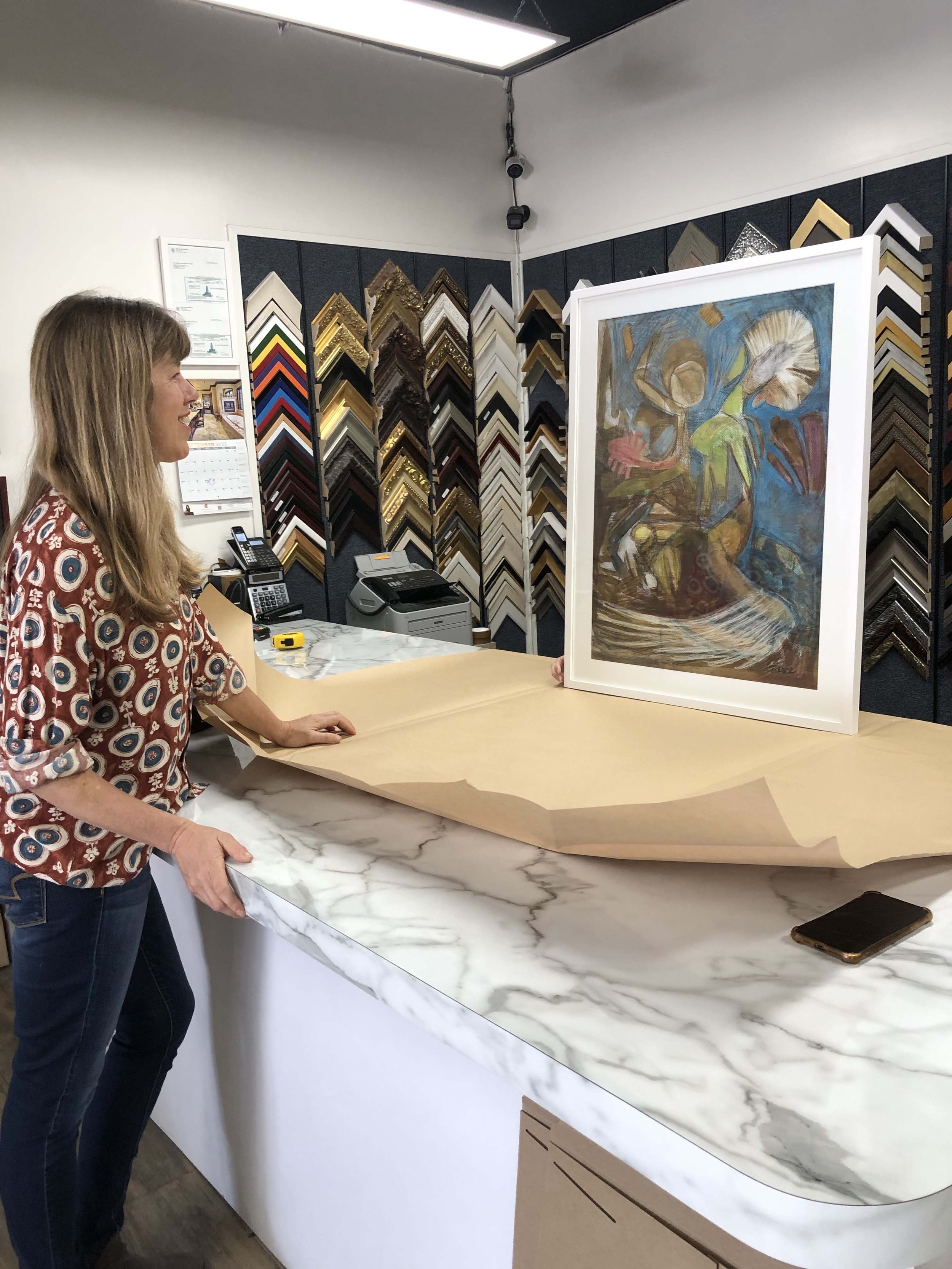
The Science of Color: A Conversation with Nathalie Tierce
Most of you know me through my work as a color consultant, helping clients bring personality, warmth, and harmony into their homes. But my approach to color is also deeply rooted in my practice as a fine artist. My paintings explore color as a language of mood, narrative, and transformation—the very sensibilities that inform my design choices in architecture.
In this blog, I’m delighted to share an article written by the insightful and talented realtor Aiesha Bailey, who highlights how these two worlds come together in our collaborations.
I’m thrilled to use this blog as a space to bridge those worlds and share more about how color lives at the heart of all that I do.
I want to extend a warm thank you to Aiesha Bailey for interviewing me and recommending my work to her clients. I learn something new about real estate every time we work together.

Aiesha: Nathalie, every time we talk, I walk away with new insight about color. But for those unfamiliar with your background, how did you find your way into color consulting?
Nathalie: I began studying art seriously at 14, attending the High School of Art and Design in New York City. At the time, I thought I’d become a commercial illustrator, but while I was there, I interned at an off-Broadway theater, which opened my eyes to set design and props. That experience led me to Pratt Institute for my BFA, and later to the Beaux-Arts in Paris for a study abroad program.
After Disney, I spent years as a scenic artist in London’s film industry. But it was 10 to 12-hour days, always giving 100 percent. When I moved to Los Angeles, it was the same.
Aiesha: So where did the color consulting come in?
Nathalie: It grew organically…

Aiesha - That sounds like it was a rich and varied journey. Was there a specific moment when you knew it was time to pivot?
Nathalie - When my son Joshua was born in 2007, my world shifted, and I reimagined my path. I began leading large-scale mural and ceiling projects in private homes, often collaborating with fellow artists. It was an incredible phase in my artistic career.
During those projects, clients frequently asked for color guidance: interiors, exteriors, roof tiles, landscaping, even pool finishes. I loved it. With my eye, training and communication skills, I was able to help. In 2008, I launched Custom Color and Art, focusing exclusively on color consultation.
Aiesha - I love that you found your niche in something that had been quietly calling you all along. What kinds of projects do you typically take on today?
Nathalie - I work primarily with private homeowners, with select commercial projects. Clients often bring me in when they feel overwhelmed. One of the greatest values I provide is helping them avoid costly mistakes. A color that looks perfect on a neighbor’s house may clash on yours - light, landscaping, and even the texture of your stucco all change how it reads. My role is to create harmony between architecture, environment, and personal taste.
Aiesha- I imagine you’ve had your share of “rescue” calls when someone skips the consultation and then needs help mid-crisis?
Nathalie- Yes, especially with exteriors. By the time I get the call, paint might already be going up - and it’s wrong. Often, it’s because they didn’t sample properly or used a board indoors and assumed it would look the same outside. Lighting and surface textures change everything. It’s stressful for them and me, because I want to help, but I’m often booked well in advance.

Aiesha - So what’s the right way to sample paint? What do people commonly overlook?
Nathalie - Sample it the way it would actually be applied - two or three full coats, using the same tool your painter will use roller, brush, or spray. If it’s brushed on trim, brush the sample. If it’s rolled on stucco, roll it on stucco. Size matters, too. I recommend 12 by 24-inch samples for exteriors, placed in different light conditions throughout the day. And most importantly - be patient. Color shifts with light and time. Observe it over several days before making a decision.
Aiesha - Let’s talk about trends. With social media constantly showing perfectly styled spaces, how do you help clients stay grounded in what actually works for their home?
Nathalie - Oh, Instagram and Pinterest have a lot to answer for! [Laughs] People see a perfectly lit, filtered room and think, “I want that.” But that same color might fall flat in their home. The “gray craze” is a good example - people assume gray is safe and chic, but without variation or warmth, it can feel cold and lifeless.
What I do is look for themes in what they are drawn to. If they bring me inspiration photos, I help identify common threads. Then I reinterpret those elements to suit their environment and lifestyle.

Aiesha - Let’s talk about some of the trends I’ve noticed recently- like millennial pink and butter yellow? Why do you think these colors have become so beloved?
Nathalie - Starting around 2008, gray and other muted neutrals dominated interior design, reflecting the caution and uncertainty of the time. People craved stability, and gray felt like a safe, clean choice. By 2019, though, fatigue had set in, and the pandemic only accelerated the shift. We began craving warmth, personality, and emotional connection in our spaces.
That is where colors like millennial pink and butter yellow entered the scene. Pinks, especially those in the red family, speak to passion, sensuality, and intimacy - they humanize a space. Butter yellow, by contrast, conveys joy and optimism. Psychologically, it sparks energy and forward motion, unlike the introspective nature of blues and greens.
These colors are more than aesthetic trends. They are emotional responses, reflecting a collective desire for soul and expression in our surroundings. Color is back as a language of feeling, and that return inspires me deeply.


Nathalie - Color multiples in impact as it scales. What seems soft on a swatch can feel intense when it covers an entire room, especially in color-drenching where walls, trim, and even ceilings share the same or harmonized hues. Context is everything.
Begin by observing your space. How much natural light does it get? North-facing rooms cool colors, while south-facing rooms warm them. Artificial lighting also shifts perception depending on whether it leans warm, cool, or neutral.
If a color you love feels too bold, do not discard it, refine it.
Aiesha - You’re originally from New York and have lived in France and London. How does light and architecture affect color choices in Los Angeles compared to those places?
Nathalie - Geography plays a major role in how we experience color, and light quality is one of the most critical factors I consider when building a palette.
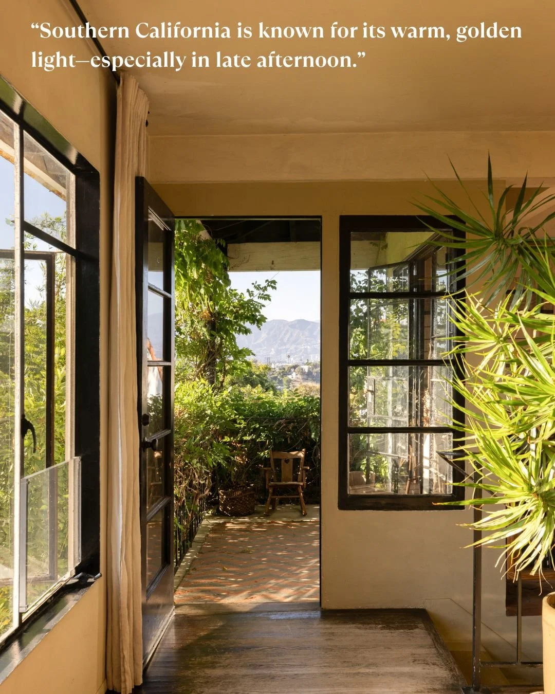
Southern California is known for its warm, golden light - especially in late afternoon. That kind of sunlight can make colors appear more saturated, sometimes even exaggerated. So, when I use bold hues here, the concern isn’t that they’ll feel flat - it’s that they might overwhelm or cause “color bounce,” where walls reflect more color into the space than expected.
In contrast, cities like New York, Paris, or London tend to have cooler, diffused light due to weather and seasonal grayness. In those environments, colors read more subdued, even moody. Richer tones feel cozy rather than loud. The concern there is usually about making sure a space doesn’t feel too dim or cold.
What feels romantic in a London flat might feel garish in a California bungalow, simply because of the surrounding light and architecture. The same red may feel warm and elegant in one setting - and jarring in another.

Aiesha - For someone just beginning a renovation or new build, what’s a smart first step when it comes to color?
Nathalie - Start with a feeling. Ask: How do I want this space to make me feel? Calm and serene? Bright and energized? Cozy and nostalgic? Once you have that, start collecting references - photos, textiles, film stills. I often suggest clients think about movie interiors they love. Take Nancy Meyers’ films- those spaces feel effortlessly homey, with soft tones and natural light. They tell a story of comfort.
In set design, we’ve built entire worlds around emotional tone. When I worked on Interview with the Vampire, the palette was all deep merlots, crimsons, and rusts - colors that supported the story. It’s no different with homes. Color sets the emotional tone. Used with intention, it creates atmosphere and cohesion. That’s what I help clients discover.


Celebrating Bowie: My Piece in the Santa Monica Art Museum Exhibition
My Mixed Media Piece at The Santa Monica Art Museum

I still catch my breath recalling the moment I learned that my mixed-media piece, Ziggy and my Favorite Extraterrestrials, had been accepted into A Day with David Bowie—an exhibition now extended through September 28 at the Santa Monica Art Museum. It’s an honor that feels like a shimmering echo of the very spirit that inspired the work.
At the heart of the exhibition is a serene, almost meditative showcase of rarely seen black-and-white photographs by Austrian photographer Christine de Grancy, capturing David Bowie’s 1994 visit to the Art Brut Center in Gugging. These images are not of the glam-era Bowie or the theatrical alien rock star. They show something quieter and more intimate: Bowie seated on a lawn, cigarette in hand, enveloped in dusk, deeply present and reflective. This is the Bowie who leans in close, who listens, who allows himself to be moved by the work of others. That quiet openness is what makes the setting so soulful—and what makes this exhibition feel so personal.

My piece, “Ziggy and My Favorite Extraterrestrials,” riffs on the mythology of Bowie’s iconic character but pushes beyond the Ziggy archetype into a kind of cosmic language—part mythology, part inner theater. It’s about transformation, reinvention, and letting the strange and beautiful lead the way. To have that work hanging within an exhibit that so thoughtfully honors Bowie’s own openness to the outsider, the uncanny, and the deeply human is more than just a professional milestone—it’s a kind of artistic alignment.
Originally scheduled for a shorter run, the show has now been extended—twice—into late September. I’m beyond grateful that my work gets to be part of this moment, part of this conversation, and part of the quiet magic this show seems to offer.
When you visit, you’ll encounter a Bowie that feels deeply human—no glitter, no stadiums—just a man in black and white, captured by a sensitive lens. The layout of the space breathes, allowing the photographs—and any work displayed alongside them—to land with clarity. There’s also a beautifully curated companion exhibition, Spectacle, featuring 60 large-scale photographs from National Geographic, running concurrently and also extended through September. It’s a show that invites contemplation and also rewards curiosity.
The Santa Monica Art Museum is open Wednesday through Friday, 12–8 p.m., and weekends from 10 a.m.–8 p.m. It’s wheelchair accessible, and they also offer private visits, making it an inviting experience for all kinds of visitors.
I hope you’ll make time to see it. And if you do stop by, I hope you find a little piece of stardust—Bowie’s or mine—that stays with you.


Thinking of Selling Your Home? Don't Neutralize it into Oblivion
How to strategically prepare a house for market, avoiding the misuse of neutrals that can make a home bland instead of memorable.

If you’re planning to sell your home, you've probably been told to strip it of personality, making everything neutral to help potential buyers envision themselves living there. While this advice may sound practical, it’s actually one of the worst things you can do. The truth is that only a handful of people can visualize a space’s potential, and even fewer can see it as an appealing, well-designed home. When you remove all character from a home, you risk making it forgettable, especially in areas where houses share similar designs and floor plans. Here’s why you should rethink the neutral approach and infuse your home with thoughtful design elements.

Neutrals done correctly for impact, style and warmth
Why Neutrals Aren’t Always the Answer One common mistake is creating a tone-on-tone palette—think tan on tan or, even worse, gray on gray. Such uniformity gives the eye nowhere to rest and blends the space into a bland, indistinct blur. Buyers browsing online listings will likely scroll past your home, forgetting it instantly. Instead, aim to include a mix of light and dark elements that catch the eye and create memorable impressions. For those who prefer neutral walls, adding a bit of black in each room can help anchor the space and provide visual interest. Among neutral shades, white walls are a better choice over tan or gray. However, be mindful to select the right shade of white—not too warm or cold—to keep the space inviting and contemporary.

Using different textures creates visual excitement in a restrained palette
The Texture Rule To make your home stand out, incorporate at least seven different textures. Textures can include materials like wood, marble, leather, and patterned fabrics—everything from the walls to the furniture and drapery counts. A well-designed room that feels cohesive and attractive often features a variety of textures that appeal to the senses. Most people may be unable to articulate why they love a particular design, but they know it when they see it. A home that’s already well-designed or offers a template that buyers can easily replicate often sells for a premium.
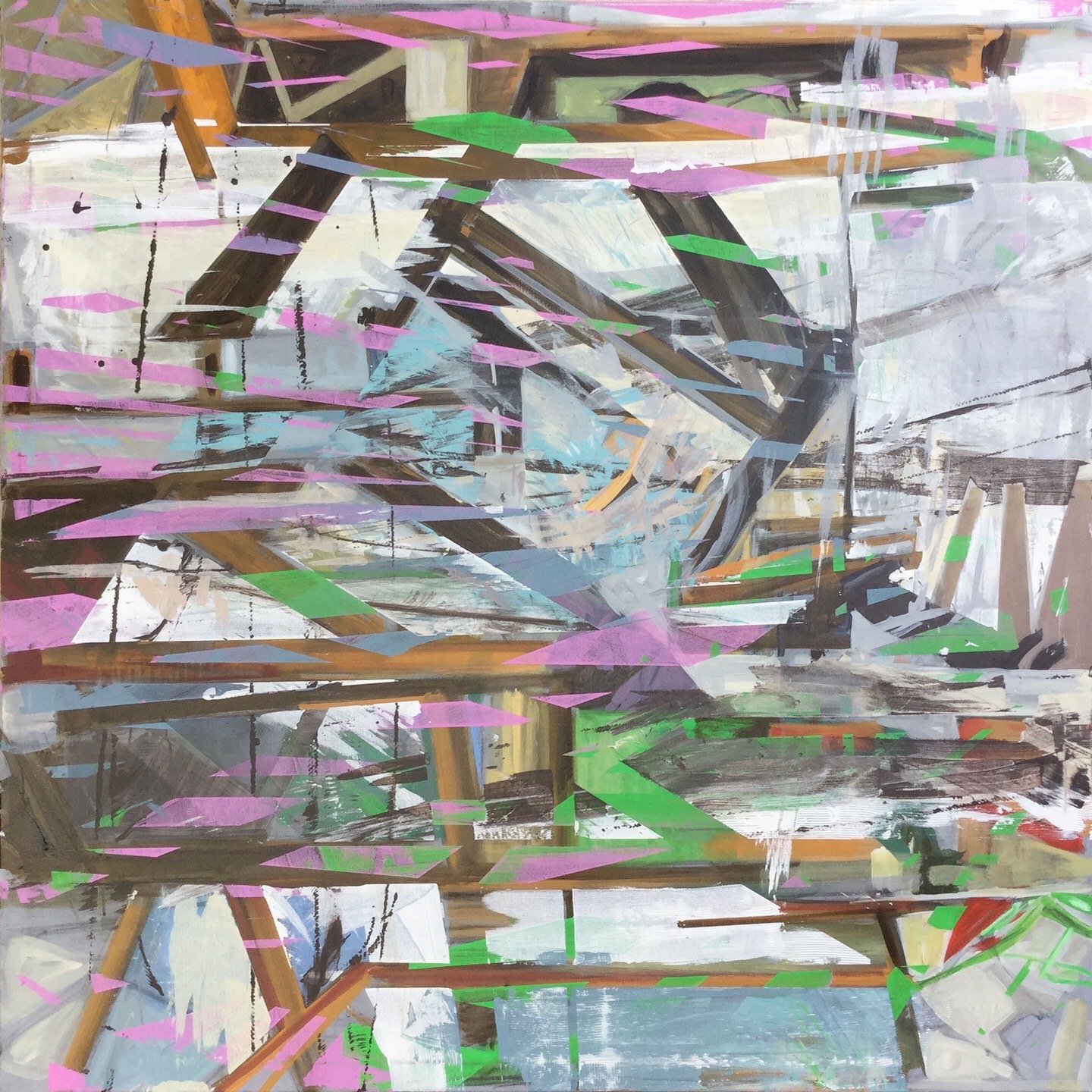
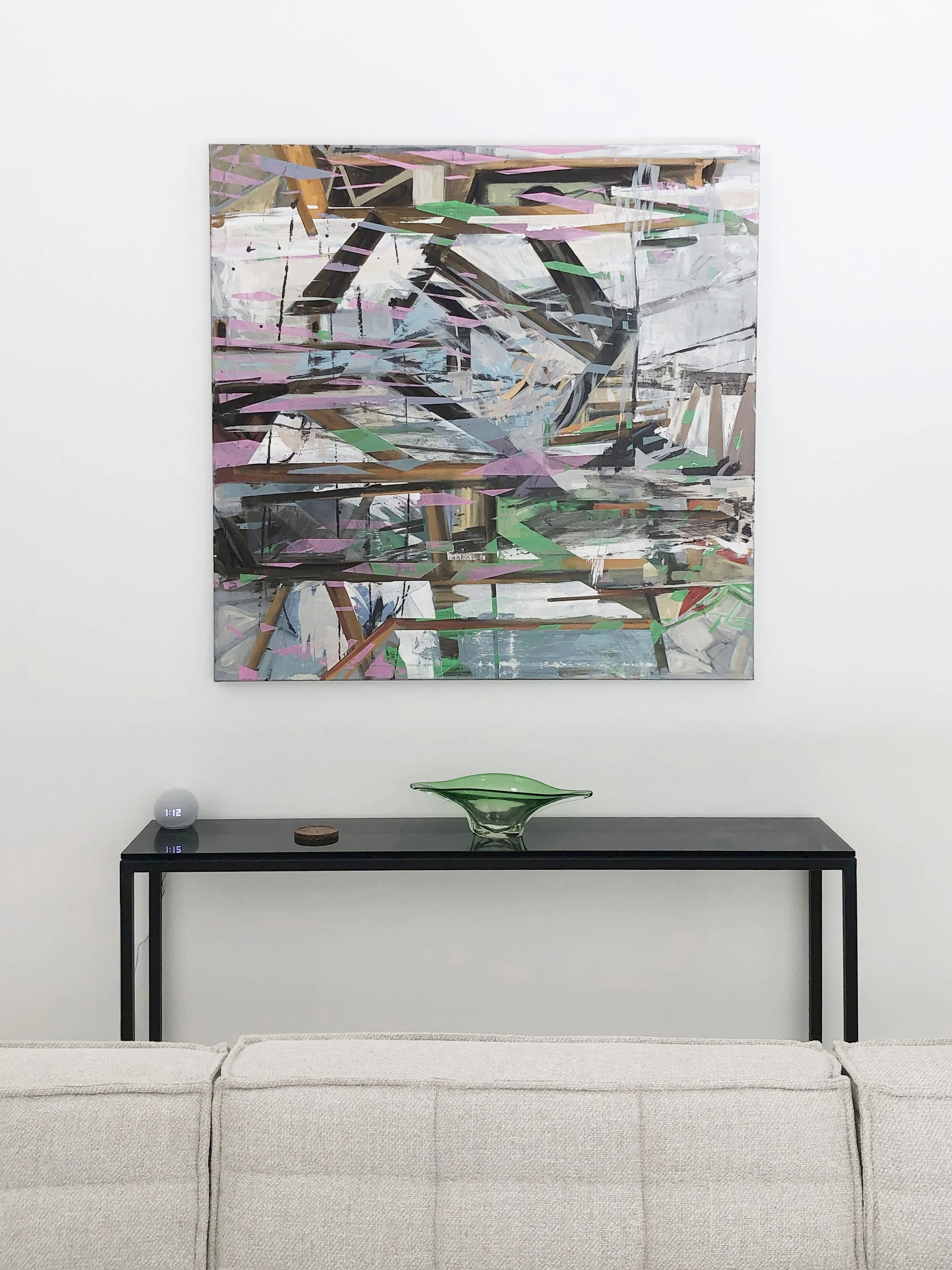
Artwork View From a Bridge ©2019 Nathalie Tierce Private Collection
Balance the Proportions of Elements
Achieving a balanced proportion of elements in your living space can significantly enhance its coziness. For instance, the overwhelming presence of a large white wall can be softened by incorporating a series of shapes in mid-tone or dark tones. Here are a few ideas:
Artwork and Wall Hangings: Hang a series of framed prints, paintings, or photographs to break up the expanse of the wall. Choose pieces with mid-tone or dark backgrounds to create a balanced contrast with the white wall.
Accent Walls: Consider painting a portion of the wall in a darker color or using wallpaper with a subtle pattern to add depth and interest without overpowering the space.
Shelving and Decor: Install floating shelves and decorate them with books, plants, and decorative objects in varying tones. This not only breaks up the wall visually but also adds a functional and aesthetic element to the room.
By thoughtfully balancing the proportions of elements in your living space, you can create a harmonious and inviting environment that feels both cozy and well-designed.
Invest in Professional Help Most real estate agents lack a background in interior design, so their advice to neutralize may not serve your best interests. Instead, consider hiring a color consultant, interior designer, or professional stager to create a memorable, well-designed space that captivates potential buyers. By doing so, you’re not just selling a house; you’re offering a lifestyle they can’t resist. The investment in expert guidance can make a significant difference in how quickly your home sells and the price it fetches.
Why Hire a Color Consultant?

Imagine stepping outside your home to be greeted by a facade that reflects your style and captures the attention of everyone who passes by. That's the power of hiring a color consultant for your exterior painting project.
As an experienced artist and designer, I understand that every space is unique, just like every homeowner's vision. That's why I take the time to collaborate closely with our clients, ensuring that the color scheme we create reflects their personality, brand, or desired ambiance.
With our finger on the pulse of current and emerging color trends, I guarantee that your home will stand out from the rest. From timeless choices to innovative options, I’ll guide you through selections that keep your property fresh and modern. But it's not just about aesthetics; it's also about value. Well-executed color choices can significantly enhance the value of your property, whether you're looking to sell or want to create a welcoming atmosphere for your guests or customers.
By investing in a color consultation, you're not just saving money; you're also saving time and energy. Our streamlined process prevents costly mistakes and ensures a harmonious color palette that aligns perfectly with your vision.
At Custom Color and Art, we're not just about painting houses. We're about transforming architectural spaces into captivating works of art. And it all starts with colors that radiate brilliance and sophistication. Let us help you make your home the envy of the neighborhood.
Rites of Passage

A collection of my works on paper, “Rites of Passage,” opened on March 22 at Studio DDLA. The exhibition delves into the states of identity that define our lives.
What made the opening unforgettable was conversing with visitors, hearing their interpretations, and witnessing their emotional responses to my work.
Some shared personal anecdotes that resonated deeply with the themes I explored, while others offered perspectives that opened new vistas of understanding.
One particular encounter stands out in my memory—a woman spoke to me of how one of my pieces, depicting a figure in a hospital gown, made her think of her mother, who had had Alzheimer's.
Studio DDLA provided a platform for my work to be seen and a sanctuary for dialogue, introspection, and connection. The exhibit is open by appointment and runs until the 19th of April.
The closing party is on April 19th from 5 pm to 9 pm at 944 Chung King Road, Los Angeles, CA
Studio DDLA provides a community, gallery, and event space to explore death, grief, life, and loss in collaboration with local doulas, artists, healers, and community members.
In addition to rotating art exhibitions, Studio DDLA hosts an array of DDLA and external programming. Our interactive workshops and educational offerings cover topics like end-of-life planning, art therapy, grief support, living funerals, and somatic and movement work.
Trust Your Gut


When I asked clients why they chose to buy that particular painting or drawing, their responses were filled with emotion. They described their connection to the artwork as something beyond mere aesthetics—it was as if the artwork had a voice, whispering secrets and stories that resonated deep within their souls. It made their senses come alive, igniting a tingling sensation that sent shivers down their spines.
It’s as if the artwork held mystical power over them. It was more than just a decorative piece; it was a portal into a world that spoke to them profoundly. Such a profound connection is a testament to the power of art and its ability to awaken emotions and inspire a meaningful connection with the world around us.
When you decide to invest in art, you are not just acquiring a physical object; you are immersing yourself in the artist's vision, their unique way of seeing the world. It reflects your innermost thoughts and desires, a cherished piece that speaks to your heart in ways that words cannot express.
This year, I would like to express my deepest gratitude to all of you, both new and long-time collectors, for making my artistic vision a part of your personal sanctuary. By displaying my artwork in your homes, you have supported my craft and shared a piece of my heart and soul with those around you. Your continued trust and support have allowed me to turn my dreams into reality; I am eternally grateful for that.
Fablous Mid Century Design in Palm Springs
As a color consultant specializing in contemporary and mid-century interior design, I understand the importance of creating color harmony in a space. For this Palm Springs residence, my goal was to fulfill the client's vision and create an environment that exudes light and openness, in line with the mid-century aesthetic.
Having worked with the client previously on their Los Angeles residence, I was familiar with their preferences and design aspirations. To maximize the influx of natural light, we made strategic decisions throughout the space. One of the critical changes was swapping out the old patio doors with sleek, thin-profile sliding doors. This alteration allowed for uninterrupted views and a seamless transition between the interior and exterior.
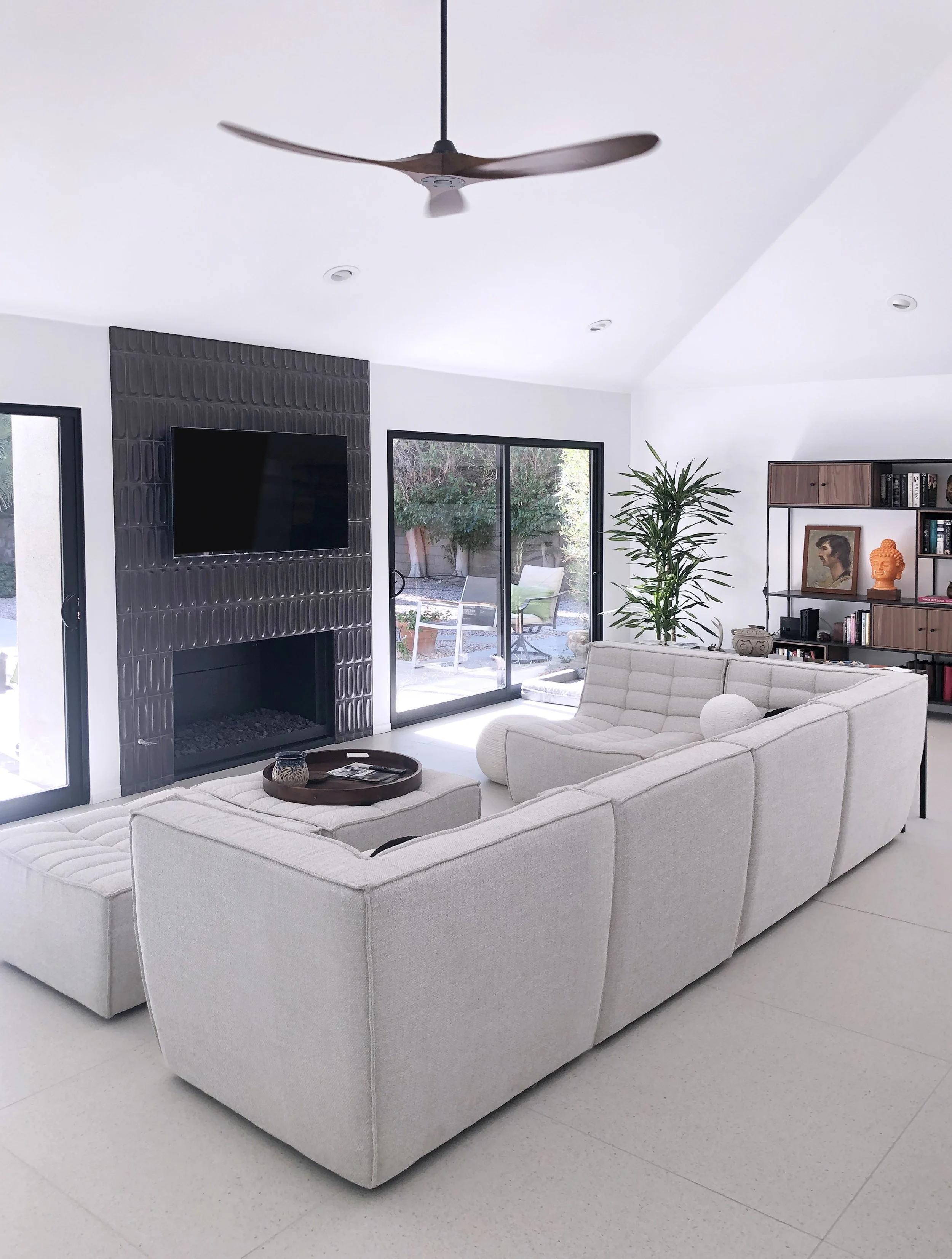
To add warmth and texture, I selected large-scale terrazzo tiles with a subtle sienna blush. This color choice balances the space and adds a touch of visual interest without overpowering the overall design. Additionally, the relief design on the fireplace tiles harks back to the sixties, lending a sense of weight and masculinity to the room. This design element also complements the dark trim of the patio doors, tying the different components together seamlessly.
When selecting the wall color, I meticulously chose a light hue that avoids appearing cold or bluish against the tiles. It strikes a balance, not being overly peachy or yellow, to ensure a vibrant and inviting atmosphere throughout the space.

Although there are still some furnishings and rugs yet to be added, I am thrilled to share a sneak peek of the space with one of my own paintings now in place. The artwork, titled "Fear of Falling," is from my "Memories of Place" series. It captures the essence of being captivated by the beauty of open space, with its volume, atmosphere, light, and dancing shadows. Its placement in the room adds a personal touch and further enhances the contemporary mid-century vibe.
To complete the design, a coffee-colored shag rug is on its way. This rug will contribute to the overall aesthetic by creating contrast between the floor and the couch, adding depth and texture to the space.
Working closely with the client, I have aimed to curate an interior that fulfills their dreams and aspirations rather than coming together haphazardly. By combining contemporary elements, mid-century influences, and the unique charm of Palm Springs, I have strived to create a harmonious and visually stunning environment in this residence.
Art For A Dark Corner Revisited
Print on LED mount. Art and Photo credit Nathalie Tierce
A client of mine asked if there was any way to light up a dark corner of her living room with one of my works of art. I thought she wanted to create a focal point for the room and light it with directional spot lights. That wasn't what she had in mind at all. She really wanted to light up the area with the artwork itself. I loved the idea, I just had to figure out to do it.
Inside workings of the LEDs within the light box frame mount.
After much research I found a graphics company that could print my artwork and then weld it to canvas. From there, a sleek frame would be built to mount the canvas. Within that frame were rows of LED lights, controllable by a dimmer switch to the side.
Bob finding where the joists are behind the drywall and preparing for the installation of the light box.
Taking back the canvas to attach the support to the wall.
Tucking the canvas back in.
With the dimmable switch, the glow of the art work can be changed to suit the mood of the room. As the lights are LEDs, they pull little power and last long time. Once the light box is in place, the print can be changed out, transforming the space again.
Tags: #artforhome, artlight, #artlight, #lightbox,#customizablelight, artinstallation, #newideaart,#darkcornerroom