Besides the Color and Design work that I do for my clients, much of my time is spent in my studio painting.
This is a short video that describes the process of developing the concepts, compositions, and color palette that goes into the artwork.
Besides the Color and Design work that I do for my clients, much of my time is spent in my studio painting.
This is a short video that describes the process of developing the concepts, compositions, and color palette that goes into the artwork.

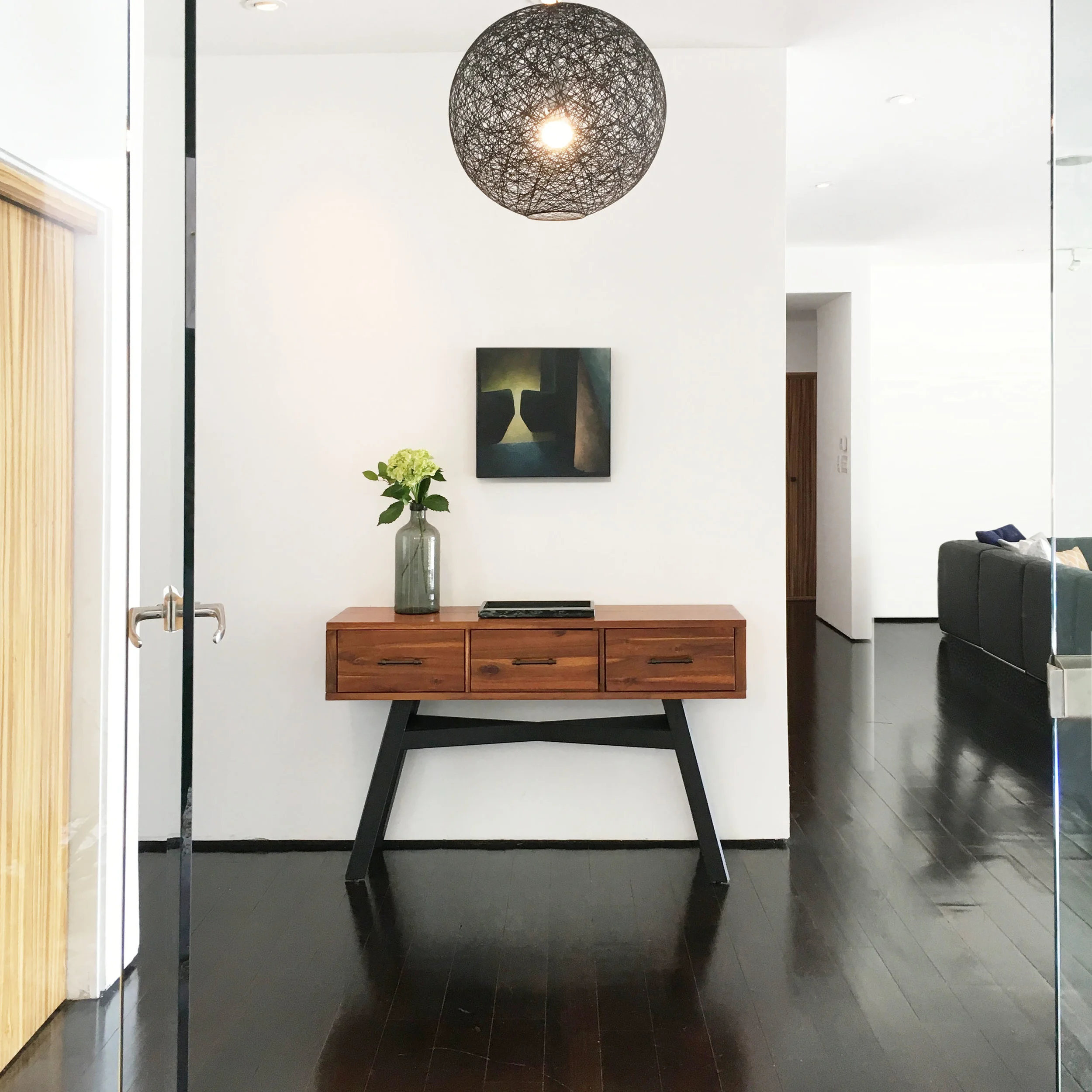
Entry way Hollywood Hills
Breakfast Nook Hollywood Hills
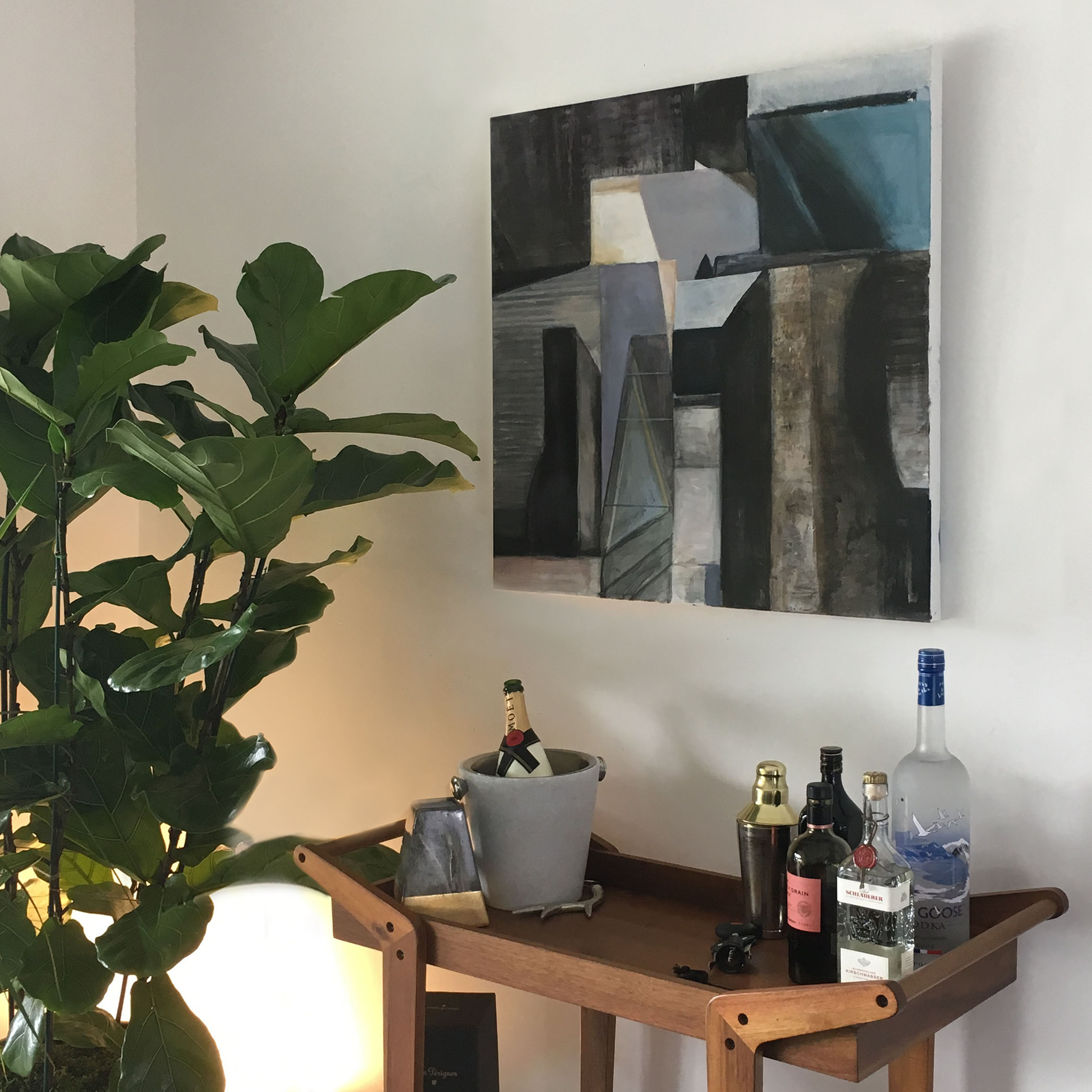
Bar Area Hollywood Hills
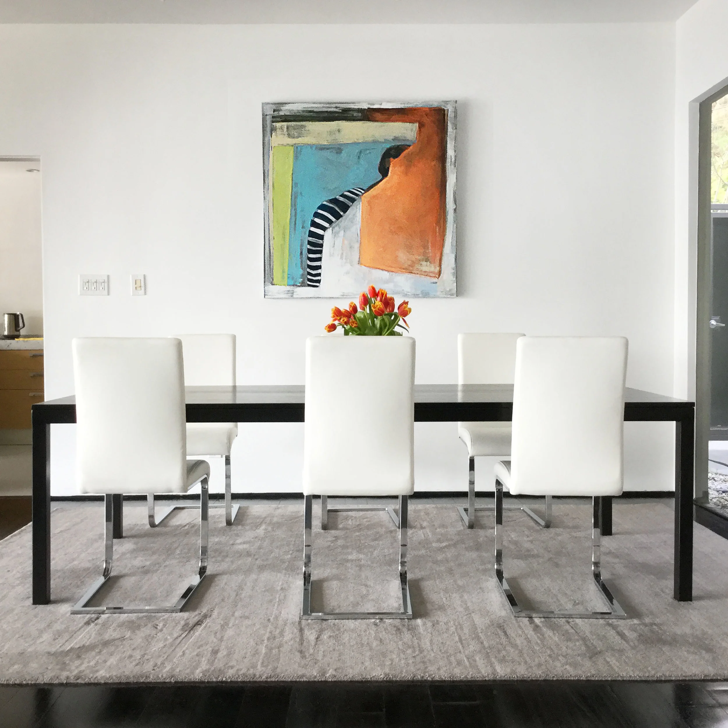
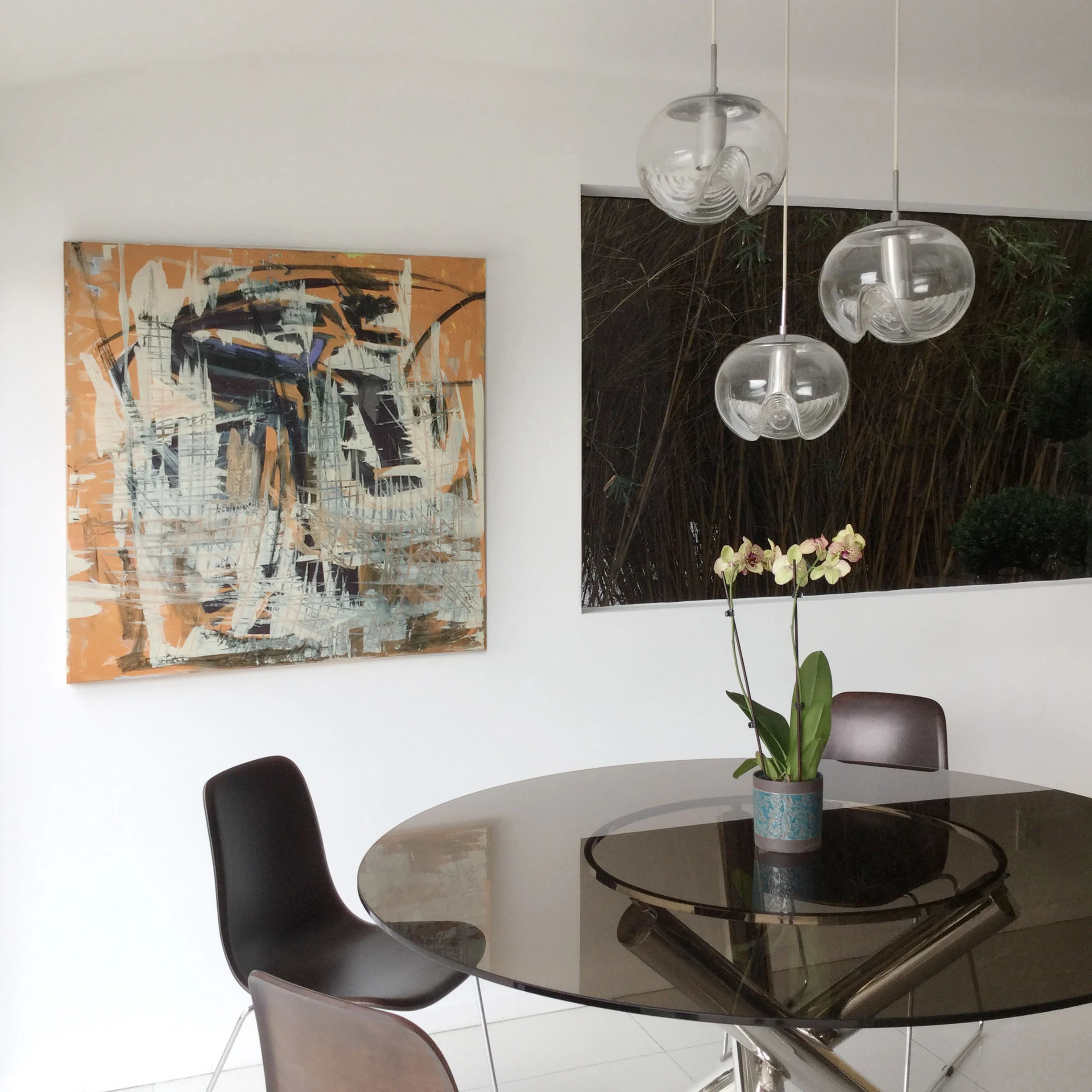
Dining Area Hollywood Hills
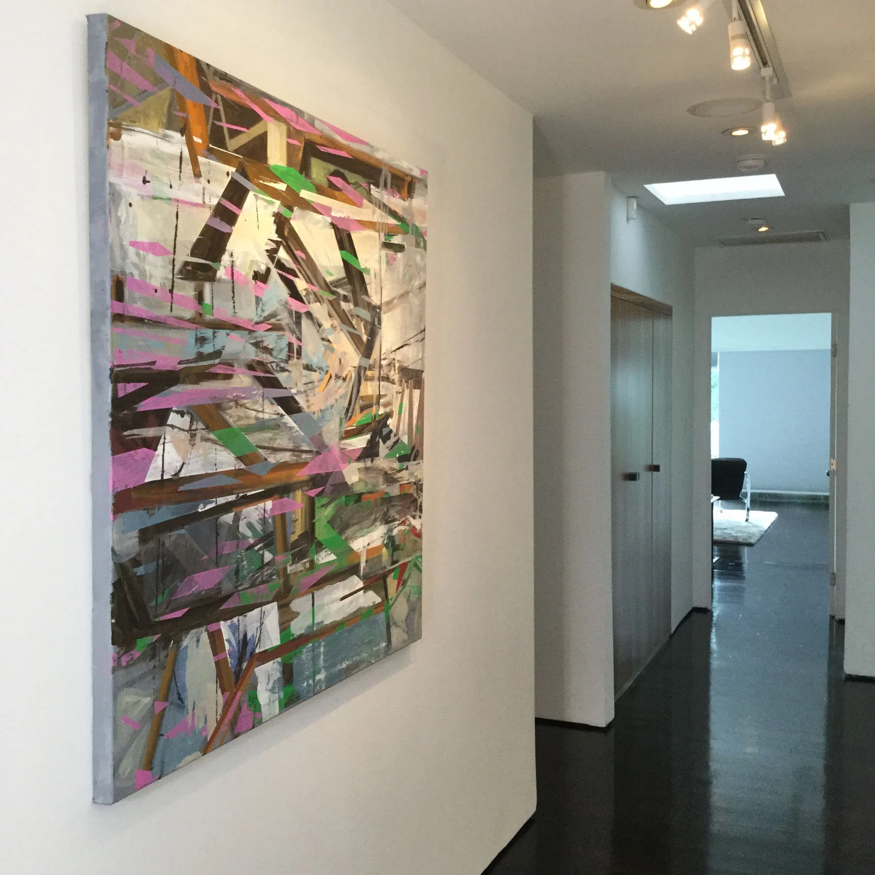
Hallway Hollywood Hills
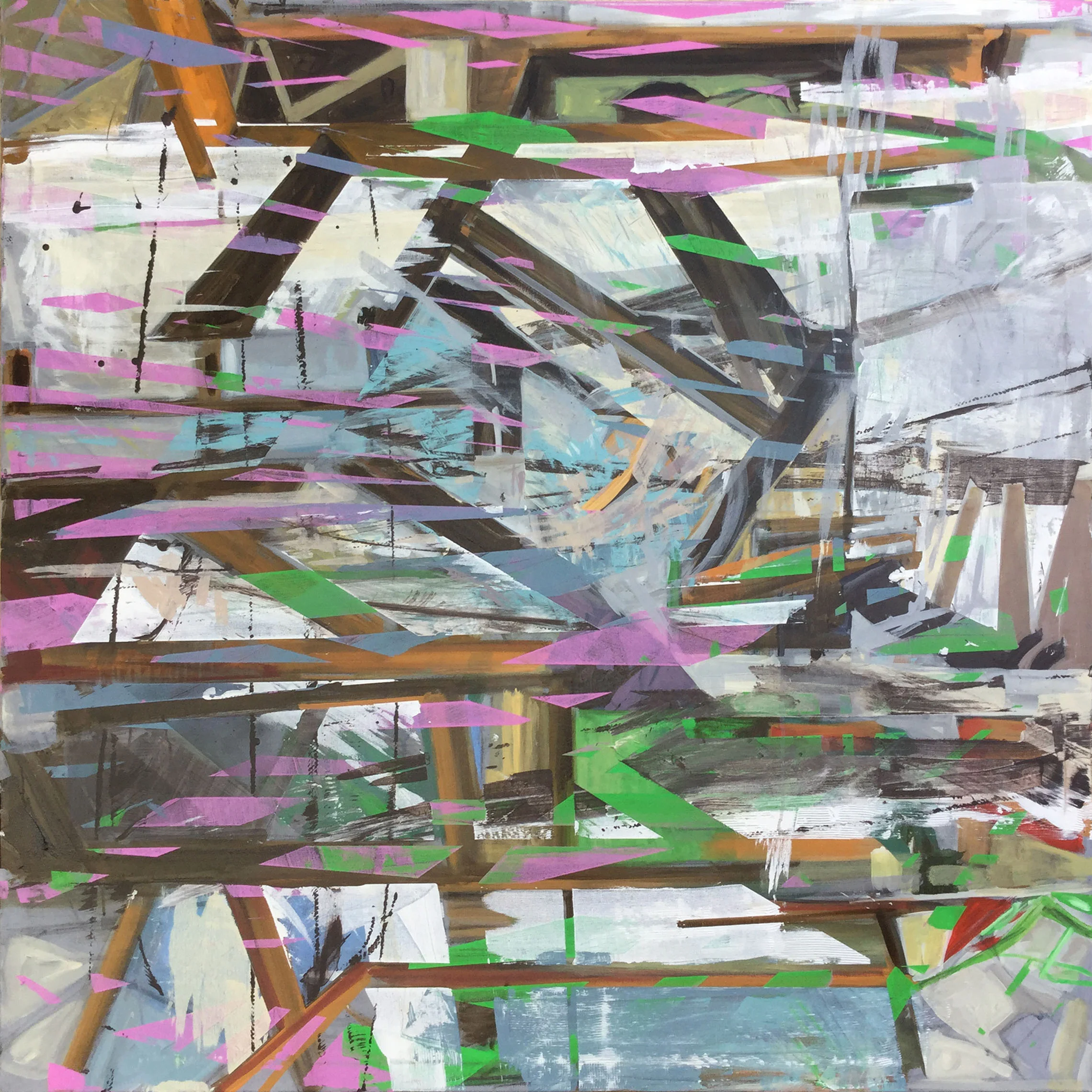
"Bark Painting #6" by Nathalie Tierce
This painting that is the sixth in a series I've been working on called "Bark Paintings". This time, however, the result is a departure from the others.
Using textures I acquire through taking pictures of bark, I use those digital samples like brushes to create imagery, fine tuning shape, color and line with smaller digital brushes.
This is one of my photographs taken of a tree's surface that I extract texture samples from and use repeatedly. As I develop it, I paint into the forms giving more precise detail and color
Up till now, the forms within the paintings, although full of detail, were very subjective. Some viewers saw animals, architectural detail, it really depended on who was looking. The overall subject matter was open to interpretation.
"Bark Painting #5" Nathalie Tierce
While working on this piece, a narrative began to in my mind as I was painting it over many weeks. Little by little I discovered this particular character that was laid to rest and fossilized becoming one with a tree that had grown above.
As I painted, a face began to emerge that made me think of the Lion from the Wizard of Oz mixed with a strange solider whose elaborate uniform I spent much time embellishing.
The face and persona was really like a search and discovery mission. Sometimes my painting efforts brought me someplace that was just wrong. Without a solid preconceived idea of a title, story or theme I knew when I was getting closer or not.
The interesting part now is starting the next painting from where this one left me off.