
A space can serve a singular purpose or have several functions. Color reinforces that harmony between that environment and the reason someone is in it.
Some spaces are for social gathering and interaction, others for quiet contemplation. Understanding the psychological effects of hue on our minds and emotions makes for better choices in designing living areas with color.
A study which illustrates the power of color effecting state of mind was done in the 1960's. Violent prisoners at a Naval Detention Center were placed in cells painted particular shade of pink (now known as Baxter - Miller Pink), there were no incidents of violent or erratic behavior. Exposure of 15 minutes was enough to have the effect.
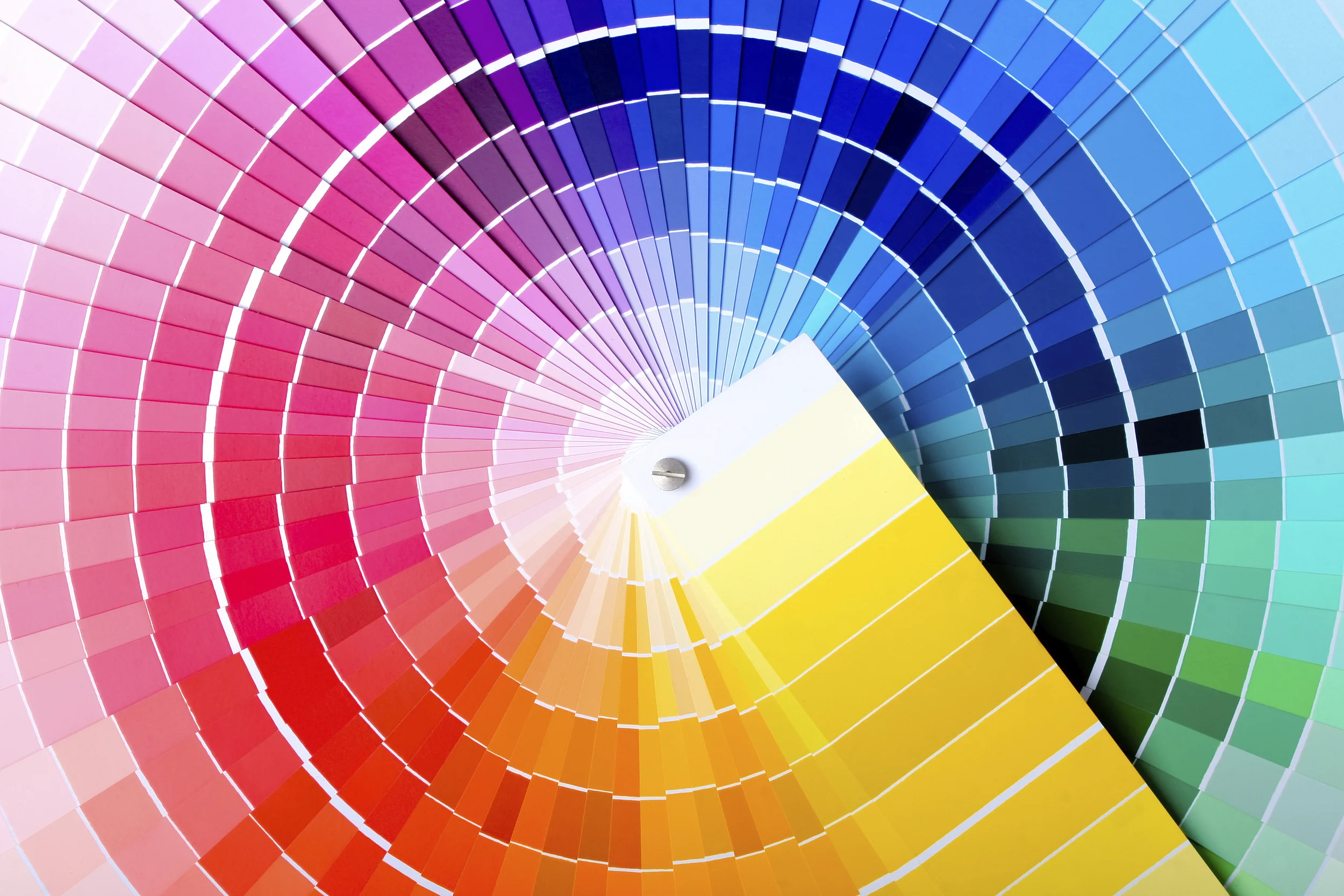
Another aspect to understanding color sometimes ignored is the type of light the area in question receives. This gives rise to one of a very common problem of seeing a paint swatch or fabric sample in a showroom and then getting it home and it looking completely different to the way it did in the store.
Natural sunlight provides the widest spectrum of light allowing us to perceive the widest spectrum of chroma.
Even so, depending on the direction of light and time of day there is a huge variation in terms of the light being warm or cool.

Monet's Haystacks early morning
Monet's Haystack's evening
Artificial light, LEDs, for example have an enormous range of variation as seen in the chart below. This can have an enormous impact in the way a color reads in one place to another.

As the higher an LED is in terms of its Kelvin rating, the cooler and brighter the light will be. On the lower end, the light will appear warmer or more yellow akin to candlelight.
So, for example a warm light will dull a cool color and intensify a warm one.
Another elusive variable to the color selection process is surface texture. This is linked to a phenomenon called metamerism. The same color on two different surfaces will appear differently to the eye because of how the light waves are reflected back. This is a prevalent frustration when a sample color on a smooth surface (like card paper) appears different from paint on drywall.
These factors can help you understand the way color behaves as it does and narrow down the selection process. Ultimately though, the last stage of picking a color is to put up samples. This is the only way to really experience the color in its proposed setting and allows you to see it as it changes during different times of day.